This Post provides a link to chapter 18 of my book, “Painting with Light and Colour”. It is the last of the chapters in the part of the book dedicated to “painting with light”. Its title, “All you need to know about painting-2” is almost the same as the title of Chapter 1, except for the number 2 tagged on at the end. The grandiose claim was made by my teacher Professor Marian Bohuz-Szyszko, during a brief encounter on the very first day we met. He asserted that “all you need to know” can be summerised in two simple rules.
The purpose of the chapter is to consider the plausibility of his assertion in the light of the ideas developed in the Chapters 2 to 17. These not only delve into the historical origins of the rules, but also provide scientific evidence of their power as tools for artists.
After the link to Chapter 18, I have added a slightly edited version of its “Introductory”, as a means of better preparing you for its contents.
.
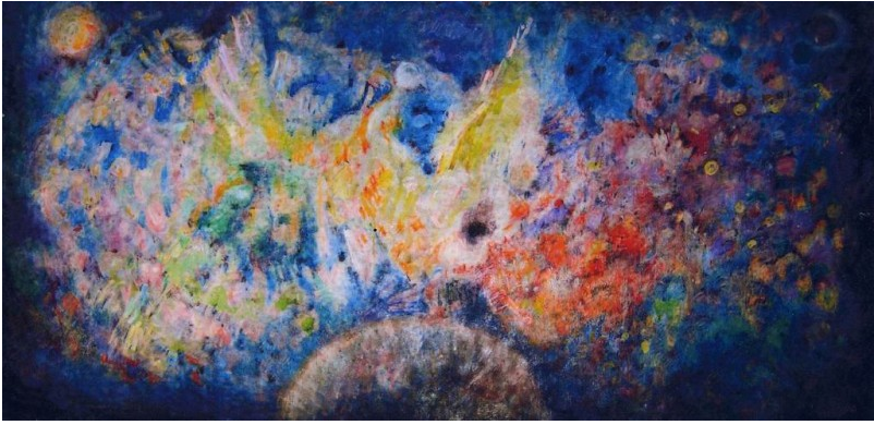
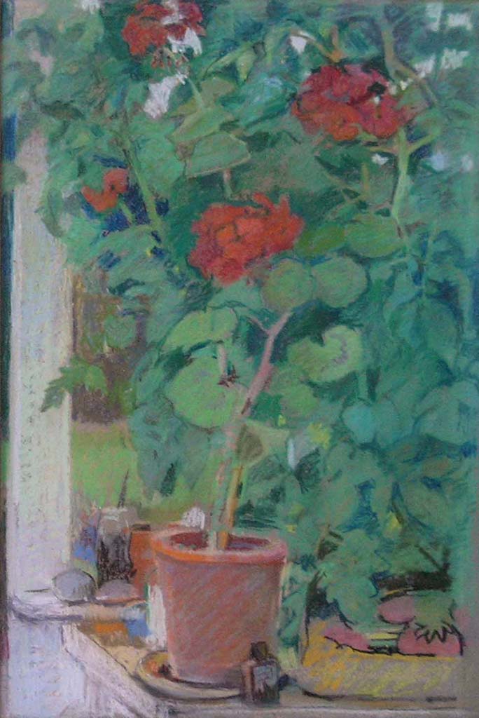
An oil painting that follows the rules of Marian Bohusz-Szyszko, by one his students, my friend Stefan Stachowicz.
Introductory to chapter 18 of “Painting with Light and Colour”
We have now come to the last chapter and the question as to how to make the best use of the information and ideas presented.
The first chapter introduces the five propositions of Marian Bohusz-Szyszko, the ones that according to him constitute, “all you need to know about painting”. The chapters that follow provide an account of their historical and scientific origins and explain why they are so powerful. At the same time they point out some limitations. However, although the avoidance of repetition and the use of complex, complementary-containing colours can transform what artists can achieve, they certainly do not represent “all there is to know about painting”, not even with the modifications and extensions suggested in this book. Most notably, the Professor’s rules give short shrift to two subjects that many artists consider to be of the utmost importance Thus they:
Have no relevance to the kind of “colour dynamics” that can be generated between juxtaposed colours (the subject of the following chapters)
Do not address what is perhaps the most important topic of all, namely the role of the feelings.
Although a full discussion of the importance of the feelings as a driving force in all domains of creativity is reserved for “Fresh Perspectives on Creativity”, it would not do at all to neglect them entirely in what follows.
.
The earlier chapters from “Painting with Light and Colour
This ‘Post’, as well as providing a link to Chapter 17 of my book “Painting with Light and Colour”, concentrates on a number of practical matters that need to be taken into account before starting to paint. Most of the suggestions concern all mediums. Where there are differences, these will be pointed out. As a bonus two highly complex images are used to illustrate practical ways of differentiating a multiplicity of colours.
The two images below are used to illustrate different approaches to ensuring that no repetition of colour occurs. The first, a pastel painting of a forest scene, was made by means of unaided visual analystic strategies and the second, a constructivist composition using acrylic paint, required the use of systematic mixing procedures.
Figure 1 : Forest scene -The challenge was to differentiate by eye between all and every one of the multiplicity of regions of colour, however small. All colours are mixtures containing complementaries or near-complementaries.
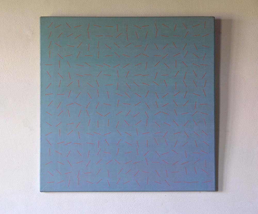
Figure 2 : 289 orange lines on a graded, blue/grey background. All 289 of the lines have been given a different orientation and each is made of a different mixture of parent colours. All the colours are mixtures containing complementaries or near complementaries.
Differentiating by eye
Figure 1 is a pastel painting. As explained in Chapter 16, to obtain a large range of subtly different pastel colours, it is necessary to have a sufficiently large number of colours to work with. It is well worth remembering that, just as important as having a sufficiency of pure pigment colours available, is to have each of them represented at a range of lightness levels. Particularly important is to include both the lightest and the darkest possible levels. To make the painting of the forest illustrated above, I probably used something like 16 base colours at 7 lightnesses levels.
I have two complementary approaches to ensuring that no colour is the same as any other colour:
The first depends on the fact that any repeated colours jump out of illusory pictorial space (See Chapter 10). The result is an ambiguity between a real surface and an illusory pictorial space interpretation. These provide the eye/brain with an insoluble interpretive problem (as explained in previous chapters). The result is both disturbing and attention grabbing.
The second depends on the fact that our analytic-looking systems are extremely good at detecting very small differences between any two compared colours.
Thus, the first strategy for ensuring that no colour is the same as any other colour, is first to allow attention to be drawn to the colours that jump out of the illusory pictorial space and, then, to differentiate between them by adding subtle touches of colour. When doing so, it is useful to remember that almost imperceptible differences can have a transformative effect.
The second strategy is to make comparisons between all the regions of colour on the picture surface, however small they may be. In a painting as complex as the one imaged in Figure 1, this means a very large number of comparisons, which is why it took such a very long time to complete.
Differentiating by means of systematic procedures.
Figure 2 is an acrylic painting that posed the problem of creating an array of 289 different oranges that, at first glance, viewers could easily mistake for being the same. This requirement implied, not only that neighbouring colours on the same row would not be perceived as being different but also neighbours from both the row below and the row above. The solution adopted was to premix and store in separate pots, a sequence of oranges, each of which was just noticeably different (JND) from its neighbours. Any mixture between any two in this sequence would produce colours that coud not be distinguished by eye. Accordingly, any progression of mixtures between them, would produce an invisible progression analogous to the progression colours that occurs between any adjacent parts of a uniformly painted flat surface (for example a wall). It is only when you compare colours situated at a distance from one another that the fact that a progression has taken place becomes evident.
This Post provides a link with CHAPTER 16 of my book “Painting with Light and Colour”. It is the first of three chapters that provide different approaches to reviewing the ideas presented so far. To whet your appetite, after an image of a painting made with a view to exploring the rules of Professor Marian Bohusz-Szyszko, there follows a reprise of the “Introductory”:
.
Figure 1 : One way of exploring the ideas – oil paint
.
Introductory
We have now arrived at the final section of “Painting with Light” . In it are three chapters. The first (this one) reviews ideas that have been presented in previous chapters. As explained there, some of these have a long history, going back both to the Italian Renaissance and to 19th century developments in science. Others are much more recent, arising from advances in the relatively new disciplines of neurophysiology and computer modelling. From the point of view of the subject of “painting with light”, the most important of the new insights concerns ways in which the eye/brain mediates our perception of surface solidity, surface form, illusory pictorial space and ambient illumination (the prevailing quality of light). It tells of two great breakthroughs. The first being the late 18th century realisation that colour and, indeed, all visual experience is made in the head. The second, the discovery, roughly two centuries later, of two functionally independent visual-systems. One of these has much to tell us about surface-reflection (the subject of the previous chapters) and the other about body-colour, the subject of the chapters that follow. This chapter is also in two parts. The first contains a review of the theory. The second moves on to a list of basic questions relating to it. Each of these is accompanied by a short answer.
Below are images of seven paintings, made between 1964 and 2015 that explore the ideas of Professor Marian Bohusz-Szyszko, as presented in previous chapters. It is important to stress that although they give some idea of the range of possibilities, they cannot reproduce the all important “harmony that runs parallel to nature”. For that it is necessary to have real paint on a real flat picture surface, illuminated by an external light source (preferably a natural light one)
.
Figure 2 : A second way of exploring the ideas – Oil paint
.
Figure 3 : A third way of exploring the ideas – chalk pastel
.
Figure 4 : A fourth way of exploring the ideas – Oil paint
.
Figure 5 : A fifth way of exploring the ideas – acrylic paint
.
Figure 6 : A sixth way of exploring the ideas – chalk pastel with water and gum arabic
.
Figure 7 : A seventh way of exploring the ideas – chalk pastel
.
Figure 8 : An eighth way of exploring the ideas – acrylic paint
Clement Greenberg, Jackson Pollock and a space within the picture surface
Clement Greenberg was a high profile mid twentieth century art critic whose thoughts on Modernism in Painting influenced a generation of artists. He had much to say on the paintings of Jackson Pollock to which he accorded a special importance. One of the reasons why was that he saw in them an unprecedented type of “pictorial space”. This he called “a space within the picture surface”
.
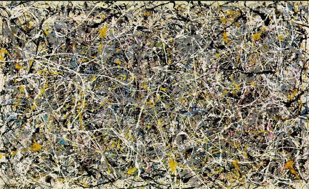
Figure 1 : As predicted by Professor Bohusz-Szyszko’s rules for creating a “harmony that runs parallel to nature”, the many repeated colours in this typical painting by Jackson Pollock can be perceived as jumping out from the picture surface, thereby creating in front/behind relations and what Greenberg described as a”space within the picture surface”.
.
A moralistic reaction against photographs
His claim had a history. In the late 1860s. a number of young artists saw a threat in the degree of realism manifested in images taken by the recently invented camera. The approach they chose for countering it was purely conceptual. It was based on a two step rationalization. First, they argued that realism of photographic images was such that it deceives the eyes and, second, that deception is “immoral”.
The way these artists, later known as the Impressionists, sought to avoid analogous immorality in their own figurative paintings was to emphasise the reality of the actual picture surface. Their main strategy for doing this was accentuate “surface texture” and “personalised mark-making”. Luckily for the history of painting, one outcome was that they discovered the exciting potential of exploiting the dynamic relationships between the reality of the picture surface and the illusion created by the figurative aspects of their work.
.
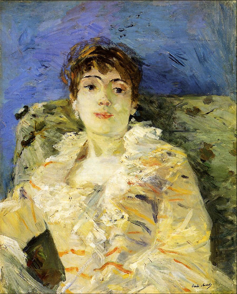
Figure 1: A main pioneer of the exploration of personalized mark-making was Berth Morisot, as illustrated in her painting “Girl on divan”.
.
Two new developments
.
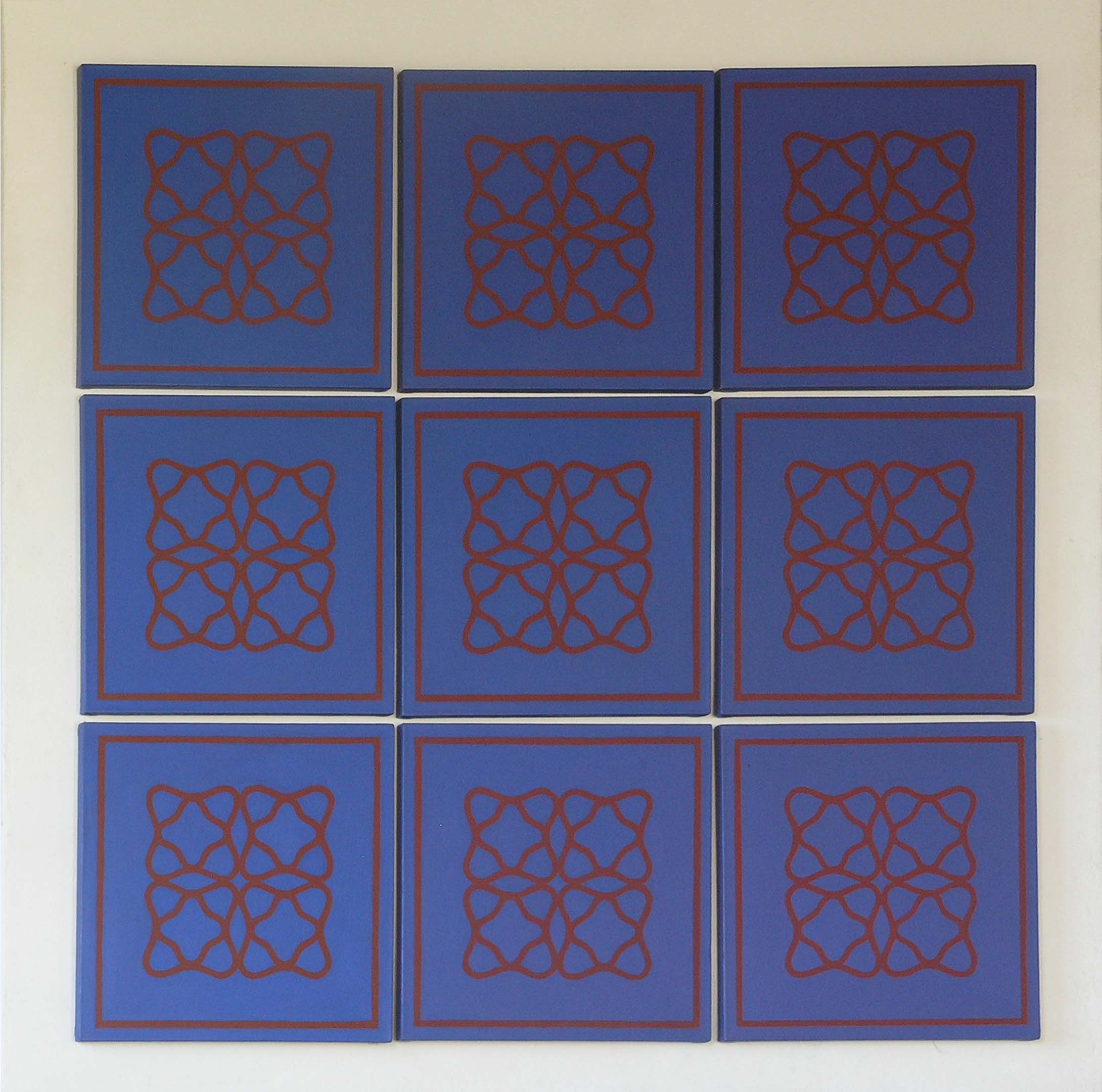
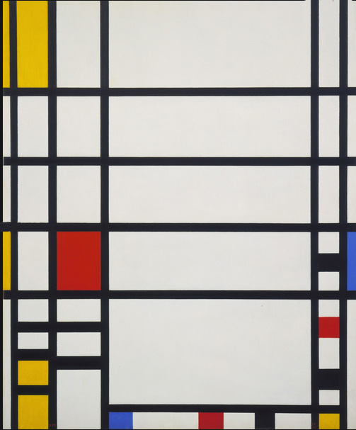
Fig 3 : Compositions like this are immediately recogniseable as being by Piet Mondrian. As in the vase/faces illusion, we can either see the white, red and yellow rectangles jumping out of the black framework or visa versa. The in front/behind implications provide an example of the kind of space Mondrian described as a “spiritual space”. This kind of space is analogous to the “space within the picture surface” that Clement Greenberg saw in the much more complicated paintings of Jackson Pollock.
.
In the course of time, the successors of these early Modernist painters discovered that figuration is not necessary for creating illusory pictorial space. They found that perceptions of it could be evoked in non figurative paintings, by means of “cognitive cues”, the most important of these being “overlap” and depth-indicating “diagonals”.
.
Fig 4 : According to the rules of linear perspective, the diagonal lines in this painting by Bart Van Der Leck (1876-1958) can be seen as receding and, therefore, indicating the “illusory pictorial space” that was anathema to Mondrian.
.
However, despite the exciting possibilities offered by real surface/illusory pictorial space dynamics, Piet Mondrian and other purists could not help concluding that any kind of illusory pictorial space was a “deception” and, accordingly, both “immoral” and to be avoided at all costs. Nor did they consider this to be a trivial matter. Mondrian permanently broke off his close, working relationship with Bart van de Leck because he had included a diagonal in one of his paintings.
Poor Mondrian had to soldier on alone. At times he must have felt despairing. However hard he tried, he could not find a way of altogether eliminating perceptions of illusory pictorial space. Eventually, his deeply religious worldview rescued him. It suggested a way of rationalising himself out of the morality problem, namely, to rename the “pictorial space” that he was unable to eradicate as “spiritual space”.
An illusory space within the picture surface
Seemingly unaware of Mondrian’s discoveries, Greenberg discerned what he described as “a space withing the picture surface” in the paintings of Jackson Pollock. This he argued was fundamental different from the “illusory pictorial space” found in the work of his Modernist Painter predecessors. However, although influential for a number of years, his claim did not convince number of later artists and theorists. Although these had no difficulty in seeing the space that Greenberg has identified, they insisted that it was illusory and they were right to do so. We now know that they were seeing was the same kind of illusory pictorial space found in the the“vase/face illusion”, in which the vase can be perceived as being either in front of or behind the inward looking faces .
The problem that now arose was that this kind of illusory space provoked an optical disturbance of a kind that some saw as an undesirable (described in the chapter on “negative spaces” in “Drawing on Both Sides of the Brain”). To remove this in the interests of creating a pure, undisturbed colour experience, artists of the 1950s and 1960s, felt obliged to eliminate all traces of Greenberg’s “space within the picture surface”.
.
Figure 1 : This was the first painting I saw by Michael Kidner. Each of the three colours are repeated in six different contexts. If the psychologists of visual perception and Joseph Albers are to be believed, this should mean that none of the three colours looks quite like any of the other eight of its kind. Michael wanted to eliminate pictorial space. Did he succeed? Ellsworth Kelly would have said “No”.
.
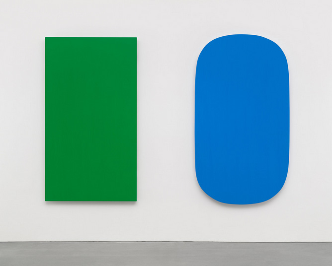
However, when they tried to do so, they found the task they has set themselves to be more difficult than they had bargained for. Indeed many decided that they were faced with an insoluble problem. They had come to the conclusion that, as long as there is more than one region colour on the picture surface, there is no way of avoiding some degree of visual tension. The reason was no longer necessarily the repeated colours of Mondrian and Pollock, it could also be the figure/field separation that occurs at the earliest stage of perceptual processing, in which the object (figure) is picked out at the expense of its context/background (field). In the view of artists like Ellsworth Kelly, the only remaining way of producing pure colour experience would be by means of single colour paintings. As these could be described as “coloured objects hanging on a wall”, the question that then arose was whether they should be classified as “paintings” or as “sculptures”. Many seem to have plumped for the latter.
.
Figure 7 :“Ellsworth Kelly, “Diptych: Green Blue” (2015). In this late painting, the artist wanted to produce two examples of pure colour experience. Did he succeed? Or, is the way we perceive the separate colours influenced by their proximity to one another? Notice the shadows under the colours that show that they are not painted on the same picture-surface, but rather as separate, intentionally isolated objects.
In 1968, the Museum of Modern Art in New York provided the art world with what turned out to be a watershed exhibition. Its title, “The Art of the Real” ,was deeply significant. From the conceptual point of view, it signed the death knell of one of the most influential strands of the broad tapestry of “Modernism in Painting”. For those that believed this to be the only strand, the future of painting had to be in some manifestation of “Post Modernism”.
None of this necessarily deterred artists from carrying on regardless with all the different possibilities. They will always be free to embark on new explorations of:
All are to be found in work produced up to the present day.
Footnote 1
As a footnote I think it worth mentioning that the issues discussed above were central to the teaching of both my main mentors.
Professor Bohusz-Szyszko felt the main importance of his rules was that they ensured what he described as “the integrity of the picture surface”.
Michael Kidner followed Greenberg and Pollock in believing in the importance of eliminating illusory pictorial space, as defined by them. He also made good use of what they described as “the space within the picture surface”, in other words what I have been likening to the illusory pictorial space exemplified in the vase/face illusion.
Footnote 2
Incidentally, Professor Bohusz-Szyszko told me that the fact that his rules ensured the “integrity of the picture surface” was one of the main virtues of the dogmas he shared with his students is. According to him repetitions of the same colour in different parts of a panting broke the “integrity of the picture surface“, either by jumping out in front of it or by creating the illusion of holes within it. We now know that this theorising was wrong. As explained in many places in my books, what they jump out of is illusory pictorial space. What actually happens is that they are perceived as jumping from surfaces in an illusory world, and integrating with the actual picture surface. From the practical point of view this theoretical distinction does not matter for in both cases the outcome is that the eye and the brain are confronted with incompatible and therefore disturbing perceptual cues.
After posting thirty-seven of the chapters of my four books, I realise that I have missed out the “Introduction” to my two PART volume on drawing. In the edited extract from it below, some general remarks are followed by a brief focus on two issues of fundamental relevance to what follows. Also, as an extra bonus, I have added three images .
.
EDITED EXTRACT
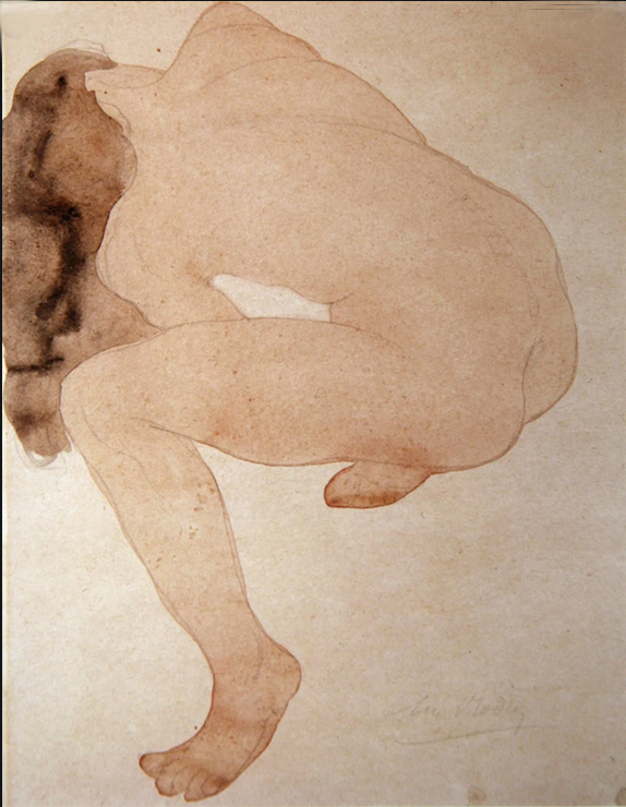
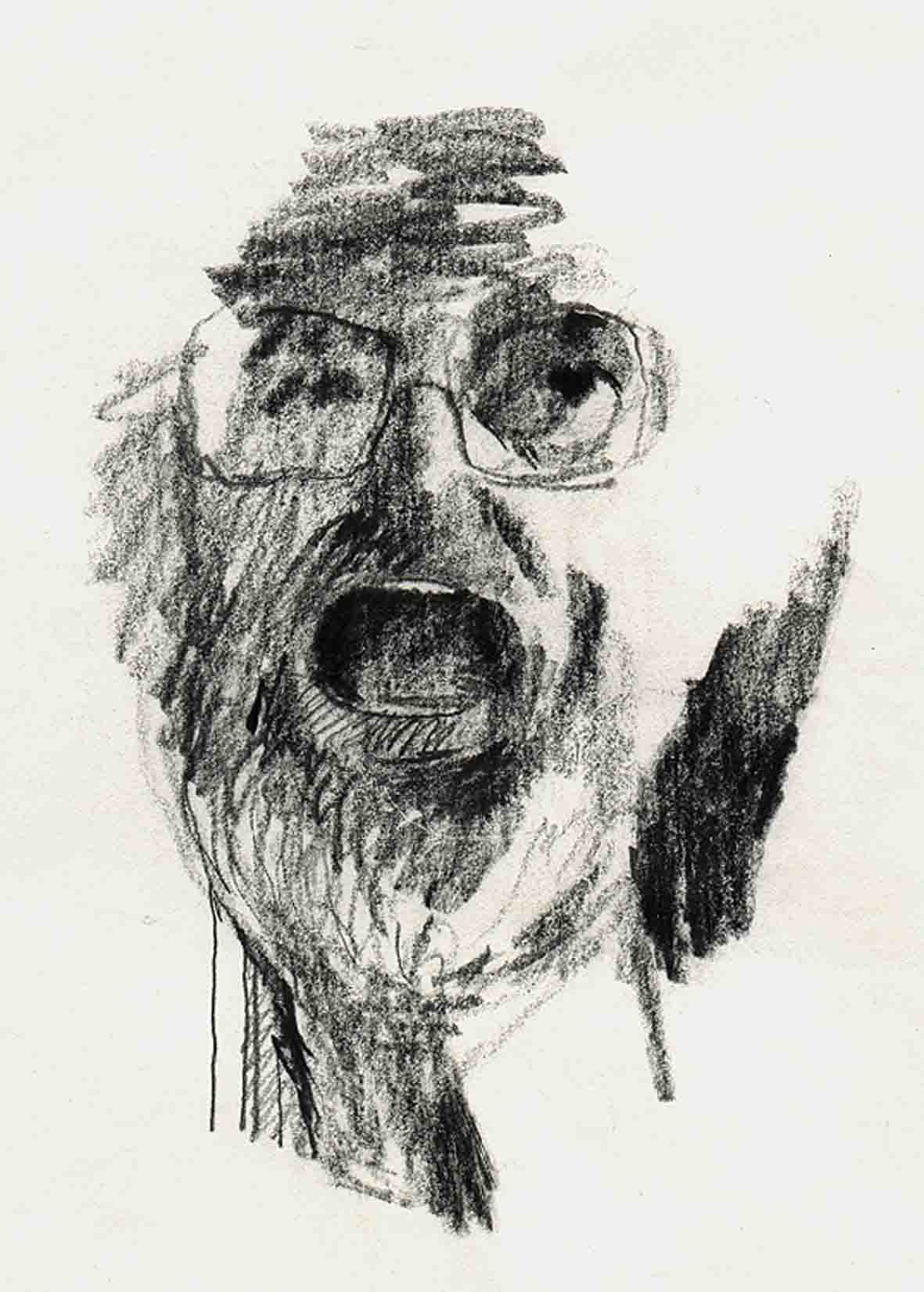
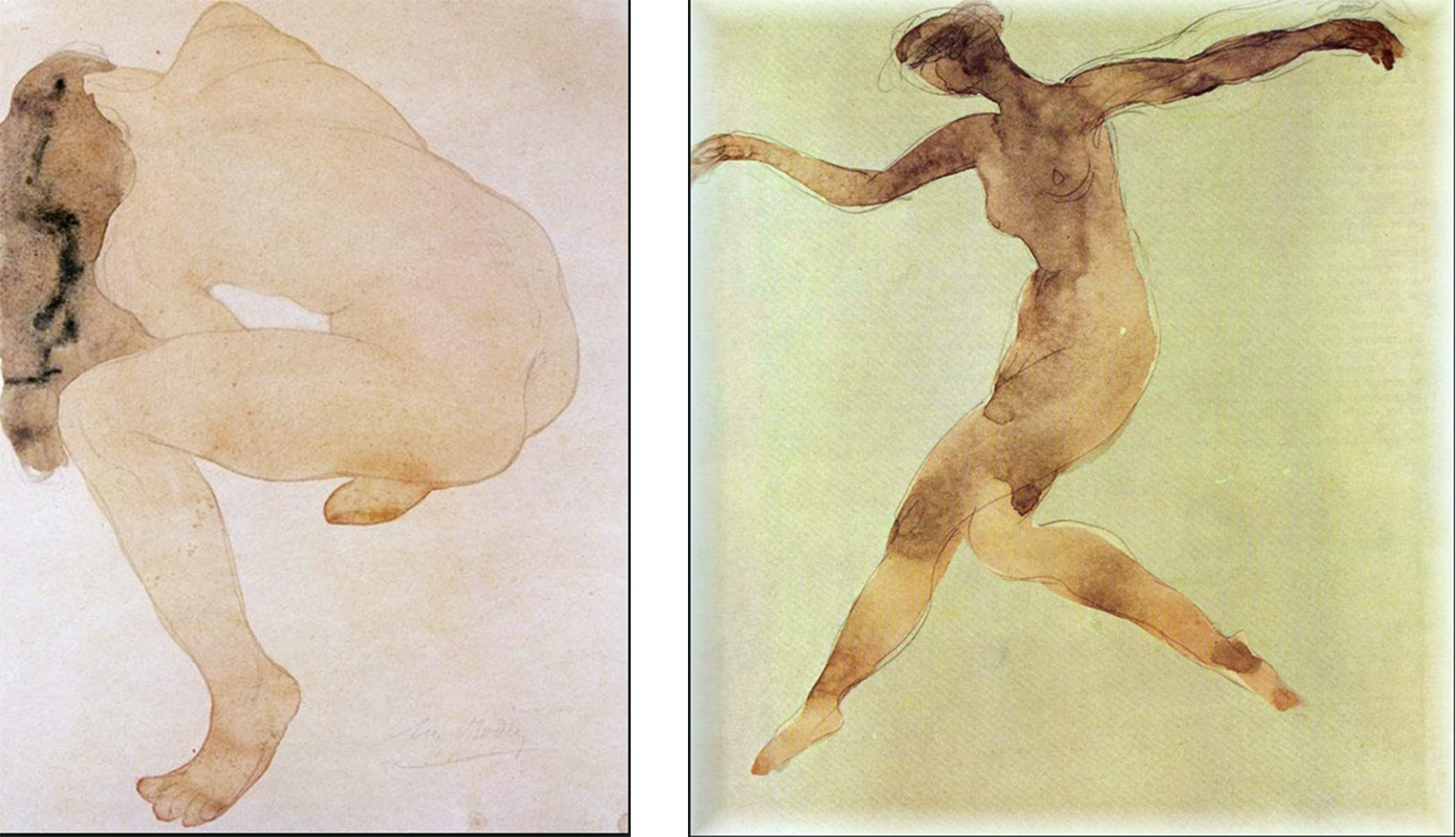
A drawing by Auguste Rodin, one of two artists who set me on the way to scientific research
GENERAL INTRODUCTION.
This volume differs in fundamental respects from earlier books on the same subjects. It offers new and practical guidance on drawing-from-observation. It does so whether the artist is seeking:
Greater accuracy.
More expressive power.
Ways of speeding up without losing control.
Its starting point is an analysis of widely used artistic practices and teaching methods. The next step is to explain not only why these have both proved to be of lasting value but also why, as they are currently taught, they have significant limitations.
A main source of evidence for the proposals elaborated in the following pages is research, done by myself and colleagues at the University of Stirling in Scotland, into how artists use their eyes when drawing or painting. This forced me to a number of conclusions that differ fundamentally from those provided by other authors, including those promoted by Betty Edwards in her extremely popular book, “Drawing on the Right Side of the Brain”.
A similarity between Betty Edwards and myself is that both of us link our main explanations to contemporary science, with a special focus on neurophysiology. The difference is that the conclusions to which we come are radically different. While she relies heavily on a false theory of brain function, my arguments are are wider ranging, more up to date and demonstrably more relevant to drawing practice. As a result, I am able to offer a great deal of new and reassuring information on human visual capacities, clarify the nature of the obstacles facing all who engage in drawing from observation and indicate effective ways of circumventing them.
During my 30 years teaching at the Painting School of Montmiral, I have had the opportunity of testing the research-based ideas on hundreds of students of all levels of attainment and a wide variety of aspirations. Although the outcome is clear and encouraging, a word of warning is appropriate. Both experience and theory make it clear that, while early progress will almost always be rapid, both for beginners and experienced artists, there is no escaping the fact that, as with all skills, the highest levels of attainment require a longer term commitment.
Experience and theory also show why early difficulties seem more daunting to some people than for others. Should this turn out to be your case, there is no need to be discouraged. No matter what your starting level, you can have confidence that, if you have the motivation to persevere, the new ways of looking and doing that I advocate will help you to far exceed your expectations.
.
THE SCIENTIFIC PERSPECTIVE
.
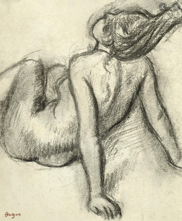
A drawing by Edgar Degas, the other of the two artist who set me on the way to scientific research.
.
My experience as a teacher makes clear that everyone has difficulties with the accurate depiction of the outlines of objects. My research at the University of Stirling helps us understand why. It also sets us on the way to achieving the combination of accuracy, speed and expressive power mentioned above.le of
As the science upon which much of my teaching depends will be unfamiliar to readers, a few words on two key ideas are appropriate. These centre on the subjects of “the variability of appearances” and “recognition”.
Variability
A useful preparation for understanding the nature of the problem with which variability confronts us, is the realisation that no two objects or parts of objects ever present the eyes with the same outline, even ones that are classified as the same object-type. Indeed, because appearances are altered by every change in viewing angle and/or viewing distance, even the same object (unless it is a sphere) will never be identical in shape unless viewed from exactly the same position. Each set of relationships, whether between different sections of contour or regions colour will always be unique.
This fundamental truth of visual perception brings us to an extremely important implication of this unvarying rule of variability and the consequent uniqueness of all perceived objects. It is that, since, by definition, recognition depends on seeing something as being the same on different occasions, the precise characteristics of the contours artists seek to represent can only have a supplementary role in the processes that enable it. Accordingly recognition must regularly involve overlooking the details of shape in favour of more general information. As we shall see in the following pages, the extent of overlooking can be huge.
.
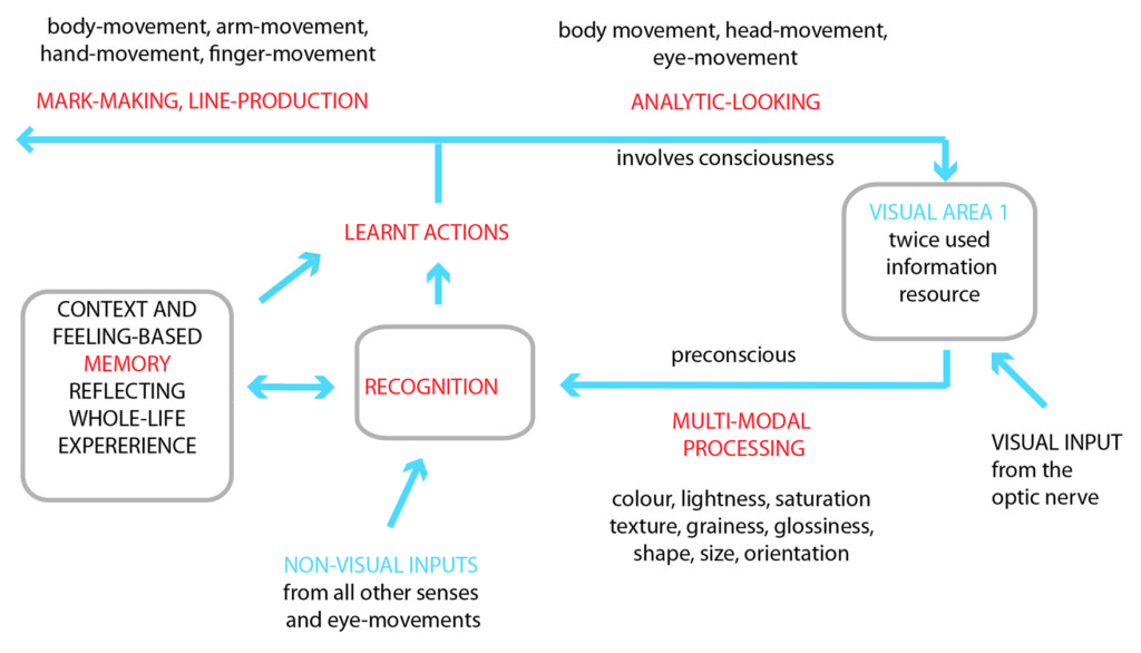
Figure 1: A diagram of the working principles of the analytic looking cycle
.
Recognition
Most people feel that they experience “recognition” as a conscious activity. But they are wrong to do so. As illustrated in Figure 1 (the details of which will be explained in due course), this key process in sensory perception always takes place before conscious awareness is achieved. The reason is that the function of recognition is not to produce an image of an object, but rather to access the knowledge required for activating instructions as to how to react to it.
.
As the diagram illustrates, the the knowledge accessed is always in the form of action instructions. These may be concerned with guiding arm, leg or other body movement or they may direct the movements of eye, head or body that enable us to target aspects of appearances that require special attention. It is only at this analytic-looking stage that consciousness has a role in visual perception.
.
But how does the eye/brain know where to target attention? It may help when seeking an answer to this question to remember that analytic-looking skills, like all other skills, are developed for specific purposes. Some skills, such as the ones learnt when very young, create platforms for more advanced ones. Anybody who sets themselves to learn a totally new skill has no option but to start with existing skills. All of these will be a compound of basic skills learnt as an infant, such as those required for grasping objects or for guiding the direction of crawling, and more advanced ones that have been developed later, such as those required for washing up, for using a computer or for any kind of sport.
.
This being the case, it follows that, if we wish to acquire complex visually mediated skills, we will have to learn the action instructions necessary for guiding appropriate ways of looking. Accordingly, although people learning to draw for the first time might have had experiences relating to other tasks that have allowed them to develop skills that could contribute the acquisition of drawing skills, they will never be enough. No matter how near the fit, they can only be of limited use unless appropriate ways of building upon them are developed.
.
If advanced artists assume that all this has no relevance to them, they should think again. The handicap of being saddled with old knowledge when facing new situations does not only apply to learning skills in hitherto untried domains of activity. It also applies to developing any skill at all beyond its present stage, no matter how well honed that may be. When Edgar Degas, one of the most skilled drawers in history, asserted, “I must impress on myself that I know nothing at all, for it is the only way to make progress”, he was making the claim that, no matter what the subject matter, fresh ways of looking will always be required. In view of the unvarying variability of appearances, there is no alternative but to agree with him.
.
A more familiar and general way of expressing the above conclusions is that learning a new visually mediated task requires leaving aside bad, old habits in favour of adopting good, new ones. This book provides comprehensive information concerning how this can be done in the domain of drawing from observation
.
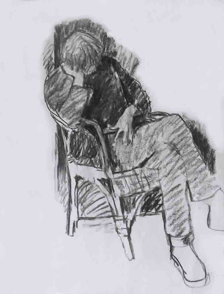
My son Thomas at a difficult moment in his life, a drawing that owed a great deal to my scientific research.
Below are links to chapters from my volumes on drawing:
This Post should be of interest to anyone wanting to get the best out of “Drawing on Both Sides of the Brain”. It describes the experiments that I did when I was a Senior Research Fellow at the University of Stirling, researching drawing skills. The official form these took related to issues of interest to “developmental psychologists” and “psychologists of visual perception”. However, my personal overriding interest was in neither of these fields of study. Rather it was in issues that had arisen in the 1960s, when I was teaching “figure drawing and painting” to evening class students at Isleworth Polytechnic. In those days, we relied heavily on the use of “negative shapes” (looking at the contours of spaces between objects rather than at the contours of the objects themselves), “contour drawing” (drawing around the outlines of the model without looking at the emerging drawing, “as if tracing them”) and “schema” (the idea that when students overlook aspects of appearances, they represent them in their drawings by referring to schematic knowledge of the object-type stored in their memories). All these methods of helping my students worked to some extent and were part of the reason why they clearly approved of my teaching. However, I was far from satisfied, for my experience in the classroom had eventually made it clear that there are serious shortcomings in all three of them. Although my efforts to find ways of improving matters met with some success, I was left with a permanent, rather hollow sense of not being able to help students as much as I would have liked to. There were just too many unanswered questions. At the time, it never occurred to me that, one day, I would be in a position to do the research that would provide answers, not only to all of the ones I had identified, but also to many more.
Although the reason that I accepted the offer to do research at the University of Stirling was the opportunity it provided to look for answers to my questions, I was far from expecting the spectacular outcomes it was to produce.
Also, although I knew that I would have the help of Dr Bill Phillips, a world authority on “short-term visual memory”, I had no idea of the galaxy of talent that would find interest in what I was doing. Or that such a high proportion of them would make something for themselves out of my initiative. I cannot start to imagine how I could have got on without their help.
During the twelve years I worked among scientists at the University of Stirling in Scotland, a transformation took place in my understanding of just about everything to do with the role of the eye and the brain in the organisation of the the main perceptual and motor skills used in the making of drawings and paintings. PART 2 of my book “What Scientists can Learn from Artists” tells of experiments done by myself, colleagues and other scientists that made especially significant contributions to this exciting development.
Chapter 7, (accessed by clicking on link below) offers an autobiographical introduction the contents of PART 2 that gives a flavour of what I was up to in those years. A theme that runs through its pages is that the transformative learning was a two way process, offering benefits to all concerned. Time revealed many unexpected advantages in my being a combination of an experienced artist/teacher and a naive beginner in all the scientific disciplines in which I was to participate. My new colleagues found themselves faced with a drip feed of questions coming from unfamiliar perspectives that were to prove their value as catalysts capable of stimulating new ideas for a surprising number of highly expert scientists, working in a variety of disciplines. In return, their often participatory responses enabled me to put together the body of ideas that underpin the originality of my books, my teaching and, to an important extent, my work as an artist.
Over the centuries, at least since the Italian Renaissance, artists have sought to represent three dimensional objects and scenes on two dimensional surfaces. By implication, this required them to create an eye-deceiving third dimension (‘trompe-l’œil‘).
To achieve their objective, they and their successors: (a) mastered the laws of ‘linear perspective’, (b) delved deeply into the subject of‘anatomy’, (c) explored the form-making properties of ‘gradation’, (d) recognised the importance of‘overlap’, (e) provided explanations for the phenomenon of ‘aerial perspective’, (f) explored whole-field lightness relations (‘chiaroscuro’) and (g) demonstrated the value of existing knowledge of the form of objects and the layout of scenes in influencing how viewers would perceive them (‘cognitive cues‘). In other words, over the centuries the artists have pioneered our understanding of just about everything that psychologists of perception needs to know about illusory pictorial space.
However, there was one big absence and it is this that dominates the discussion of illusory pictorial space in two of my books. In“Painting with Light and Colour” the subject is approached from the perspective of artistic practice. In “What Scientists can Learn from Artists”, which contains the chapter that can be obtained by clicking on the link below, its treatment has both scientists and artists in mind.
The chapter also touches briefly on the issue of what they saw as the immorality of deceiving the eye, which was to have both a decisive and long lasting effect on the evolution of painting from the Impressionists until the late 1960s at least. More on this in my other books.
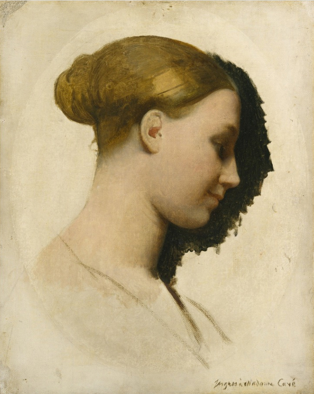
Elizabeth Cavé and her great friend Eugene Delacroix
A portrait of Elizabeth Cavé by Jean-Auguste-Dominique Ingres
.
In an earlier Post I told of the teaching of Horace Lecoq Boisbaudranand its widespread influence. In it I did not mention another important figure who also developed a method for training the memory. Her name was Elizabeth Cavé. Like Lecoq Boisbaudran her method eventually found favour with the establishment and was to some extent introduced into the national curriculum. She was also, over some 30 years, a personal friend and confidant, often described as “mistress”, of Eugène Delacroix, who was something of a Father figure to the young Impressionists, including:
Edgar Degas who, as a young man, went, with his friend Gustave Moreau (teacher of Matisse), to visit Delacroix in his studio. When they arrived, despite having been warned to expect a testy old cumudgeon, they were given a warm and generous welcome. In contrast they described his intellect “icy”, maybe a reaction to the scientific bent that led him to be an early champion of the ideas of Michel-Eugène Chevreul, the chemist who first enunciated the law of ‘simultaneous colour contrast’
Probably all the other young ‘Impressionists’ for whom it is said that a ‘must see’ experience was the application of Chevreul’s law to be found in the frescoes painted by Delacroix towards his life (between 1857 and 1861), in the L’Eglise St. Sulpice, Paris.
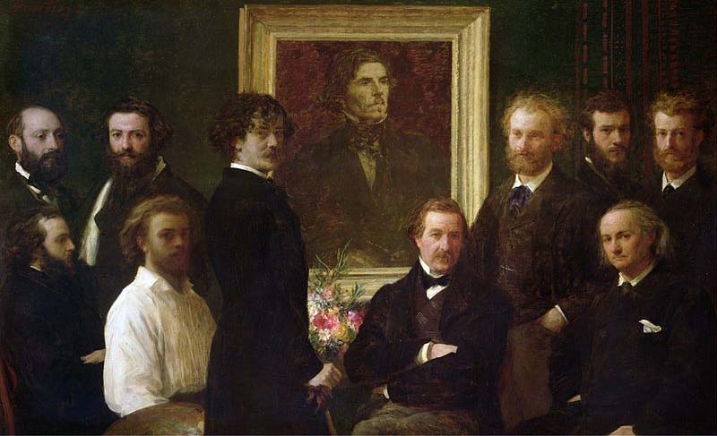
Homage to Eugene Delacroix by Henri Fintin Latour, including fellow students of Horace Lecoq Boisbaudran
.
My letter to LRB
With all this information in my head, you can imagine how my interest perked up when I came across a quotation from Delacroix in an article by T.J.Clark, published in the London Review of Books in October 2019. In this Delacroix tells us that he experienced a paradigm shift in his approach to painting, from being “hounded by a love of exactitude” to employing his memory to sift out “what is striking and poetic”. He also states that this transformation occurred as a spin-off from his “African voyage” in 1832.
On reading this endorsement of the virtues of channelling experience through memory, I was immediately reminded of the philosophy of Lecoq Boisbaudran. From there my mind jumped to Elizabeth Cavé and to wondering whether Delacroix’s change of direction had any link to her teaching method. When I discovered that their liaison had started in earnest in 1832, I could not resist the thought that either she had influenced Delacroix or, perhaps more likely, vice versa. If so, there seemed to be quite a lot to add to what T.J.Clark had to say. Below is what I wrote.
The letter
T.J.Clark (LRB 10-10-2019) quotes Eugene Delacroix as dating a change from being hounded by a love of exactitude to making work based on “recalling” what is striking and poetic. He asserted that it came after his “African voyage”, which mean after his return from Morocco in 1832. When I read this I immediately realised that this date roughly coincided with the beginning of his relationship with Elizabeth Cavé in 1833. Whether or not her ideas were influenced by Delacroix or visa versa , she published ‘Le dessin sans maître’, which received a laudatory review from her, by now long standing, friend (in the ‘Revue de deux Mondes’ of September 1850). In it, she explained her method of teaching drawing which, according to her, she had been practising since 1847. Key to this was training of the memory. Two years earlier, in 1848, Horace Lecoq Boisbaudran published a compilation of two texts, ‘L’Éducation de la mémoire pittoresque’ and ‘la formation de l’artiste’, in which he explained his method, also based on training the memory. His connection with Delacroix can be inferred from the personages in the 1864 painting ‘Homage à Delacroix’ by his pupil Henri Fantin-Latour, in which we see others two students of Lecoq Boisbaudran, Alphonse Legros and Felix Bracquemond. Also in the painting is James MacNeil Whistler who is know to have learnt Lecoq Boisbaudran’s method from Alphonse Legros and who famously demonstrated it to a doubter. He did this, first, by looking at an unfamiliar landscape and, then, turning his back on it and painting it from memory (for more about the influence of Lecoq Boisbaudran and its plausible ramifications see https://www.painting-school.com/horace-lecoq-boisbaudran-influence
So how does all this relate to the quotation from Delacroix? The clue lies in his youthful “love of exactitude” being replaced by a more mature approach based on “recalling what was striking and poetic.” What Lecoq Boisbaudran would surely have argued is that the great man’s earlier obsession with ‘accuracy’ prepared him for his later personalised use of memory with all its benefits, for this was exactly what his teaching method (and presumably that of Elizabeth Cave) aimed at achieving. The main differences, he could argue, lay in the shortness of the time in which his students were expected to make their transition and the methodical progression from simple to complicated that characterised the learning exercises that made it possible. Surely, both Delacroix and Lecoq Boisbaudran would have concurred with Edgar Degas, significantly a great friend of Alphonse Legros, when he said, “It is always very well to copy what you see, but much better to draw what only the memory sees. Then you get a transformation, in which imagination works hand in hand with the memory and you reproduce only what has particularly struck you.”
Rodin acknowledged the importance to him of Horace Lecoq Boisbaudran’s memory training
.
As well as the personalisation of artistic output, the method had huge advantages in terms of rapidity of information pick up. The famous late watercolours (‘Cambodian dancers’, etc) of Rodin, another student and a lifelong admirer of Lecoq Boisbaudran and his teaching, illustrate both these advantages. Likewise the post-African paintings and drawings of Delacroix. Also, I find it hard to believe that there is not some connection here with Delacroix’s famous assertion that “any artists worth his salt should be able to draw a man that has been thrown out of a sixth floor window before he hits the ground.”
PS. For your interest, I was teaching on much the same principles as Lecoq Boisbaudran for at leat 25 years before I learnt of his existence. These I derived from research done at the University of Stirling in the early 1980s <https://www.painting-school.com/the-course/the-course-director/>.
Back in November 2019 I started posting chapters from “What Scientists can Learn from Artists”, the book which presents the research and the science based ideas that that lie behind much of the contents of my three other books: “Drawing on Both Sides of the Brain”, “Painting with Light and Colour” and ” Fresh Perspectives on Creativity”. I set the ball rolling with with six of the chapters that describe research findings which were in large part responsible for:
Overturning almost all the preconceptions I had about the nature of visual perception.
Providing the building blocks required for replacing them with the coherent picture presented in these books.
When I first came across the material I have summarised in these chapters, their cumulative effect on me was more than just fascinating. It amounted to a paradigm shift. My hope is that reading them will perform the same service for others, particularly when buttressed by the contents of earlier and later chapters.
Below is an extract from the “Preface” to “What Scientists can Learn from Artists”, which summarises its structure. The chapters so far published in my Posts come from PART 2. In the next weeks I will be posting chapters from PART 1 and in the coming months chapters from PART 3. I will wait to see the level of interest before I go on to PART 4, which I have reason to believe will be is considerably more demanding on non scientists.
Also below are links to already published Posts.
The structure of the book
Because the context of the knowledge of scientists and artists is so different, it seems prudent to provide a certain amount of background material which, while likely to be familiar to readers from one side of the arts/science divide, may well not be to those from the other. Thus PART 1 contains a number of general ideas both artistic and scientific many of which may well be familiar to one community and not the other, and PART 3 provides a basic introduction for non scientists to the nature of visual perception that emphasises the variety of visual systems involved in different aspects of visual processing. The function of PART 2 is to describe the main experiments used to underpin the theoretical speculations which lead to the general model of perceptual and cognitive processes that provides the subject matter for PART 4. Throughout the attempt has been made to present ideas in such a way that they will be understood by both groups.
Chapters from my book “What Scientists can Learn from Artists”
These deal with subjects that feature in the other volumes in greater depth.
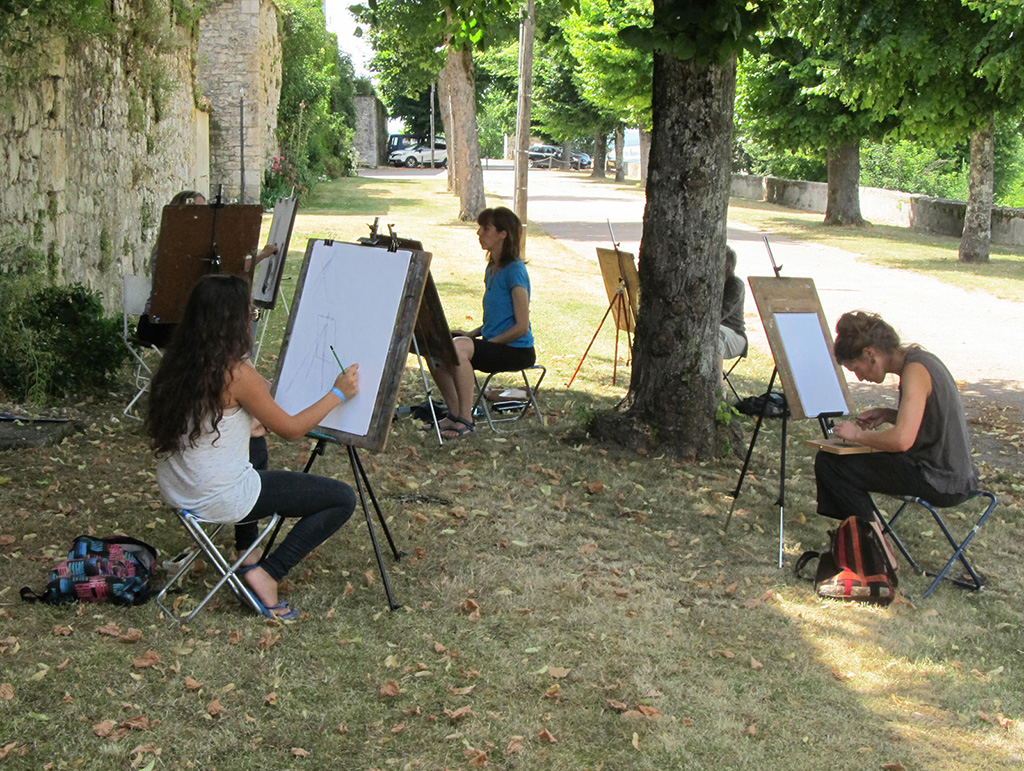
There are still places vacant for the 2020 sessions of the Painting School of Montmiral. Here a three photos to remind you of our idyllic setting and the seriousness of the teaching