The main body of my two part volume on “Drawing” is now complete. What is now required is a bridge to the volumes on “Painting”. This is provided by returning to the subject of “accuracy” as a catalyst to “creativity“.
It is common to find artists and teachers that scorn accuracy. These point out point out that all truly accurate drawings would be the same, no matter which artist produced them and that this would be the antithesis of creativity. But nowhere in any of my books is this use of accuracy recommended. What they do recommend is its use as a tool for both ‘looking‘ and ‘feeling‘ in new ways.
The efficacy of the ‘looking‘ part is easier to explain, for the search for accuracy gives us every chance of expanding awareness. This must be the case for it requires us to adopt strategies that reveal aspects of appearance that we normally overlook.
In “Drawing with Feeling“, the first BOOK in this volume, the focus is on two inextricably linked approaches to seeking accuracy:
The analysis of relativities of size, length, orientation, curvature, position on page, etc..
The use of comparative looking to as a means of avoiding the many traps that the processes of visual perception have laid in our way.
Due to the fallibility of human judgement, neither of these can actually achieve total accuracy. But that is beside the point. It does not matter how inaccurate the result, the process of seeking it will have revealed new aspects of appearances and provide opportunities for finding out more about ourselves.
In “Drawing with knowledge“, the second BOOK in this volume, the emphasis is on using linear perspective and anatomy, not as rules for construction images, but as ways of guiding looking strategies. In other words as tools that encourage new awarenesses.
In the next two books, “Painting with Light” and “Painting with Colour“, the emphasis is on how knowledge of light and colour-related phenomenon can help develop our sensitivity to colour in nature and extend and enrich our domains of exploration.
The idea that the accuracy aspiration might provide a bridge to the awakening of new feelings is harder to for some people to entertain. However it necessarily constitutes a voyage of discovery and, accordingly, provides a way of enriching the memory stores that link us to the feelings of a lifetime.
This chapter has a large number of quotations from artists, but no images accompanying them. I am therefore taking this opportunity to rectify this omission and add a few more quotations.
The first three come from artists that were working well before the arrival of the “Modernist Painters”, but who were significant precursors.
The emphasis is on ‘feeling’ and ‘memory’ and the implication that these is a connection between the two.
Jean-Baptiste Siméon Chardin, “Did you say that one paints with colours? Not at all, one merely uses colours. One paints with feeling.”
Edouard Manet, seeking the ‘effortless’ look, is known to have submitted at least one of his models to more than forty sittings. His hope seems to have been to complete his painting in one go, but he is said to have only once succeeded. Except on that one occasion, every sitting consisted of a variably long sequence of “failures”, each of which had to be scraped down ready for another try. Evidently, as one sitting succeeded another, the artist could not but help become more and more familiar with the pertinent aspects of his sitter’s appearance and this familiarity would certainly have influenced the looking strategies he used subsequently.
Claude Monet, “I want to succeed in expressing what I feel”and “No one is an artist unless he carries his picture in his head before painting it, and is sure of his method and his composition” and “Impressionism is nothing but immediate sensation. All the great painters were more or less Impressionists”
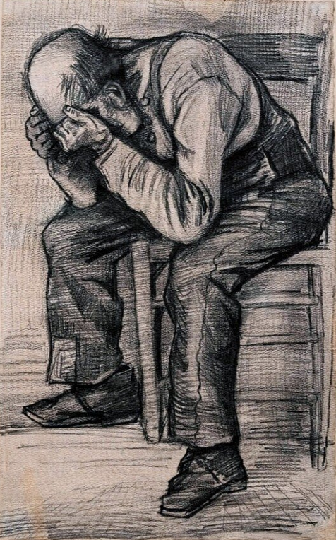
Vincent van Gogh: fellow students in the Antwerp Academy were astonished to see him completing fifteen studies of the model while they were still labouring away on their first. In the Dutch artist’s view, “one drawing study on its own does not give full satisfaction, but many of them, even if they come from different sources, mutually complete one another.”He also said, “I would like to be able to draw more freely and with more exaggeration.”
Paul Gauguin “My simple object, which I take from daily life or nature, is merely a pretext, which helps me by means of a definite arrangement of lines and colours to create symphonies or harmonies”. Also, he is said to have remarked that he closed his eyes in order to ‘see’.
Paul Cézanne was far from advocating cold objectivity when he made the statement, “The painter paints, whether it be an apple or a face. Painting is only a pretext for play of lines and colours, nothing more”. According to him “painting from nature is not copying the object, it is realising one’s sensations.” His advice was to “look at the model and feel very exactly… and express oneself distinctly and with force.”
Pierre Bonnard, “Drawing is sensation. You can take any liberty with line, with form, with proportions, with colours, in order that the feeling is intelligible”.
Edgar Degas: “Drawing is not shapes, it is one’s feelings.” and “It is all very well to copy what you see; it is much better to draw what you only see in memory. There is a transformation during which the imagination works in conjunction with the memory. You only put down what made an impression on you, that is to say the essential. Then your memory and your invention are freed from the dominating influence of nature.
After eighty (some say ninety) sittings, Pablo Picasso felt that he had failed to complete his portrait of Gertrude Stein. However, without realising it, during his struggles, he had got to know the features of the sitter’s face so well that, after a period of reflection and gestation, he was able to produce his rendering of it from memory.
Henri Matisse, “Exactitude is not the truth” and “I cannot copy nature in a servile way; I am forced to interpret it and submit to the spirit of the picture” and “I might be satisfied with a work done in one sitting, but I would soon tire of it: therefore, I prefer to rework it so that, later, I may recognise it as representative of my state of mind”
Chapter 21 of my BOOK “Drawing with Knowledge“, entitled “Deformations–muscles, fat and clothes“, is not finished. Many of the large number of images required for illustrating the issues discussed in the text have not been made. Producing them will require several photo sessions with appropriate models. In the past, I have been putting off confronting the complications this will entail, until the book is accepted for publication. Now I have decided to make use of this website edition of the book, to present a preliminary version of the chapter in its current uncompleted form. I am doing so because, even as it stands, the text is important as it goes beyond what you are likely to find in other writings on anatomy.
As its title indicates Chapter 21 discuses issues relating to surface appearances in ways that are routinely omitted in other texts on anatomy. These occur for a number of reasons and the way they influence appearances can be due to a number of causes:
Differences due to the fact of individual variations in properties of muscles
Differences due to the fact of individual variations in characteristics of subcutaneous fat
Pressures on muscles and fat between different body parts
Pressures on muscles and fat between body parts and external objects
Effects of gravity on muscles and fat.
Chapter 21 also discusses issues arising when a model is wearing clothes. In particular,
Identifying regions both where clothes touch the body and where they follow its form closely
Establishing where clothes leave space between them and the body
Discovering how the characteristics of materials and the forces of gravity effect appearances.
Clicking on the link below will access chapter 21 in its current form:
When I have a more comprehensive collection of relevant images, I will be inserting a number of them below on this web page. Meanwhile, I thought you might enjoy the three images I have chosen and the questions that go with them.
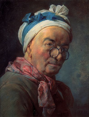
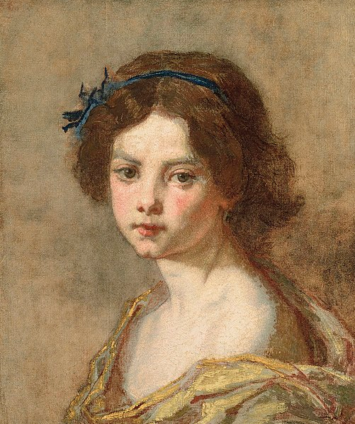
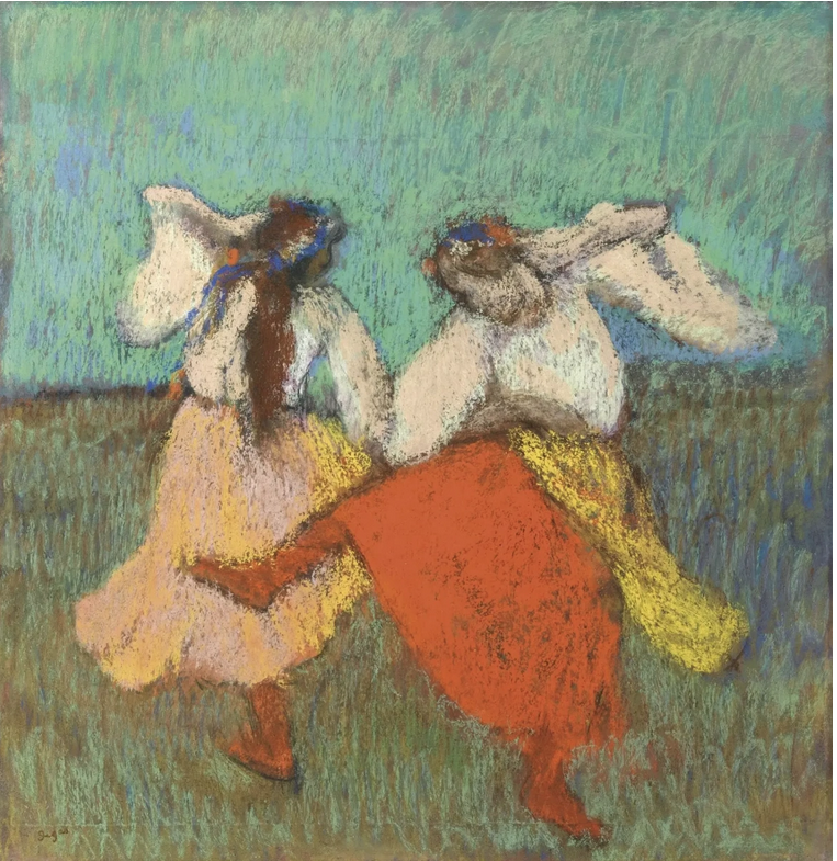
The first is a symphony of mark-making by Berthe Morisot
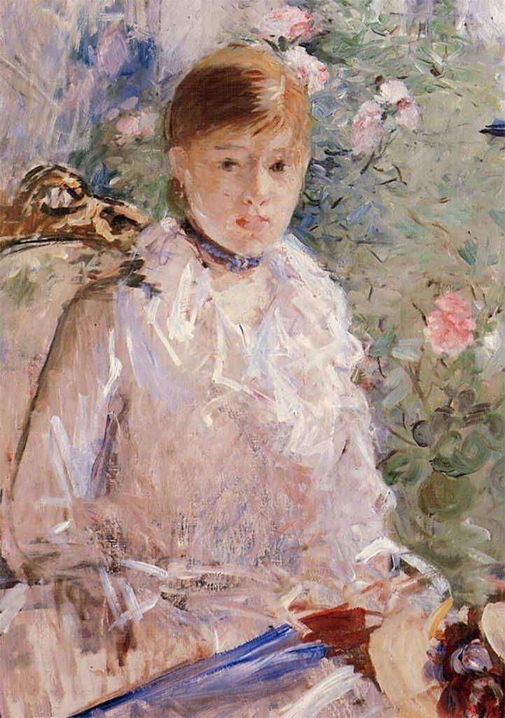
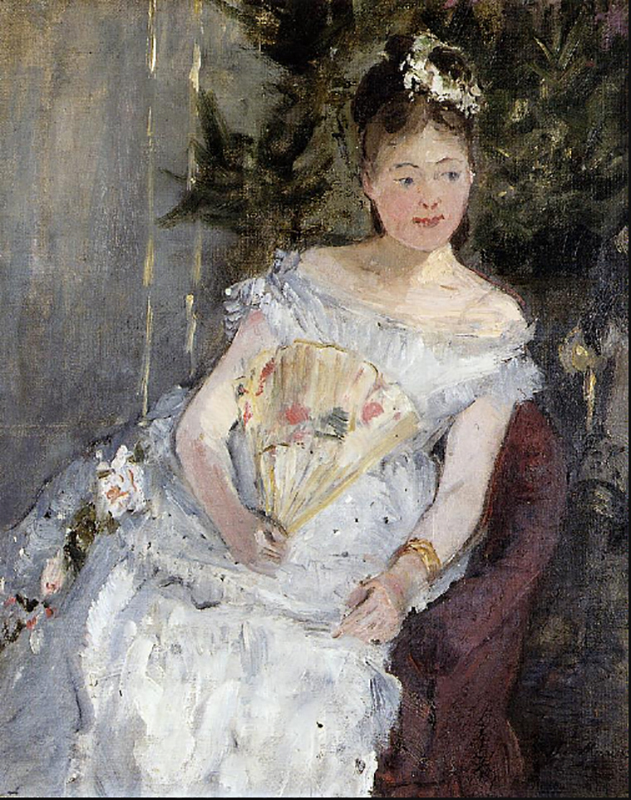
The second is by the same artist. It illustrates how knowledge of anatomy can underpin a masterly and sensitive depiction of human body parts.
The third shows one of my own paintings, in which my feelings for colour dynamics dominated, to the exclusion of any concern about anatomy. The question is asked whether this is a good thing or a bad thing.
Do we need knowledge of muscles or fat?
Here are two paintings by Berthe Morisot that answer this question differently: The first painting with a tentative “no“. The second of them with a resounding “yes“. It had to be, in view of the underlying knowledge of anatomy enshrined in the quality of observation evident in the depiction of the model’s arms. Quite up to the exemplary standard of Edgar Degas.
Berthe Morisot : portrait of young girl
Berthe Morisot : Portrait of Margaret Carr
Can other priorities override need for accuracy?
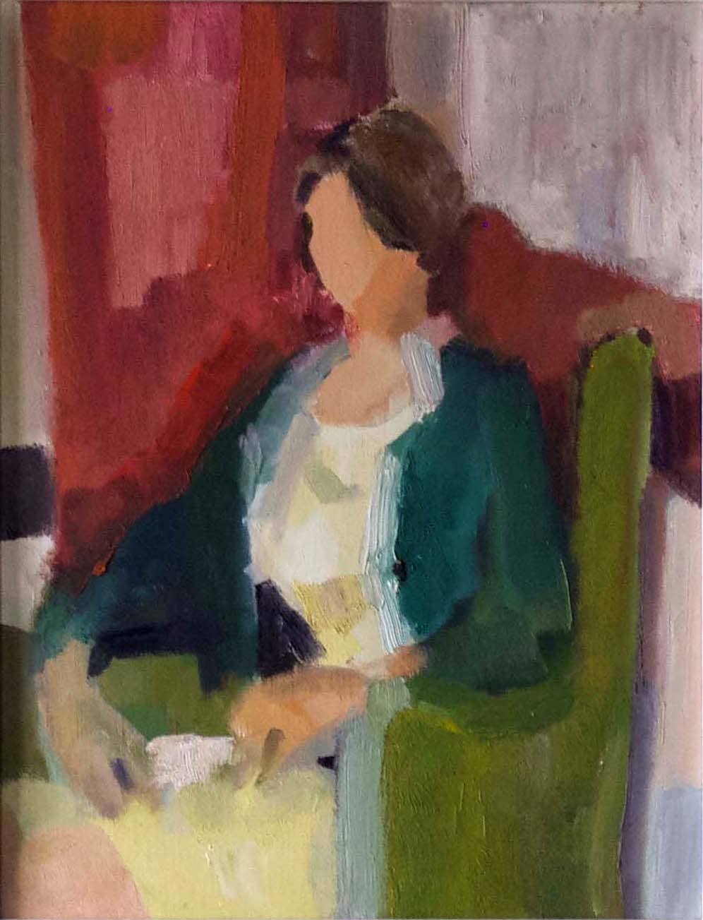
In the painting below, done in 1965, in the class of Professor Bohusz-Szyszko, I was enjoying testing out my teacher’s assertion that “all the best paintings are based on colour“. As is clearly evident, anatomy took a back seat. The question is “Did this have a good or bad effect on the result?” My answer is indicated by the outcome, which was sufficiently was positive to encourage me to continue with making paintings in the same spirit.
Ann seated. Colour-dynamics were the exclusive motivation in my head.
Three final questions
Looking back at the top of the two Berthe Morisot paintings, do you think her priority was accuracy or expressing her feelings through the extraordinary range of mark-making dynamics she achieved, stretching from extreme delicacy to panache?
Do you think that Professor Bohusz-Szyszko should have added “the feelings” to his claim that “all good painting is based on colour“? For myself, I might have found his dogmatic assertion easier to accept unreservedly, if it had been extended to be, “All good painting is based on both colour and feeling, as expressed through the dynamics of the combination of colour and mark-making“? Of course, the definition of “mark-making” would have to include the deliberate suppression of marks.
What do you think is left out of the above?
Some quotations emphasising the centrality of the feelings:
Jean-Baptiste Siméon Chardin: “Did you say that one paints with colours? Not at all, one merely uses colours. One paints with feeling”.
John Constable: “Painting is just another word for feeling”.
Jean-Baptise Camille Corot (teacher of Berthe Morisot): “Never lose the first impression that moved us“.
Claude Monet: “Impressionism is nothing but immediate sensation. All the great painters were more or less Impressionists”.
Paul Gauguin: “My simple object, which I take from daily life or nature, is merely a pretext. It helps me, by means of a definite arrangement of lines and colours, to create symphonies or harmonies with them”.
Paul Cézanne: “painting is classifying one’s sensations of colour.”
Pierre Bonnard: “you can take any liberty with line, with form, with proportions, with colours, in order that the feeling is intelligible”.
Henri Matisse: “Colours and lines are forces and the secret of creation lies in the play and balance of these forces”.
The eye is full of surprises. The biggest ones come from the structure of retina that is situated at the back of it. The purpose of this Post is to provide a link to images and explanatory captions that tell us more about this starting gate of visual processing. At first sight, much of what we find strikes us as bizarre. But, when we delve more deeply, we discover the considerable advantages of the way things actually are. It turns out that nothing would work nearly as well as it does, if things were arranged any differently. The images and their captions will go a long way towards explaining why.
In the process, they will help readers to get a better understanding of how the eye/brain combination makes practical use of the information contained in the ever-changing patterns of light coming into the eye.
The link to the diagrams
Click on the link below to access the images and captions referred to. They are extracted from ‘The Glossary‘ to the four volumes I am in the process of publishing on this website.
Upon leaving the retina, the neural signals travel in two directions. Some go up the optic nerve to the region of the neocortex known as ‘Visual Area 1′. Others take a completely different route that makes contact with the regions of the “Old Brain”. These play a central role in visual perception as we experience it. For example, they play their part in eye movements, spatial awareness, affective responses, multimodal processing, whole-field relations and much besides. Images and captions relating to both these routes will be posted later on this website, in a separate entry, entitled, “Visual Regions in the Brain”.
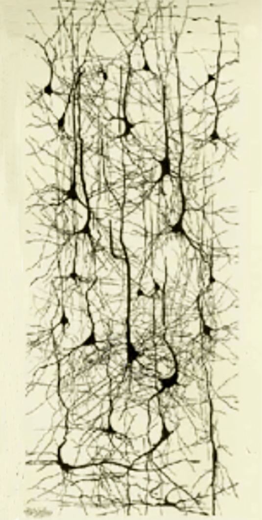
Images of blood vessels, neurons and and neural processes in the eye.
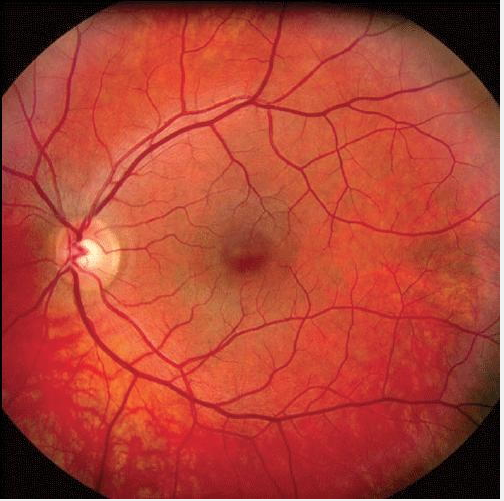
The human retina contains a very large number of neurons (cells) and a very much lager number of neural of processes providing links between them. It also features a dense network of blood vessels that supply blood to the neural processes. Together these three components make a significant barrier to the passage of any light that strikes the receptors. Until I learnt better, this light-blocking function did not seem to be of much of interest.
What changed my mind was the discovery that the light-sensitive cone and rod receptors that transform light-energy into neural signals, do not face towards the incoming light, but away from it. Consequently, the light coming into the eyes has to penetrate this light-impeding layer of neurons, neural processes and blood vessels, before it reaches the receptors. To add to my surprise, it turned out that the light-receiving end of the receptors is buried in a layer of dark matter. It was some time before I realised how these seemingly bizarre arrangements make possible visual perception as we know it.
The barrier confronting the light that enters the eye
It turns out that the barrier of neurons, neural processes and blood vessels compensates for the fact that the rod receptors are very much more sensitive to light than the cone receptors. The benefit of this state of affairs is that it enables a necessary degree of functional equality between the responses to the incoming light of the two different receptor-types. Needless to say, this equalling up would not take place, if the light striking the less sensitive cone receptors were to be subjected to the same impediments. This explains why the forces of evolution have created a gap in the neuron and blood vessel barrier in front of the region known as the fovea, exactly where the incoming light strikes the cone receptors.
Glare-blindness
If the equalling up process did not take place, the rod receptors would be bleached out whenever the incoming light was strong enough to activate the cone receptors. The result would be a massive degree of glare-blindness in daylight conditions.
Dire consequences
If they were effectively blind, the rod receptors would not be able to participate in daylight visual processing. As a consequence, the neural computations of whole-field relations could take place. One of the many aspects of visual processing that would rendered impossible would be the separation of reflect-light from body-colour. As a result there would be neither colour constancy, nor the use of the information residing in the reflected-light that has been separated out.
If this were so, pretty well all that I have written in my book “Painting with Light” would be nonsense.
Burying the receptors in dark matter
The burying of the light-sensitive receptor heads in the dark matter is easier to explain. It prevents the light from scattering from one receptor to the next and, consequently, reduces blurring.
Figure 1: Blood vessels blocking light from the ‘rod’ photosensitive receptors. The small darker disc is where the light sensitive ‘cone’ receptors are located. Notice that no blood vessels impede the passage of incoming light to these.
Figure 2: This image of a small section of a network of neural processes gives an inkling of an idea of the extent to which these these can block the incoming light. For reasons explained above, the blockage only applies to ‘rod’ photosensitive receptors. It does not apply to the ‘cone’ photosensitive receptors .
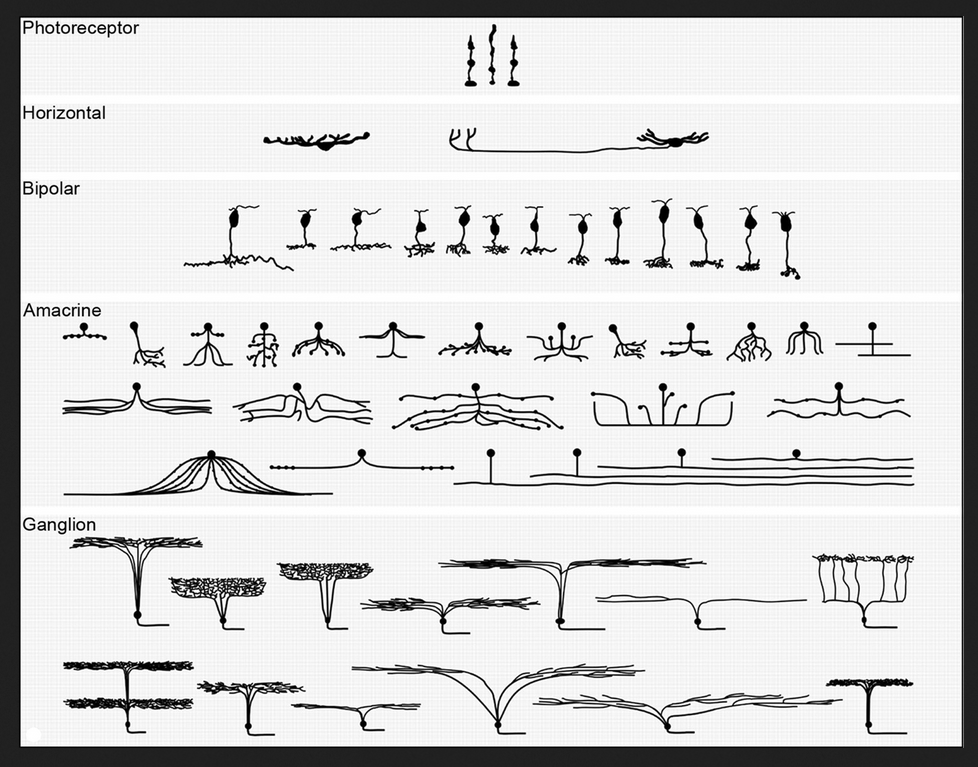
Figure 3: A diagram of cell-types in each of the five layers of the retina. The massive numbers of each of these contribute to the blocking of the light arriving at the ‘rod’ photosensitive receptors.
Some numbers and sizes
One estimate for the number of the light-sensitive receptor cells is in the region of 150 million. Although the precise number of neurons and neural processes in the retina is unknown, it is certainly in the hundreds of millions. All this packs into an astonishingly thin layer (less than 0.5 mm) whose extent can be compared to that of a 10p piece.
A reference
If you want a comprehensive account of the component parts and structure of the retina, you could consult the relevant pages of the website of the The National Library of Medicine. You will find them dizzyingly more complex than the grossly oversimplified information given either above or in the ‘Glossary‘ extract.
This POST provides a link to “Shading and surface form”, Chapter 27 of my book “Painting with Light and Colour”. It may surprise many that it comes in PART 2, which is dedicated to painting with colour. The reason is that the visual systems that are used to create colour consider blacks, whites and greys to be colours and, accordingly,they treat the blackness, greyness and whiteness of shadows, shading and highlights as colour.
Surface-solidity, spatial-separation and ambient-allumination
However, this fact of visual perception does not mean that the reflected-light does not provide information to other visual systems, working in parallel. In particular, the systems that tell us about surface-solidity, spatial-separation and ambient-illumination continue to perform their function. As explained in PART ONE of this volume, although they enable us to sense these properties, they never make them visible in the way body-colour is visible.
The problem of invisibity
The “invisibility” of these properties confronts artists trying to represent them with the seemingly insoluble problem of deceiving the eye/brain into “seeing” something that they cannot see. Luckily due to the research of Seurat, Cézanne, Bonnard, Marian Bohusz-Szyszko and others, a simple and, accordingly, practical resolution of this seeming paradox is available. Moreover, due to research undertaken by myself and colleagues, its efficacy can be explained in scientific terms (see many chapters in Book One of this volume and Chapters 13 and 14 of “What Scientists can Learn from Artists”)
The solution
The practical solution provided to me by Professor Bohusz-Szyszko is to ensure (a) that there should be no repetitions of colour in any part of the surface of paintings and (b) that all the paint that is actually visible to viewers of the painting should be made up of mixtures containing some proportion, however small, of complementary or near-complementary, pigment colours. In this conntext, it is important to emphasise that this solution should be kept in mind when painting shadows, shading and highlights.
This Post introduces Chapter 23 of my book “Painting with Light and Colour”. It is the second of three chapters that concentrate on “viewing conditions”. Because all three are concerned with issues arising from my own science-influenced researches, you are almost certain to find a lot that is new to you. To give you a bit of a foretaste of what to expect, I have included below a slightly edited a reprise of its “Introductory”. It follows the link to a .PDf version of the chapter.
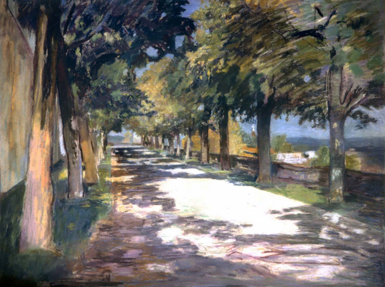
This chapter continues the story of how my interest in thin lines led to previously unknown, or little explored, ways in which viewing conditions can affect the pictorial dynamics of paintings. Sometimes the changes they bring about are dramatic. At others, they can be extremely subtle or even virtually invisible. Those that influnce the way we experience paintings can be well worth taking into account.
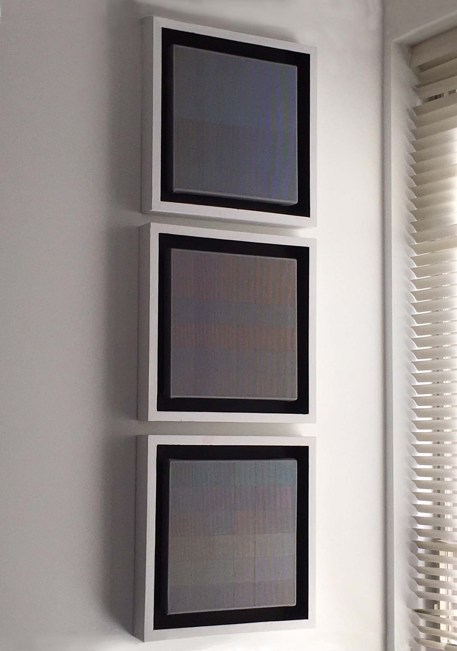
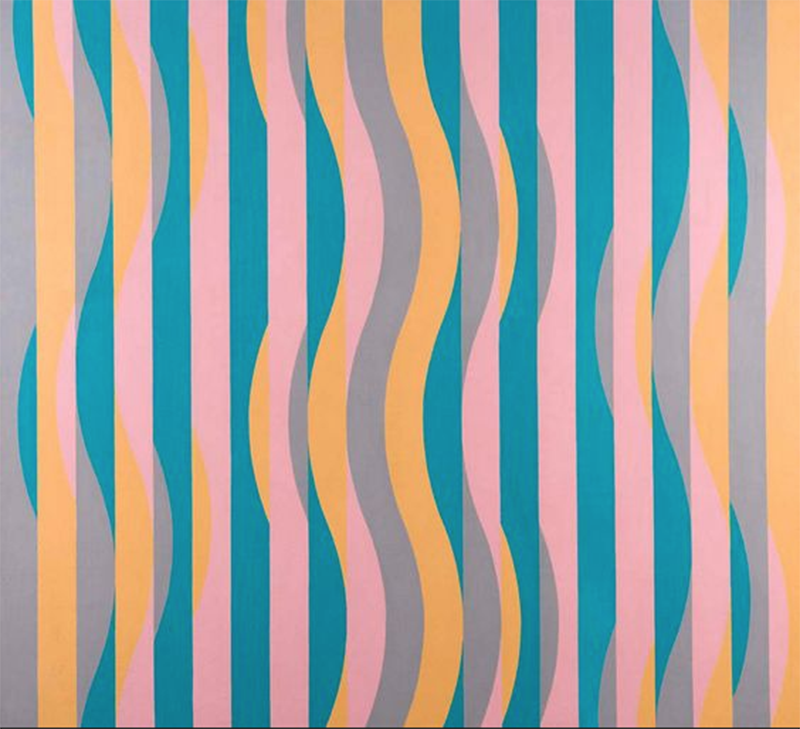
Three paintings that give viewing conditions a dynamic role
Three thin line paintings from the Stirling series. The bottom two are from the first project and the top one is from the second.
Other Chapters from BOOK 2 of “Painting with Colour and Light”
Google says that the “integrity of the picture plane” is a phrase coined by the influential art critic Clement Greenberg in his essay “Modernist Painting”. It concerns the issue as to whether the fact of creating an“illusory pictorial space” interferes with perceptions of the “objectness”of the actual picture surface. This was a question of primary importance to the “Early Modernists” from the late 1860s onwards. For them, as explained in Chapter 6 of my book “Fresh Perspectives on Creativity”, the fact of the possibility of being aware of the actual surface of paintings was one of the reasons for what they believed to be their inherent superiority relative to photographs. Their belief was that, since“deception is immoral”, painters must avoid it at all costs. Despite the difficult-to-comprehend nature of this evidently questionable argument, it stuck for about a century. Thus, in the 1960s, it was still a potent aspect of the teaching of my two mentors, Professor Bohusz Szyszko and Michael Kidner. The difference between the “Early Modernists” and Clement Greenberg was that the former (and Professor Bohusz-Szyszko) thought it possible to depict illusory pictorial space without destroying the integrity of the picture surface. In contrast, Clement Greenberg asserted the impossibility of any such thing, as didPiet Mondrian and a number of earlier painters, plus a whole list of later artists, including Michael Kidner and Ellsworth Kelly.
As those who have read “Painting with Light”, the first Book in this Two Book Volume (see contents list), will realise, the early Modernists and Professor Bohusz-Szyszko got it wrong. The use of unmixed repeated colours did not disrupt the picture-surface, but rather the illusory pictorial space. They do so because our eye/brains read them as being on the picture surface and, consequently, as jumping out in front of any illusory pictorial space. It is thus, the integrity of illusory pictorial space that is disrupted.
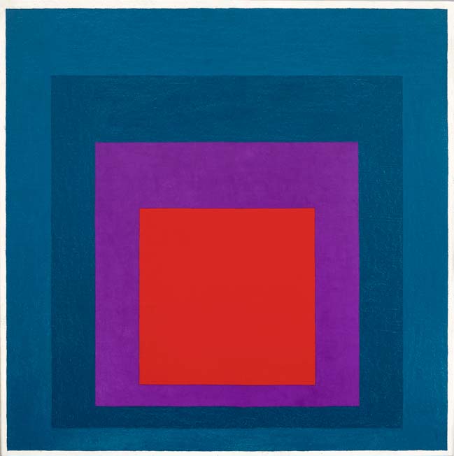
Two paintings that illustrate different meanings of the phrase “integrity of the picture suface”
Cézanne: one of the Fôret du chateau noir paintings
Ellsworth Kelly : Shaped painting on gallery wall – an experience of pure red
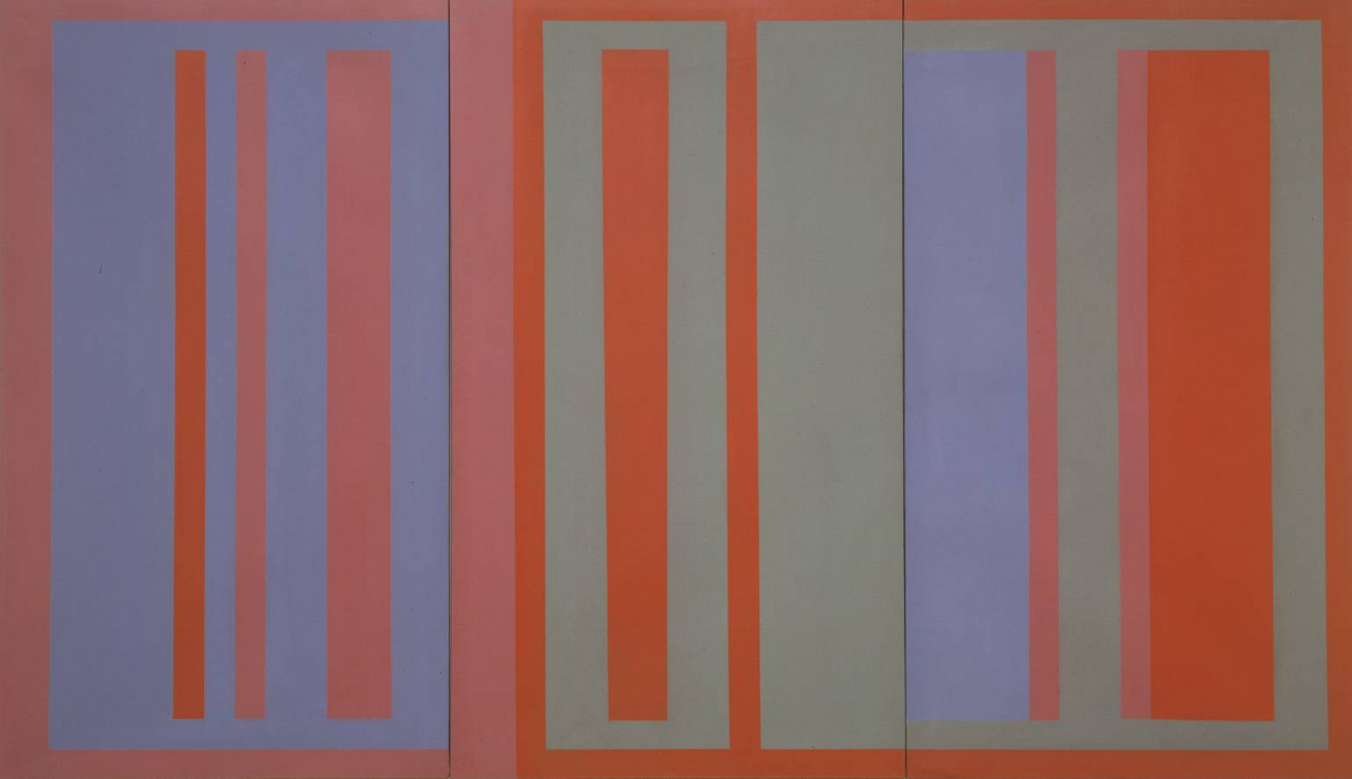
This Post introduces Chapter 22 from my book “Painting with Light and colour”. It uses one of my paintings to discuss many issues that relate to viewing conditions. These all apply to all paintings, but it is difficult to find information about them in other books. Indeed, it was not until I began work on paintings including numbers of thin lines that I became fully aware of many of them. My awakening was a result of the coming together of many strands of the story I have been telling in my series of four books.
The dogmas of Marian Bohusz-Szyszko (see Chapter 1),
My interest in the debates relating to “illusory pictorial space” (see Chapters 7-10 in “Painting with Light”, the first part of this volume),
My interest in the Modernist Painters obsession with what they described the “integrity of the picture surface”* and its dynamic implications in the history of “Modernism in Painting“**
In general, whenever images of paintings are transferred to the computer screen, many of their qualities are lost. Sometimes this can be an advantage, but never for paintings that follow the dogmas of Professor Bohusz-Szyszko. This is particularly true for the images using thin lines discussed in this chapter and the next. Often, you will just have to take it on trust that the effects discussed are as described.
An image of a painting with twelve of orange thin lines
* If you ask Google “What is a Modernist painter”, you get the following excellet summary: “Modern art includes artistic work produced during the period extending roughly from the 1860s to the 1970s, and denotes the styles and philosophies of the art produced during that era. The term is usually associated with art in which the traditions of the past have been thrown aside in a spirit of experimentation.” However, if you had asked Manet, Cézanne, Van Gogh, Matisse, etc., etc., whether traditions of the past had been thrown aside, you would find that it was by no means all of them.
** Google says that the “integrity of the picture plane” is a phrase coined by the influential art critic Clement Greenberg in his essay “Modernist Painting”. It concerns the issue as to whether the fact of creating an“illusory pictorial space” interferes with perceptions of the “objectness”of the actual picture surface. This was a question of primary importance to the “Early Modernists” from the late 1860s onwards. For them, as explained in Chapter 6 of my book “Fresh Perspectives on Creativity”, the fact of the possibility of being aware of the actual surface of paintings was one of the reasons for what they believed to be their inherent superiority relative to photographs. Their belief was that, since“deception is immoral”, painters must avoid it at all costs. Despite the difficult-to-comprehend this questionable argument, it stuck for about a century. Thus, in the 1960s, it was still a potent aspect of the teaching of my two mentors, Professor Bohusz Szyszko and Michael Kidner. The difference between the “Early Modernists” and Clement Greenberg was that the former (and Professor Bohusz-Szyszko) thought it possible to depict illusory pictorial space without destroying the integrity of the picture surface. In contrast, Clement Greenberg asserted the impossiblilit of any such thing, as didPiet Mondrian and a number of earlier painters, plus a whole list of later artists, including Michael Kidner and Ellsworth Kelly.
As those who have read “Painting with Light”, the first Book in this Two Book Volume will realise, the early Modernists and Professor Bohusz-Szyszko got it wrong. The use of unmixed repeated colours do not disrupt the picture-surface, but rather the illusory pictorial space. They do so because our eye/brains read them as being on the picture surface and, consequently, as jumping out of any illusory pictorial space, which is allways behind it. It is thus, the integrity of illusory pictorial space that is disrupted.
Earlier chapters from “Painting with Light and Colour”:
This Post provides a link to the introduction to BOOK 2 of “Painting with Light and Colour“. It deals with what I have described as “body colour” and is subivided into four PARTS:
Part 1: Colour and feeling (Chapter 19).
Part 2: Local colour interactions (Chapters 20-24)
Part 3: Shadows, shading and highlights (Chapters 25 -28)
Part 4: Concluding syntheses based on both “Painting with Colour” and “Painting with Light”( Chapters 29-31)
Ealier, in Chapters 8, 9, and 10, much was written explaining about how “optical mixing” was central to Seurat’s ideas about “painting with light”. Here it is used to introduce lesser or unknown aspects of the subject of interactions between adjacent regions of colour (the subject of this and the next four chapters). The more familiar aspects have been given less space because they have already been treated authoritatively in books by Joannes Itten * and Joseph Albers** of the Bauhaus,*** as well as in countless other books and magazine articles, with varying degrees of reliability.
Like Chapter 20, these earlier chapters also take “optical mixing” as their starting point. However, their concern is not with contrast effects but with other topics:
This Post introduces Chapter 21 of my book “Painting with Lightand Colour”. It focuses on a subject that is dealt within every book, every article and in every classroom in which the subject of colour dynamics is treated. It was first described by Michel Eugène Chevreul in 1839. The name he gave to it was “simultaneous colour contrast“.
Its potential for use in paintings was popularised by Eugene Delacroix. It was picked from him by the Impressionists and many of their Modernist Painter successors. In the twentieth century when so many artists turned to non-figurative productions, it came to be treated as a subject in itself. A particularly influential part in this process was played by teachers at the Bauhaus. Of special importance were Johannes Itten and Joseph Albers, both of whom produced books exploring the possibilities of colour contrast effects . Both had a widespread and lasting influence on artists and art education. The purpose of this chapter is to introduce their ideas as a preparation for going beyond them. Doing so will provide the subject matter for this chapter as well as chapters 22, 23 and 24.