The surprising eye in diagrams

The surprising eye

The eye is full of surprises. The biggest ones come from the structure of retina that is situated at the back of it. The purpose of this Post is to provide a link to images and explanatory captions that tell us more about this starting gate of visual processing. At first sight, much of what we find strikes us as bizarre. But, when we delve more deeply, we discover the considerable advantages of the way things actually are. It turns out that nothing would work nearly as well as it does, if things were arranged any differently. The images and their captions will go a long way towards explaining why.

In the process, they will help readers to get a better understanding of how the eye/brain combination makes practical use of the information contained in the ever-changing patterns of light coming into the eye.

The link to the diagrams

Click on the link below to access the images and captions referred to. They are extracted from ‘The Glossary‘ to the four volumes I am in the process of publishing on this website.

GLOSSARY DIAGRAMS (1)-THE EYE


What happens next

Upon leaving the retina, the neural signals travel in two directions. Some go up the optic nerve to the region of the neocortex known as ‘Visual Area 1′. Others take a completely different route that makes contact with the regions of the “Old Brain”. These play a central role in visual perception as we experience it. For example, they play their part in eye movements, spatial awareness, affective responses, multimodal processing, whole-field relations and much besides. Images and captions relating to both these routes will be posted later on this website, in a separate entry, entitled, “Visual Regions in the Brain”.

Images of blood vessels, neurons and and neural processes in the eye.

The human retina contains a very large number of neurons (cells) and a very much lager number of neural of processes providing links between them. It also features a dense network of blood vessels that supply blood to the neural processes. Together these three components make a significant barrier to the passage of any light that strikes the receptors. Until I learnt better, this light-blocking function did not seem to be of much of interest.

What changed my mind was the discovery that the light-sensitive cone and rod receptors that transform light-energy into neural signals, do not face towards the incoming light, but away from it. Consequently, the light coming into the eyes has to penetrate this light-impeding layer of neurons, neural processes and blood vessels, before it reaches the receptors. To add to my surprise, it turned out that the light-receiving end of the receptors is buried in a layer of dark matter. It was some time before I realised how these seemingly bizarre arrangements make possible visual perception as we know it.

The barrier confronting the light that enters the eye

It turns out that the barrier of neurons, neural processes and blood vessels compensates for the fact that the rod receptors are very much more sensitive to light than the cone receptors. The benefit of this state of affairs is that it enables a necessary degree of functional equality between the responses to the incoming light of the two different receptor-types. Needless to say, this equalling up would not take place, if the light striking the less sensitive cone receptors were to be subjected to the same impediments. This explains why the forces of evolution have created a gap in the neuron and blood vessel barrier in front of the region known as the fovea, exactly where the incoming light strikes the cone receptors.

Glare-blindness

If the equalling up process did not take place, the rod receptors would be bleached out whenever the incoming light was strong enough to activate the cone receptors. The result would be a massive degree of glare-blindness in daylight conditions.

Dire consequences

If they were effectively blind, the rod receptors would not be able to participate in daylight visual processing. As a consequence, the neural computations of whole-field relations could take place. One of the many aspects of visual processing that would rendered impossible would be the separation of reflect-light from body-colour. As a result there would be neither colour constancy, nor the use of the information residing in the  reflected-light that has been separated out.

If this were so,  pretty well all that I have written in my book “Painting with Light” would be nonsense.

Burying the receptors in dark matter

The burying of the light-sensitive receptor heads in the dark matter is easier to explain. It prevents the light from scattering from one receptor to the next and, consequently, reduces blurring.

spacer

The eye
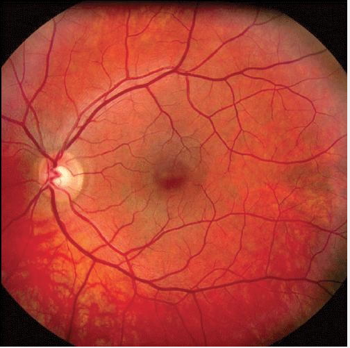
Figure 1: Blood vessels blocking light from the ‘rod’  photosensitive  receptors.  The small darker disc is where the light sensitive ‘cone’ receptors are located. Notice that no blood vessels impede the passage of incoming light to these.


The eye
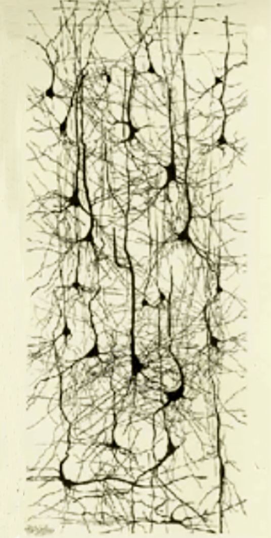
Figure 2: This image of a small section of a network of neural processes gives an inkling of an idea of the extent to which these these can block the incoming light.  For reasons explained above, the blockage only applies to ‘rod’  photosensitive receptors. It does not apply to the ‘cone’ photosensitive receptors .


The eye
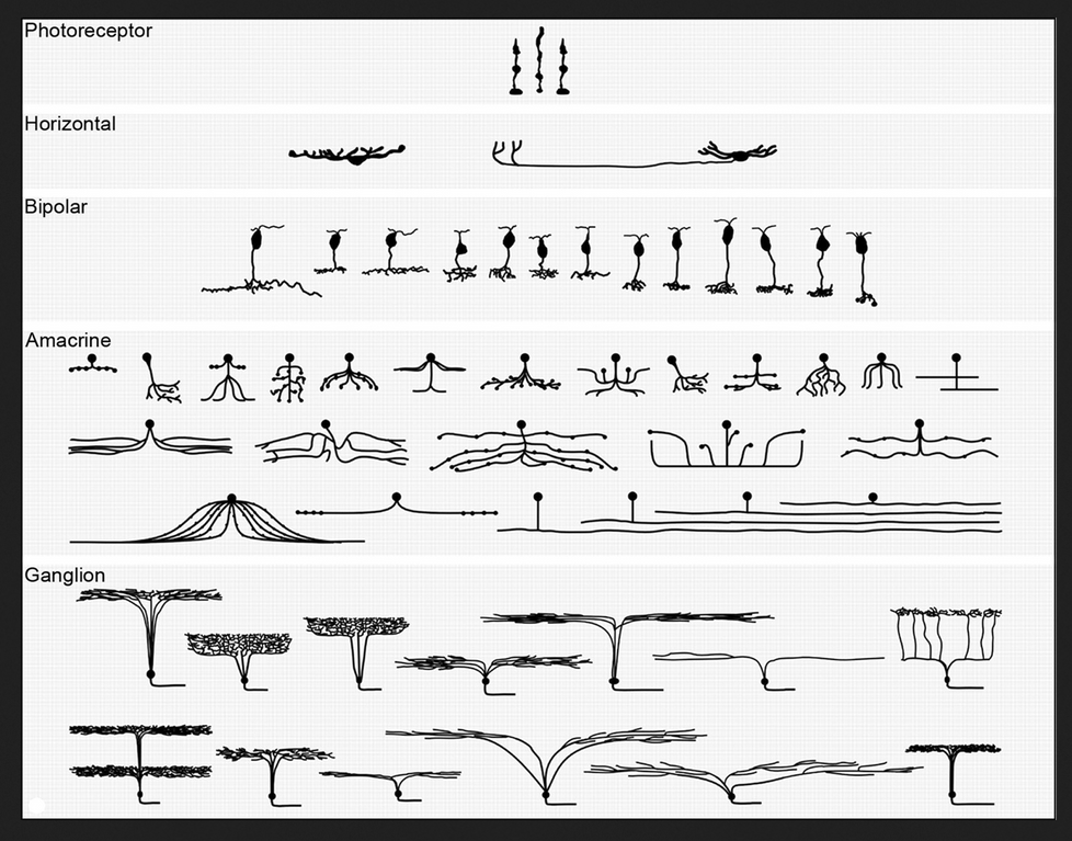
Figure  3: A diagram of cell-types in each of the five layers of the retina. The massive numbers of each of these contribute to the blocking of the light arriving at the ‘rod’  photosensitive receptors.

Some numbers and sizes

One estimate for the number of the light-sensitive receptor cells is in the region of 150 million. Although the precise number of neurons and neural processes in the retina is unknown, it is certainly in the hundreds of millions.  All this packs into an astonishingly thin layer (less than 0.5 mm) whose extent can be compared to that of a 10p piece.


A reference

If you want a comprehensive account of the component parts and structure of the retina, you could consult the relevant pages of the website of the The National Library of Medicine.  You will find them dizzyingly more complex than the grossly oversimplified information given either above or in the ‘Glossary‘ extract.

spacer

Go to top of page

Go to list of all other contents

spacer


Ambiguity and its uses

When I arrived at art school in the late 1960s, ambiguity was one of the first things we were expected to think about. Over the years I have learnt what an important role it has played in artist’s thinking over the last on hundred and fifty years.

Definition

Ambiguity occurs whenever two or more interpretations are in competition with one another. They may be within any domain of sensory experience or across domains, but here it is considered in relation to the visual domain.  The purpose of this Post is to present some of the reasons why ambiguity should be of fundamental interest to artists, particularly if they are:

  • Wish to depict illusory pictorial space.
  • Seeking to create either harmony or discord in their paintings.

An illustration of ambiguity

abiguity
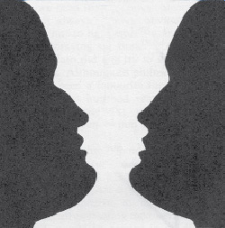
Figure 1 : Perceptions of vase & face in competition

.

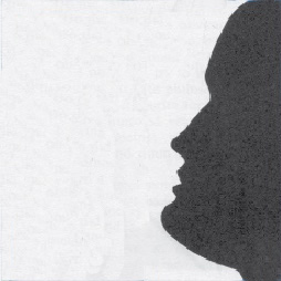
A good example of a high level of ambiguity is provided by the well known vase/face illusion illustrated in Figure 1, in which we can see either a vase or two silhouetted faces. However, it is important to notice that, although we can choose between the vase or the two faces interpretations, we cannot stop the ambiguity of the situation providing a degree of tension. The force of this can be sensed by comparing the right hand side face with the identical face in Figure 2 in which there is no left hand side face to create the vase shape. Clearly, by removing the ambiguity between the vase and the two faces interpretations, the face is easier to look at. The question for artists is whether they want to maximise ease of looking or to create works with some degree of tension.

.

Ambiguity
Figure 2 : Face only – no competition


Escaping ambiguity

As explained below, it can be argued that all paintings exhibit an ambiguity between their pictorial contents and their presence as objects with real surfaces. The the only way the escape this is to make use of one or more of the strategies that are available to us for that purpose. Not counting that of looking away altogether, these depend on concentrating attention on details at the expense of wider context, which can be done either by focusing down or by moving closer. However, although both these manoeuvres work well enough for reducing ambiguity in everyday visual perception, our eye/brains can seldom completely exclude the influence of alternative interpretations in paintings..

Real picture surface versus illusory pictorial space

Ambiguity
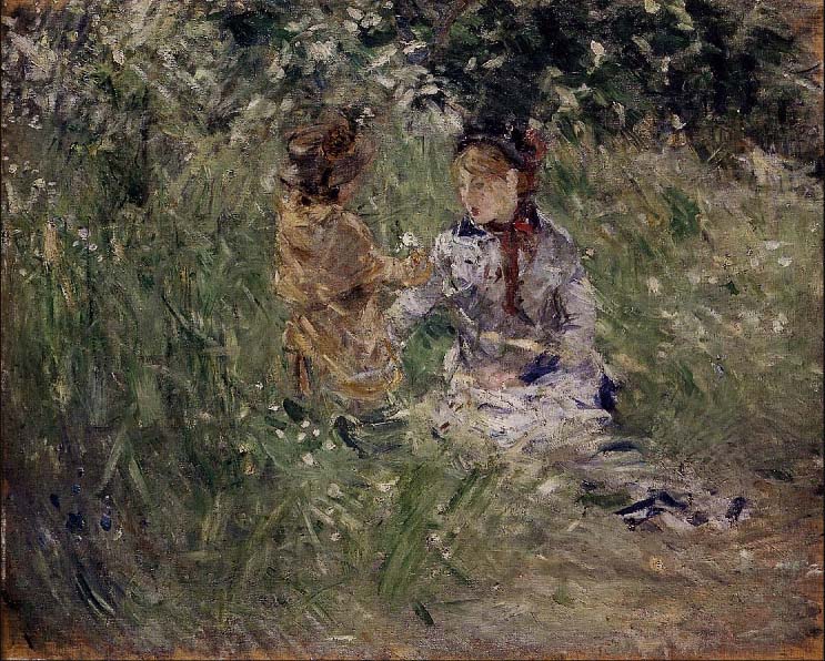
Figure 3 : Berthe Morisot – “Julie with Passie in the garden at Bourgival”

.

One type of ambiguity has had a pivotal place in the history of painting. It is that between perceptions of an illusory pictorial space and awareness of the real picture surface. Historically speaking, it became important when the Impressionists and other early Modernist Painters were looking for ways in which their hand-painted images could combat the threat posed by the high levels of realism produced by the newly available photographic method. They feared that the fact that it was so easily and quickly obtained in photographs, would undermine their livelihood.

Luckily for them and for the history of painting, they saw photographic images as deceiving the eye and hit on the now seemingly absurd idea that this deception was morally reprehensible (an idea that was still influencing artists in the 1960s and beyond).  Abruptly, for progressive painters at least, the trompe-l’oeil, which for so long had been the goal of artists, became something to be avoided at all costs.

The solution found by these Modernist painters was to introduce ambiguity. Their idea was to provide a counterpoint to perceptions of illusory pictorial space by emphasizing the reality of the picture surface. The painting, by Berth Morisot, illustrated in Figure 3, provides a good example of how brush marks and surface texture can be used as a means of preventing the trap of deception. What these pioneer artists reasoned was that the impossibility of being able to enter the illusory pictorial space created by the realism of the image without being aware of these indicators of real paint and real surface, meant that a salutary ambiguity would be inevitable.  What they could not have guessed is that the wealth of unexplored possibilities that the picture surface/illusory pictorial space dichotomy would make available, not only to them but also to their successors during well over a century.

An example of competing cues

ambiguity
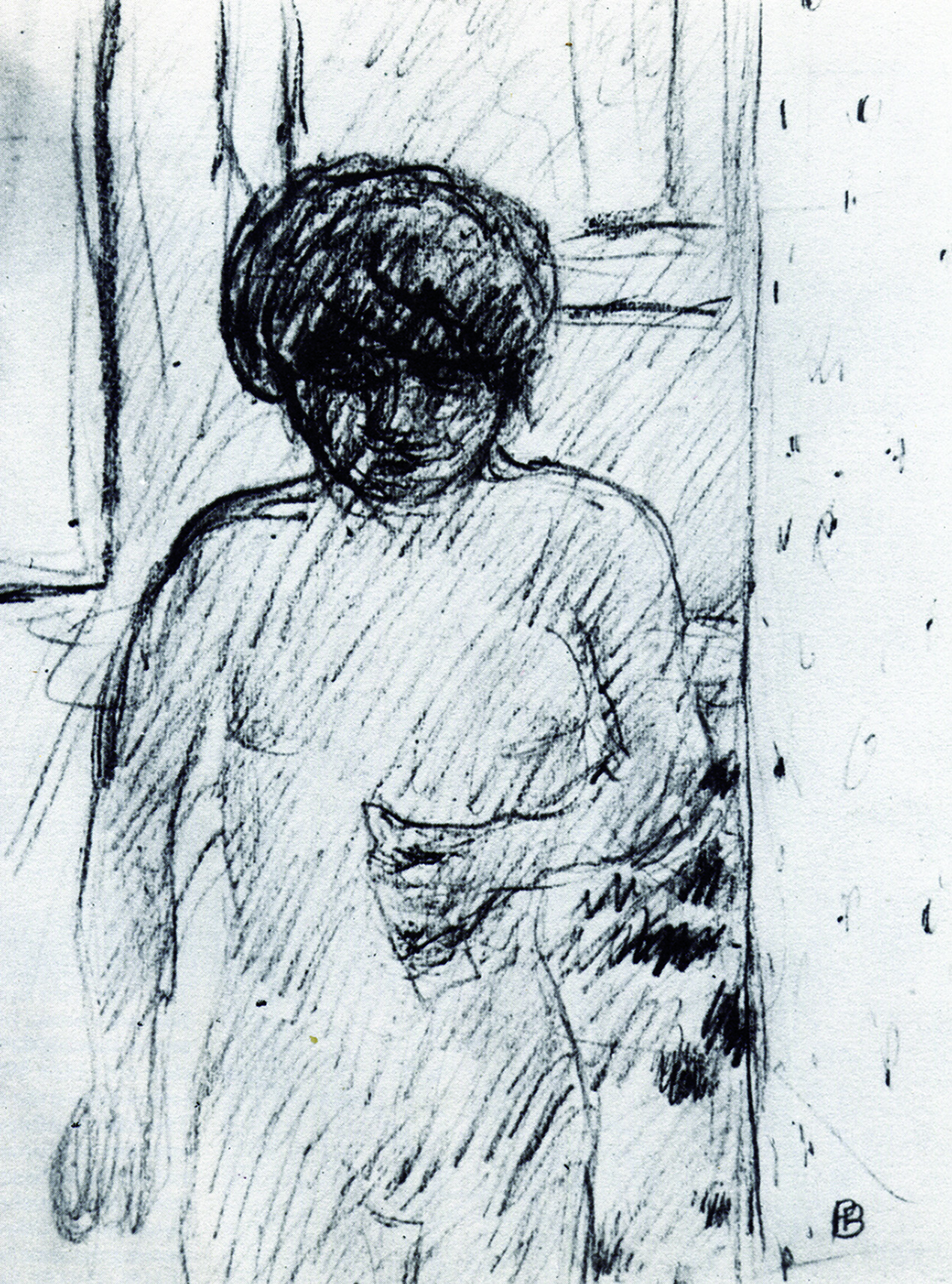
Figure 4 : Bonnard – Drawing of Marthe his companion

.

The Modernist Painters were also interested in another kind of ambiguity in which attention is drawn in competing directions. For example, Figure 4 shows Pierre Bonnard going a long way towards obscuring the features in his wife’s face, presumably with a view to allowing the telling gesture of the hand to take on more significance than it would have done had the eyes, nose and mouth been more clearly delineated. However, since this strategy completely fails to override the eye/brain’s built in tendency to give faces more importance than hands, the result is a pull in both directions. The consequent dynamic equilibrium is of central importance to the experience of looking at the drawing. Just as in Figure 1, it is difficult to look at the vase interpretation without being influenced by the two-face interpretation, it is difficult to look at either the hand or the face to the complete exclusion of the other.

Figurative versus abstract

Ambiguity
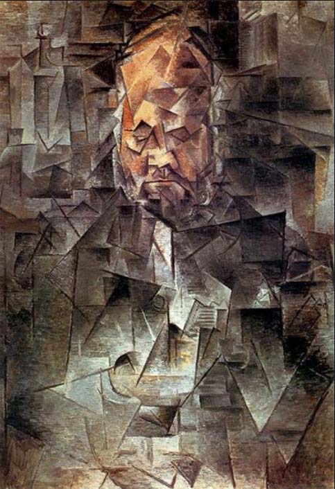
Figure 5: Pablo Picasso – “Ambrose Vollard””

.

Another area of competition is between pictorial dynamics based on figurative content and ones that involve non-figurative relationships such as those between colours, contours, textures, etc.. The more the Modernist Painters found their interest turning to the latter, the more they sought ways of playing down the influence of the former. A first step in this direction was that of reducing the strength of the cues that make recognition too easy (as in the case of the face in both the drawing of Marthe by Pierre Bonnard, illustrated in Figure 4, and the portrait of Ambrose Vollard by Pablo Picasso, illustrated in Figure 5). A second step was to get rid of figuration and its attention-distracting pull altogether.

Seeking to eradicate ambiguity

Ambiguity
Figure 6 : Michael Kidner – “Penrose 093″”

.

Many artists saw great potential in the removal of figuration but did not want to get rid of illusory pictorial space, which they felt gave extra dynamic possibilities to interactions of colour, contour, texture, in front/behind relations, etc. Others were still troubled by the immorality of deceiving the eye and sought to eliminate illusion altogether. They wanted all regions of their paintings  to be perceived as being flat on the picture surface, as no doubt was the intention of Michael Kidner when making the work illustrated in Figure 6.

However, these purists were soon to realise that achieving this objective might prove more difficult than they had imagined. It seemed that no matter how hard they struggled, if a picture surface, had more than one region of colour on it, their eye/brains would find ways of creating perceptions of illusory pictorial space within it. In other words, they seemed unable to prevent some of the regions of colour appearing to be either in front of or behind others. Even the simplest two colour painting, such as the one by Ellsworth Kelly illustrated in Figure 7, would not do, for it gives at least some people the impression of a landmass, a horizon and a sky.

.

Ambiguity
Figure 7 – Ellsworth Kelly – “Two Yellows”

.

Sculpture?

Ambiguity
Figure 8 : Ellsworth Kelly – “Curve”

.

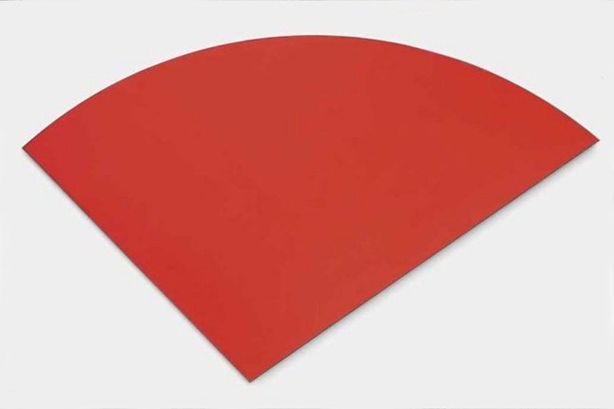
In the end, the only solution seemed to be one colour paintings, of which many appeared in the 1950s and 1960s. These included the series of blue paintings, embarked upon by Yves Kline in 1957, and several works by Ellsworth Kelly on the lines of Figure 8. The only ambiguity remaining lay in the question whether these were correctly classified as “paintings”. Some might think it more appropriate to describe them as “sculptures” or, merely, as “objects hanging on a wall”. For those artists who identified (in my view falsely) the search to remove the ambiguity as being of the essence of “Modernism in Painting“, it was time for “Post Modernism“.

Harmony and discord

To find out what this has to do with “harmony and discord” please consult previously posted chapters from “Painting with Light and Colour” and excerpts from the “Glossary”. In particular I suggest reading:

Relevant chapter

Relevant excerpts from the Glossary

Go to top


Aerial perspective: Theory & warnings

Today, I have been editing the entry for aerial perspective in the Glossary for my books. As I was making my corrections, I had the idea that readers of the Posts Page of this website might like a preview of this and future Glossary edits that I feel might interest them. So, to start the ball rolling, here is a slightly expanded version of the one on aerial perspective, with four images added.

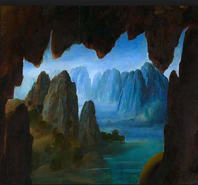
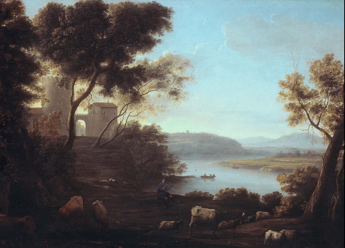
Aerial perspective: Between any viewer and the surfaces of the objects at which they are looking lies a portion of the earth’s atmosphere. In addition to the transparent gases that make up air, this contains quantities of dust and other particulate matter (such as the water droplets in mist and, more evidently nowadays, various kinds of pollution). The effect of the intervening atmosphere on the appearance of distant hills and objects seen is well known to us all. We all perceive distant parts of landscapes being bluer and/or greyer  and lighter than nearer parts, and objects seen through mist or fog appear progressively greyer and lighter as the distance between them and us increases. Many artists dating back to the Italian Renaissance, most famously Leonardo da Vinci (1452 – 1519) and Claude Lorrain (1600 – 1682), have demonstrated the value of applying these principles in paintings. So convincing was their effect, that they were adopted as “rules”  by the French  Académie Royale de Peinture et de Sculpture soon after it was founded in the mid seventeenth century.  No one would dispute that the images in Figure 1 and Figure 2 produce a sense of progressive distance.

.

Aerial perspective
Figure 1 : Leonardo da Vinci – detail of “the Virgin of the Rocks”

.

Aerial perspective
Figure 2 : Claude of Lorrain- Classical landscape

.

Warnings

  • Although the theory explaining aerial perspective is scientifically sound and although it virtually always has an important effect on how we perceive both distant parts of landscapes and objects on misty days, it has no discernible effect on how we perceive objects within an arms length. So at what distance does its influence become apparent? The answer is that it varies according to the composition and density of the particles floating about within it.  Thus, on dry, bright days of the kind that often follow abundant heavy rain, when the air has been washed clean, the visibility of atmospheric intervention is minimised, whereas on a hot sultry or misty days, when the air is at its fullest of dust and pollution, it is maximised. In practice, this can mean that on a clear day its effect on the appearance of objects hundreds of meters away may not be discernible.
  • Despite these facts of appearances, over the years, I have found that many students, when they first come to my Painting School, have been in the habit of adding blue to objects much nearer than that (in one exceptional case, a newcomer, when painting a bunch of flowers in a vase, added blue to the colour of flowers and foliage at the back of the arrangement, arguing that it made it look further away). When I see this being done, it tells me is that the student in question cannot have been looking at the near/far colour/lightness relativities. If so, how can they appreciate the amazing riches of colour relations in nature? They need to learn that rules are not for following blindly, but for testing, a process which will always open doors of awareness.
  • To further complicate the situation, there are a number of other variables that can result in people perceiving more distant surfaces of a particular colour as brighter and more fully saturated than nearer surfaces of the same colour: In other words, the opposite of the aerial perspective rule. For example, in summertime, the green canopies of distant oak trees that are illuminated by bright sunlight will look lighter and brighter than those of nearer oak trees should they happen to be situated in the shadow of clouds. Also, a boat on a lake that is painted with a fully saturated red that is actually further away from the viewer than a boat painted with a desaturated red will still look further away. If we made a painting of them, matching as best as possible the colours as we see them, the laws of aerial perspective would predict that the further boats would be perceived as being nearer than the nearer boat. Clearly there needs to be a way of depicting distance that has nothing to do with the representation of atmospheric intervention. Luckily there are several of these, including overlap, relative size and texture cues, but only one of them necessitates the use of colour. Unfortunately, this colour-dependent way of enhancing illusory pictorial space appears to be little known, despite its solid foundations in well known history, its sound scientific underpinning and the ease of its practical application. Much of my book “Painting with Light and Colour” is devoted to giving it new life. If you want to know more, read chapters already published on this website and watch for later Posts.

Two examples of minimal effect of aerial perspective, containing contradictions to the laws as exemplified by Clause Lorrain.

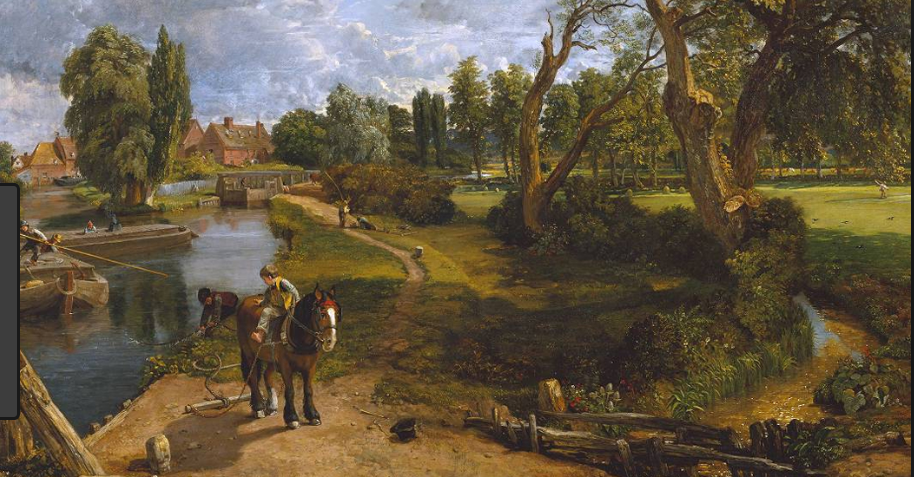
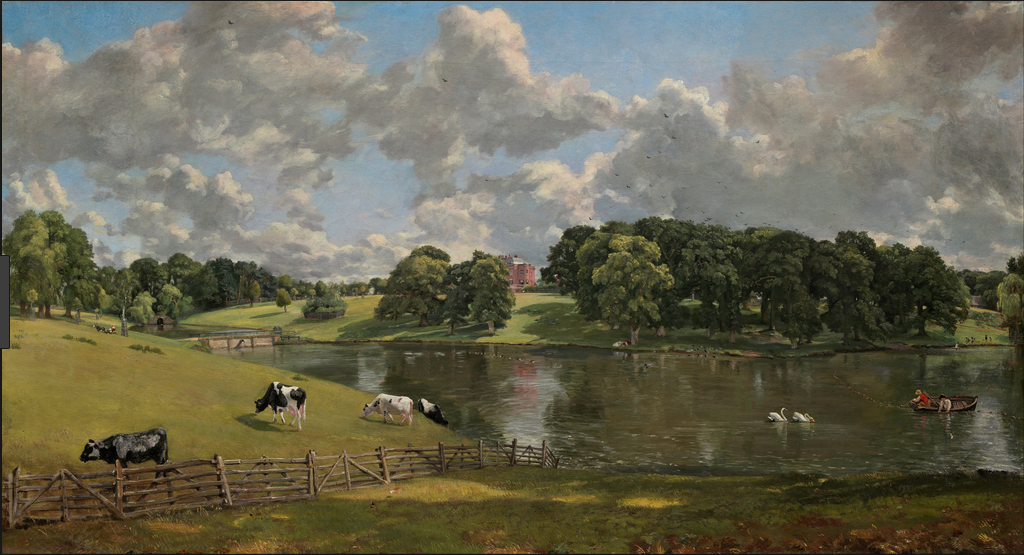
John Constable (1776 – 1837) was a great admirer of Claude Lorrain, but he looked more carefully at nature. Figure 3 and Figure 4 are images of two of his paintings that contain elements that are not consistent with a rigorous interpretation of the laws of aerial perspective. See how many you can find?

.

aerial perspective
Figure 3 : John Constable, – “Flatford Mill”.

.

aerial perspective
Figure 4 : John Constable “Wivenhoe Park”.

.

Now look at paintings by the Impressionists – Monet, Renoir Pissaro, Cezanne, Gauguin, Bonnard, etc. – to see how much they make use of the rules of aerial perspective. Where they do make use of them, was this the result of applying the rules or of looking carefully at nature? According to what is written above, far distant hills should always actually look bluer or greyer, but what about landscapes representing the kind of distances depicted by Constable or shorter ones?

Effect of patchy cloud cover on relative brightnessess

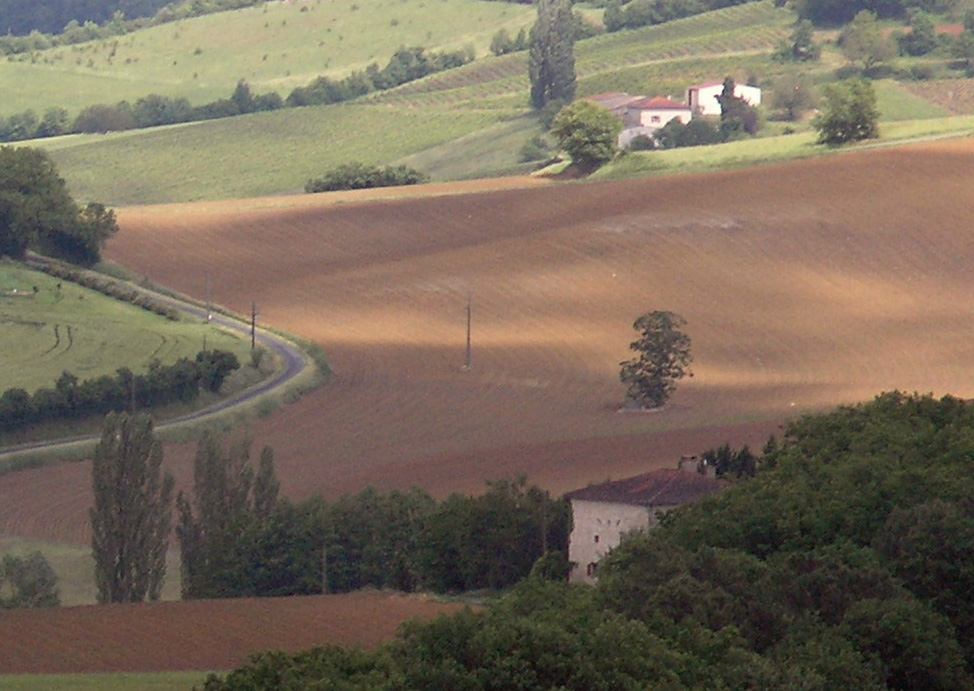
Finally to ram the point home, here are three photographs that illustrate how patchy cloud cover can produce contradictions to the laws of aerial perspective.

.

aerial perspective
Figure 5 : Duller nearer/brighter further

.

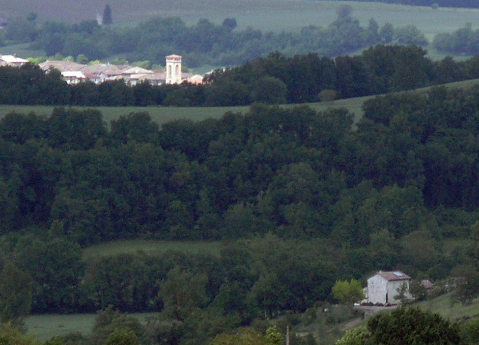
Figure 5  illustrates an exception to the law. Due to their being brightly illuminated by sunlight, the walls of the distant church tower are much brighter than those of the house in the foreground, which is in the shadow of passing clouds.

.

aerial perspective
Figure 6 : Brighter nearer/duller further

.

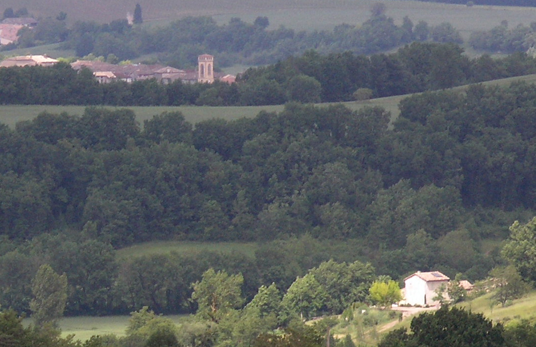
In Figure 6 the situation is reversed. The walls of the house in the foreground are now brightly illuminated by direct sunlight and are much brighter than those of the church tower, which is now in the shadow of passing clouds.

Figure 7 shows:

  • The far house,
  • The strip of green field in front of it,
  • The sunlit patches of brown earth in the ploughed field,

as being brighter than,

  • The near house,
  • The ribbon of green field in the bottom left of the image,
  • The area of brown earth immediately above it.

.

aerial perspective
Figure 7 : Duller nearer/brighter further

.

In all three images atmospheric intervention is playing a part, but in Figure 5 and Figure 7, its effects are being obscured in the ways described.


Back to top

Back to list of contents


.


Preparation for the drawing lesson

The need for preparation

When new students at The Painting School of Montmiral are first faced with a live model in a figure drawing class, the majority of them give little time for preparation, even for long poses. Within a matter of seconds, even experienced artists have embarked upon active mark-making. It does not seem to occur to them that, before drawing the first line, it might be useful to spend time familiarizing themselves with the situation that faces them. If this is the case, they will almost certainly be denying themselves an important opportunity.

The feeling-based drawing lesson

At the heart of my book, “Drawing on Both Sides of the Brain“, is a  feeling-based drawing lesson that is described in three chapters. Chapter 9 (link below) is about getting ready for drawing the first line.  Chapter 10 (to follow) gives a blow by blow account of the main lesson in which:

  • Precise instructions are given concerning the preparation and execution of every line and every relationship.
  • Detailed reasons are offered for each and every one of these instructions. These relate to scientific studies of how artists coordinate their visual-analytic and line-output skills when drawing from observation.

Chapter 11 (to follow) suggests follow up exercises.

Preparation in previous chapters

All the chapters preceding Chapter 9  have been preparing for this lesson. Thus, they have discussed:

  • The pros and cons of widely used teaching methods.
  • The importance of scientific findings in the development of artists ideas.
  • How more recent scientific findings relating to the eye/brain’s analytic-looking and motor-control systems can help with issues of accuracy, line production speed, self-confidence and self expression.

Preparation in Chapter 9

Chapter 9 is likewise getting things ready for the drawing lesson, but in a much more specific sense, starting with practical issues such as setting up the easel/drawing board, establishing a viewpoint, deciding whether to shut an eye, etc. But it also introduces a certain amount of science-based information that will be useful in explaining reasons for the instructions used in the drawing lesson.

CHPT 9 – A DRAWING LESSON-PREPARATION

Diagrams and explanations from the Glossary

As Chapter 9 contains footnotes that refer to diagrams with explanations to be found in the Glossary, I have included three of these:

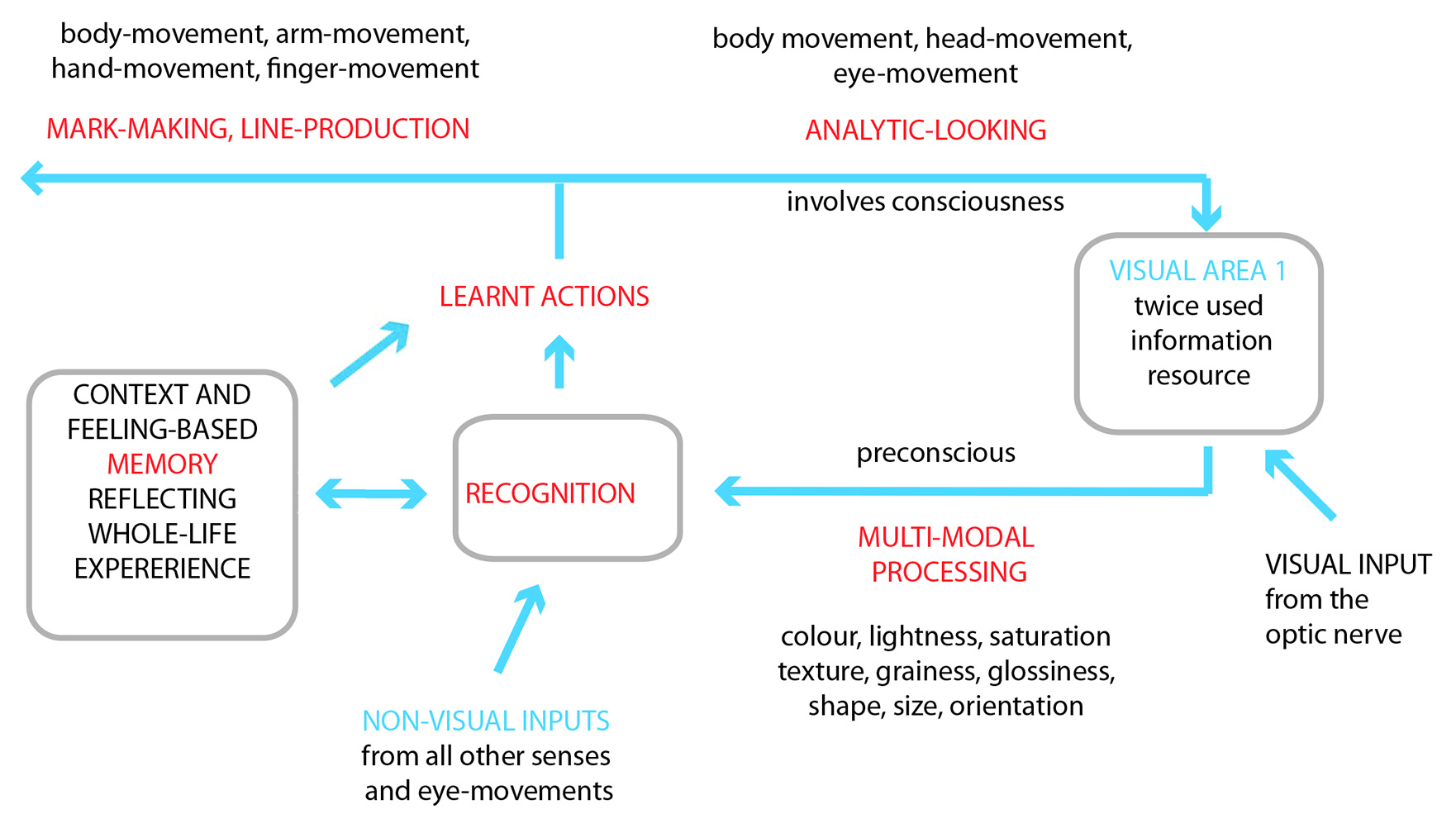
  • Figure 1 is the flow diagram representing the main factors that contribute to the analytic-looking cycle.
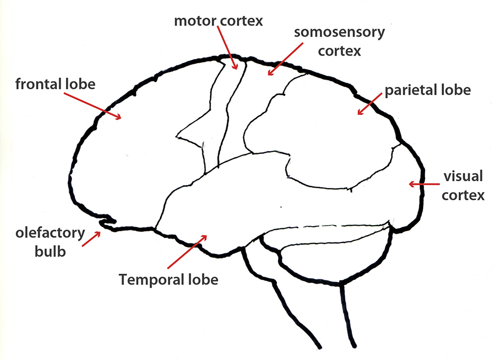
  • Figure 2 indicates regions of the neocortex (new brain) involved.
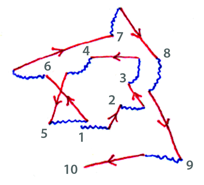
  • Figure 3 provides a mapping of eye movements showing glides and saccades.

Figure 1


preparation

The boxes and arrows in Figure 1 can be related to regions in the neocortex illustrated in Figure 2. Notice that Visual Area 1, which takes input from the retina via the optic nerve, supplies information not only for the preconscious processes that enable recognition, but also for the subsequent consciousness-related ones that accompany analytic-looking (This is why it is labelled “twice used information resource”).

In addition, the diagram indicates the key role of memory stores (whether short-term or long-term) in enabling both recognition and learnt-actions. It also calls attention to the importance of context and feeling in building them up and  of whole-life experience in determining how they do so. But perhaps the most important lesson that can be drawn from it is that recognition takes place before analysis. Thus it can be asserted that, in an important sense, “we know what we are looking at before we are consciously aware of it”.

Recognition also takes place before the implementation of learnt-actions, such as those that guide artists when drawing contours or making any other kind of mark. Accordingly, we can draw “what we know” about an object-type on the basis of the multi-modal, preconsciously acquired information made available by the very limited number of looks that are required to enable recognition (seldom more than one or two). In other words, the eye/brain acts as if further analysis of the object itself is unnecessary. The diagram also indicates the role of non visual-inputs in enabling recognition. For example, we may recognise something, in whole or in part, by its sound, smell or feel and can in princple complete the process of doing so without confirming what it is visually.

Figure 2

preparation

Figure 2 maps a number of the functional divisions in the neocortex (new brain). These can be related to the stages of the analytic-looking cycle as diagrammed in Figure 1. Thus:

  • The arrow labelled “visual cortex” points to the location of “visual area 1” in Figure 1
  • The region from there down to temporal lobe corresponds to the labels “preconscious multimodal processing” and “recognition” in Figure 1.
  • The motor cortex mediates “learnt actions” in Figure 1.
  • The parietal lobe underpins “conscious analytic-looking” and “the constancies of shape, size, and orientation” in Figure 1.

However, the area in Figure 1 labelled “context” and “feeling-based memory reflecting whole life experience” is more difficult to place, but would include:

  • The “somosensory cortex” (an essential part of the “feel system”).
  • Parts of the frontal lobe” with its links to the emotional centres in the old brain. These are thought to be involved in the choice between “good” and “bad” actions and the determination of “similarities” and “differences” between things or events, both of which are essential to developing the skills that underpin drawing from observation (as explained in Chapters 9 – 11).
  • The frontal lobe, along with old brain regions including the hippocampus, is also thought to play an important part in the creation and retention of  long-term memory.

Figure 3

preparation

Figure 3 is based on a photographic record of typical eye movements in which slow moving glides (wobbly blue lines) are interspersed with faster moving saccades (straight red lines with arrows to represent speed). The glides provide a constant stream of same/different information, while the saccades enable an intermittent averaging of input that is useful for neural computations that require knowledge of ambient illumination. The average glide/saccades combination lasts approximately one third of a second.


Other Posts that publish chapters from “Drawing on Both Sides of the Brain”

Other drawing-related Posts

Full list of Posts in all categories

Go to top

.

Clarifications: what does colour mean?

Clarifications

Experience with new students suggest that there is a need for clarifications on the meanings of the word “colour” and a number of related words and phrases. The following excerpt from the Glossary to my books on drawing and painting provide answers to the questions listed below, and many others.

  • What is meant by “body colour”?
  • What is the difference between “brightness “ and “lightness”?
  • What is meant by  “reflected light”?
  • How can colour be used to enhance perceptions of illusory pictorial space?
  • Are “black” and “white” colours?
  • Are cast shadows “black“?

What follows relates to several already published Posts. For example:

Colour 1: Colour and surface

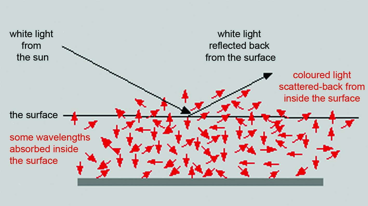
In everyday language the word “colour” has four main meanings. The first three of these can be explained in terms of the interaction between surfaces and the light that strikes them as diagrammed in Figure 1.

.

clarifications
Figure 1: The two ways light interacts with surfaces, giving information about surface-reflection profile and body colour

.

  • “Surface-reflection” : A part of the incident light is reflected directly back from the surface without changing its wavelength combinations.  This is“surface-reflection” and is one of several sources of information that enables the eye/brain to create the experiences of surface-solidity, surface-form and in front/behind relationships.
  • “Body-colour”: The remainder of the incident light enters surfaces and interacts with the pigments in them, such that some of its wavelengths are absorbed (i.e; turned in to non-visible electromagnetic energy) and the remainder is scattered about within the surface, before being scattered back out again into the eyes of the viewer. It is this scattered-back-out light that gives surfaces their “body-colour”, enabling us to see the surfaces as their characteristic colour (e.g. red, blue, brown, grey, skin colour, leaf colour, earth colour, sky colour, etc.).
  • “Transmitted light”: In some cases, a surface can be viewed from the side opposite to the light source,  in which case, it is  said to be “translucent”.  When this is the case, the light that enters a surface and interacts with the pigments in it is scattered out on the other side, into they eyes of a viewer. Accordingly it is described as “transmitted light”. It is this that that gives us the colours of stain-glass windows and translucent leaves when seen against sunlight.  In the virtual absence of surface-indicating reflected-light, we perceive such colours as both surfaceless and formless. Two other examples of familiar, perceptually surfaceless colours are the blue of the sky and the colours of the rainbow.

The fourth meaning is more prosaic:

  • Paint or pigment colour: The word “colour” is also used to describe any selection from the gamut of paints, pastels or crayons used by artists to give colour to their paintings. Thus we talk about the “colours” contained in our paint box, or of the “lemon yellow” and “cobalt blue” tubes of paint to be found in it.

Colour 2: Colour, light and physics

While in everyday language “colours” are referred to with words like “red”, “blue”, “yellow”, “pink”, “brown”, “grey”, etc., and we are all familiar with what they mean, physicists have preferred to describe them in terms of electromagnetic energy and combinations wavelengths and levels of intensity. Accordingly, they are likely to describe the three cone-receptor types in the retina at the back of the eyes as being relatively sensitive to “short”, “medium” and “long” wavelengths. However, even physicists can lapse into referring to them, more colloquially, as “blue”, “green” and “red”,  a slippage which can lead to significant misunderstanding. If we wish to understand the nature of colour vision, it is important to realise that  knowing the wavelength of the light coming into the eyes from a surface is by no means the same as knowing its colour. Light has no colour: Colour is a creation of eye/brain systems gathering and comparing information from arrays of inputs (as explained  elsewhere in these Posts, as well as in the chapters of my books).

One consequence of this fundamental truth is that, although there is indeed a correspondence between wavelength profiles and the colour perceptions that they stimulate, this is not as simple as many people seem to believe. It is only occurs if all the wavelength profiles entering the eyes from all parts of the scene being analysed during the colour-creating process are taken into account. Likewise, our experience of colour in paintings does not depend simply on the absorption/reflection properties of individual regions of pigment colour but rather on the absorption/reflection properties of all the regions of pigment colour on the entire picture surface. In other words, they depend on  “whole-field-colour-relations”.

clarifications
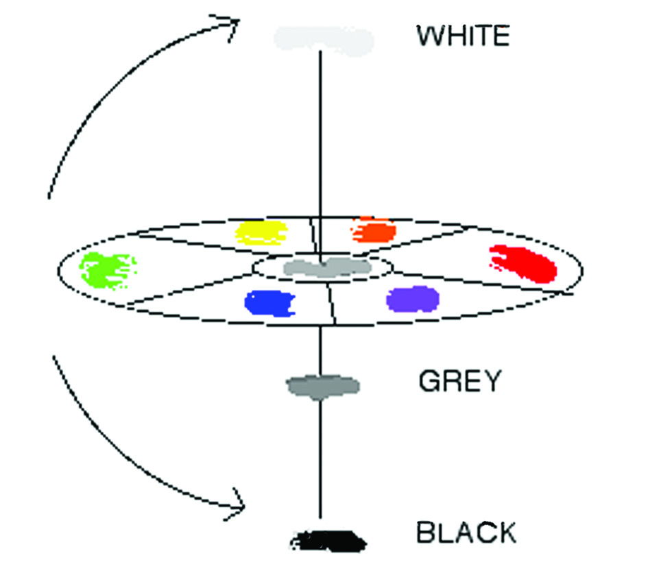
Figure 2: A diagrammatic representation of the colour sphere

.

Colour 3:

As with all words with a long history, the word “colour” has evolved in terms of its meanings and it is therefore it is important to be careful when using it. Most commonly it is used to describe visual sensations that are experienced as attributes of surfaces or regions of surfaces in the external word. We talk of “red” roses or “green” grass because we have learnt to use these words to describe our experience of “red” and “green” objects that we come across in daily life. However, in the eighteenth century, scientists of visual perception realised that colour is not anything of the kind. Rather it is a creation of eye/brain systems based not only on information coming into the eyes from the surface that is being perceived as coloured, but also from the surfaces that surround it. In short, they realised that the experience of colour is both brain-made and context-sensitive. Together these two insights made it clear that the colour of a surface cannot be equated with wavelength combinations of the light reflecting from it, as physicists had been doing. For more on this see the section on colour constancy under the constancies in this Glossary.

Soon after the physicists made new contributions to the progress of understanding about colour by going deeper into the subject of the information that the eye/brain picks up from surfaces. What they found was that it is made up of two components with very different properties. In this series of books these are called “body-colour” and “surface-reflection”. Figure 1 shows that when daylight, containing all the visible wavelengths strikes a surface it is divided into two parts:

  • One part penetrates the surface. When inside, some of its wavelengths are absorbed and others, having been scattered around inside, are scattered back out again into the eye of an observer. This is the “body colour” (what we see as the green of leaves, the yellow of ripe corn, the flesh colour of flesh, etc.). As far as I know, nobody has estimated the number of different body colours in the visible world, but there are clearly at least many thousands.
  • Another part never enters the surface. Rather it is reflected directly off it according to the rule the angle of incidence is equal to the angle of reflection. Since no light is absorbed during this process, the incident light and the reflected-light contain the same wavelength combination. In the diagram both are shown as being the same “white” light.

In the interests of simplifying its message, Figure 1 only shows one ray of incident light. In the real world light arrives at surfaces from a combination of primary light sources (coming from one or more different directions) and a multiplicity of secondary light sources of different of intensities (coming from a multiplicity of different directions). While primary light sources can have fairly predicable wavelength/intensity profiles, secondary light sources never do: The likelihood of any two combinations of them being the same is negligible. The resulting complexity is such that no part of any one surface reflects the same wavelength/intensity combination as any other part of it.  Likewise, no two surfaces in any scene reflects the same wavelength/intensity combination. Physicists would describe the consequent variety of in the composition of the reflected-light that results as  “infinite”. However, for the perceptual scientist, the limitations on the sensitivity of their visual systems restrict the number of nuances of which human eyes can be aware. How many is disputed, but it is generally agreed to be in the millions.

Colour 4 : black and white are colours

In the 1980s Semir Zeki, when investigating area V4 of the visual cortex, found twenty-two “colour coded cells”. These respond to body-colour independently of their wavelength profiles. The twenty-two not only included “violet”, a colour that has no simple wavelength equivalent, but also “black” and “white”. This means that the eye/brain responds to achromatic regions of surfaces in precisely the same way as it responds to regions of blue, green yellow, orange and red. This definitively resolved the question as to whether black and white are colours.

Although Zeki’s dicoveries provided incontrovertical proof that colour is made in the head, this conclusionhad been reached and generally accepted by scientists of visual perception well over 150 years earlier when they were trying to make sense of the phenemenon of colour-constancy.

Colour 5: Shadows

More recently, the discoveries of the physicists have been combined with the ideas of the perceptual scientists to explain how the eye/brain is able to separate surface-reflection from body-colour. Details of how this is done are given in “What Scientists can Learn from Artists”, Chapters 13 and 14. However one part of the computation depends on the sudden changes in the profile of the reflected-light that regularly occur at the edges of regions of colour (whether at edges of regions of different pigmentation within the same surface or at edges of the surfaces themselves) being equated with changes in body-colour. However it turns out that the computations concerned cannot distinguish sudden changes in actual body-colour from those that occur at the edges of cast shadows (due to sudden changes in intensity relative to adjacent illuminated regions of surface). Accordingly our eye-brain systems classify these erroneously as “body-colour” Accordingly, as far as the eye/brain is concerned  the colour of shadow is just as much a colour in its own right as the blue of the sky, the red of a tomato, the yellow of a lemon, the green of a leaf, the white of snow or the black of soot.

.

Colourists : different meanings

Colourists in 20th century art

A colourist can be defined as artists who give priority to the creation of colour-based experiences in their paintings. The problem is that it can be used in significantly different ways. In two Posts, I suggest two approaches to the unraveling  the consequent ambiguities. This post contrasts the very different meanings of the word for three particular 20th century painters who have been described as colourists. The Second Post analyses its meaning when used in the phrase “Venetian Colourists”. See also The Glossary entry for “colour

First approach: Two distinct types of colourist compared

I had two artist teachers who described themselves as colourists. One was interested in whole-field colour relations and the other in local colour-contrast effects. Both represented widely accepted meanings of the word.

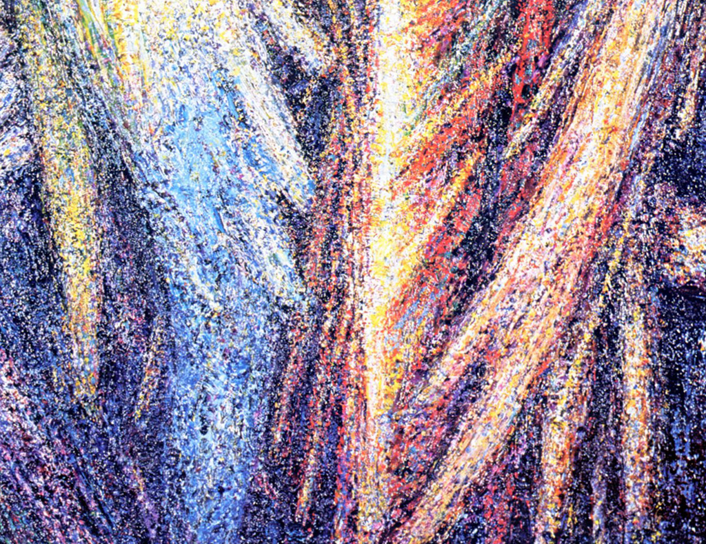
  • Marian Bohusz-Szyszko, the Polish artist, teacher and mathematician, thought in terms of a multiplicity of colours (in principle many hundreds of thousands) and, more precisely, the effect of each and every colour on the picture surface on each and every other colour on it.

.

colourists
Marian Bohusz-Szyszko – Detail from “the seven Archangels 1963–1979

.

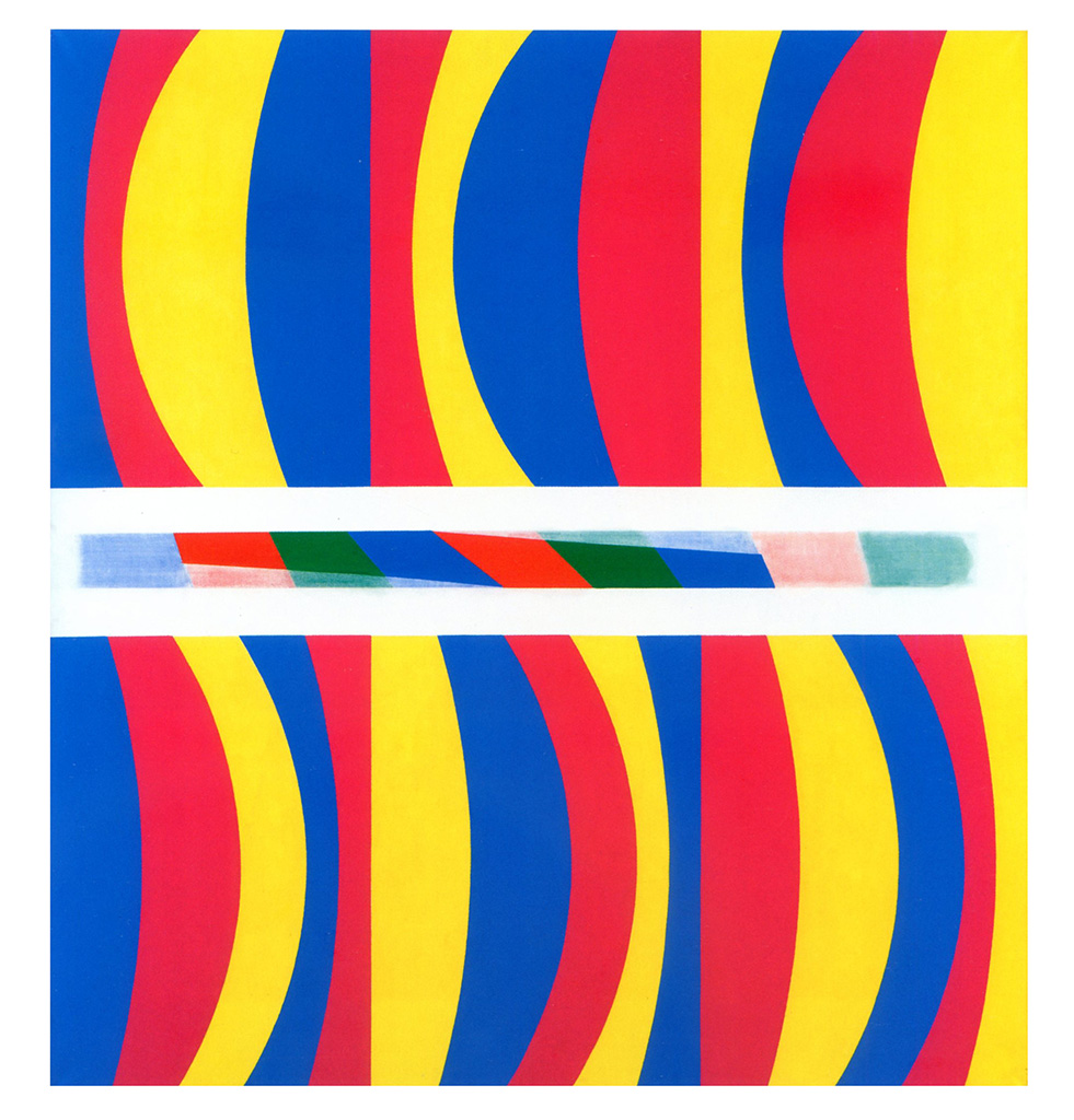
  • Michael Kidner, the English “Systems Painter”, thought in terms of a very limited number of colours (for example, two, three or four) and was principally interested either in local interactions between them or in their denotative function in his systems.
colourists
                                        Michael Kidner – Primary Colours 1967

.

A well known American artist had different ideas:

  • Ellsworth Kelly felt that both of the approaches to colour just described divert attention from the experience of colour as itself. He came to the conclusion that the only way of providing a pure experience of colour was to cover the entire surface of a painting with a single colour.
colourists
                                       Ellsworth Kelly- Red Curves 1996

.

But these are only three examples and many other possibilities exist. For instance, I have met artists and viewers who seem to think that producing more or less any array of what they consider to be colourful colours qualifies them as colourists, no matter how garish and discordant the results appear to the eyes of others.

Click here for lists of other Posts

Return to top

.

Venetian Colourists

Defining “Venetian Colourists”

In a previous Post, I compared three 20th Century artists all of whom who have been described as “colourists” despite having very different ideas on the place of colour in their painting. I also suggested that these represent only three among many possibilities.

In this related Post, I comment on the meaning art historians’ give the word “colourist” when writing about two different groups of pioneer artists, one that flourished in the  the Italian Renaissance and the other that overturned all sorts of preconceptions in the last part of the nineteenth century.  The two groups are:

  • The Venetian Colourists (Giovanni Bellini, Giorgione, Titian, Tintoretto, Veronese, etc.) and other, later artists, who kept within the same tradition (Vermeer, Turner, etc.).
  • The Modernist Painter Colourists of the late nineteenth century (Cézanne, Gauguin, etc) and early twentieth century (Matisse, Bonnard, etc.).

Continue reading “Venetian Colourists”

MY VOLUMES ON ART PRACTICES

A main difference between these volumes and others on the same subjects is that they are strongly influenced by the wide ranging and innovative research undertaken by the author and colleagues into how artists use their eyes when drawing and painting. 

CONTENTS LISTS

Below are the contents lists for the four volumes on art practice:

1. Understanding Drawing

  • book 1 -‘Drawing with Feeling’

  • book 2 ‘Drawing with knowledge’

2. Understanding Painting

  • book 1 – ‘Painting with Light’

  • book 2 – ‘Painting with Colour’

3. Understanding Creativity   

4. Related Science

5. Extracts from the Glossary (in process)

6. Miscellaneousspacer______________________________

INTRODUCTORY

VOLUME ONE :

“UNDERSTANDING DRAWING”

BOOK 1 : “DRAWING WITH FEELING”

BOOK 2 : “DRAWING WITH KNOWLEDGE”

The chapters so far loaded:

Other posts on drawing can be found under “miscellaneous”:

VOLUME TWO:

“UNDERSTANDING PAINTING”

BOOK 1 : “PAINTING  WITH LIGHT”

 BOOK 2 : “PAINTING WITH COLOUR”

ADDITIONAL POSTS ON LIGHT AND COLOUR IN PAINTINGS

VOLUME THREE : 

“UNDERSTANDING  CREATIVITY”

          The chapters so far loaded:

  • Chapter 11 – Eight endings
    • The human visual system
    • Creativity
    • Heredity and learning
    • Painting is like writing
    • Serious ambition
    • Living with uncertainty
    • Seeking validation
    • The goose in the bottle

VOLUME FOUR : “UNDERSTANDING THE SCIENCE: Experiments and ideas underpinning my books”

The chapters so far loaded, all of which deal with subjects that feature in the other three volumes

EXTRACTS FROM THE “GLOSSARY”

(other entries on the way)

MISCELLANEOUS

PAINTING SCHOOL MATERIAL FROM FORMER YEARS

Request for comments on the chapters from the books.

I look forward to your comments in the section provided at the bottom of each Post. When you have made them, please leave your email address and tick the box “Notify me of new posts by email.”

Enjoy

Return to the top of the page

books


Horace Lecoq Boisbaudran & Alphonse Legros

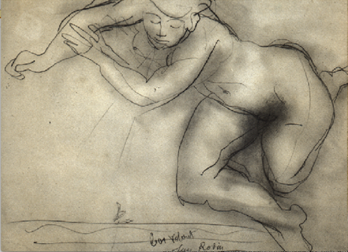
by Rodin pupil of Horace Lecoq Boisbaudran
A fast Drawing by Auguste Rodin, a pupil and lifelong admirer of the teaching of Horace Lecoq Boisbaudran

.

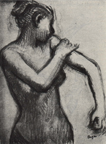
Drawing by Degas, friend of Alphonse Legros pupil of Horace Lecoq Boisbaudran
Drawing by Edgar Degas, a close friend of Alphonse Legros, star pupil of Horace Lecoq Boisbaudran, who widely shared his understanding of his teacher’s teaching method and ideas.

.

Horace Lecoq Boisbaudran came to my notice in 2014. In later posts I will be saying more about him. In brief, I was amazed and gratified to find that the research upon which he based his teaching has more in common with my research than anything else I have come across. Although the exercises he proposed differed in many details from the ones that I suggest in my books, we have in common the idea that training the memory requires rigorous exploration of the unvarying uniqueness in the appearance of every object. Horace Lecoq de Boisbaudran’s pupil Alphonse Legros, who actively promoted his teacher’s ideas, became a close friend of Edgar Degas. It may therefore be no coincidence that it was he who provided the best synthesis of Horace Lecoq Boisbaudran’s philosophy that I know:

It is all very well to copy what you see; it is much better to draw what you only see in memory. There is a transformation during which the imagination works in conjunction with the memory. You only put down what made an impression on you, that is to say the essential. Then your memory and your invention are freed from the dominating influence of nature. That is why pictures made by a man with a trained memory, who knows thoroughly both the masters and his own craft, are almost always remarkable works; for instance Delacroix.

Where my teaching is substantially different from that of Horace Lecoq Boisbaudran is the emphasis I put on training the “feel system“.

Meanwhile here is an extract from the “Glossary”  to “Drawing on Both Sides of the Brain” that provides an introduction to his ideas and his influence. I have also added the entry for Alphonse Legros, described as his star pupil, who had great success in spreading his ideas to both his own generation and the following ones.

Continue reading “Horace Lecoq Boisbaudran & Alphonse Legros”