Recently I was asked if I could post the five colour mixing chapters from my book “Painting with Light and Colour” (Chapters 11 – 15). I will be surprised if you do not find that many of the ideas in them are new, interesting and practical. At the bottom of the page is a link to Chapter Eleven, the first of the four chapters, whose title is, “Colour mixing – definitions and misconceptions”. To whet your appetite (below the image) I have included a slightly edited version of its “Introductory”.
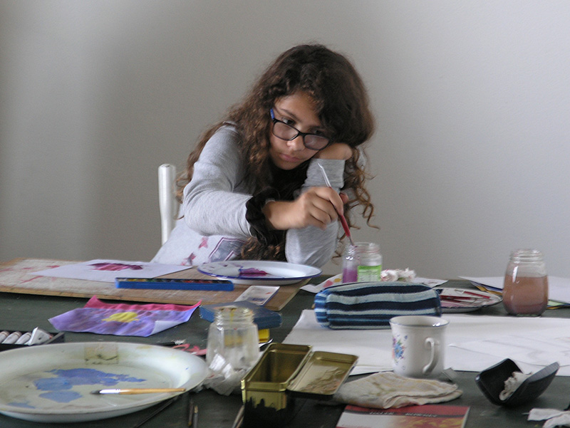
Figure 1 – A young student exploring some of the practical colour mixing ideas explained in the four colour-mixing chapters of my book
Introductory to Chapter Eleven
Introductory At the outset of my life as an artist, my conception of colour-mixing was of a dry and mechanical subject. I thought of it as no more than one of those necessary basic skills that could easily be picked up along the road. To my surprise, nothing turned out to be quite so routine as it had seemed, and one line of enquiry led to another in a most seductive way. Each new development plunged me deeper into the history either of science or of art, until an engagingly coherent story emerged. The result was a practical understanding of a kind that might be difficult to find elsewhere.
“Most how-to-do-it art books have sections on colour-mixing and there are a number of tomes that offer technical information for professionals. These latter tell us that scientists have understood the physics underpinning colour-mixing theory for a very long time: Certainly they have done so since James Clerk Maxwell’s lecture on colour vision, given at the Royal Institute, two years before the First Impressionist Exhibition in 1874.
In view of the availability of all these sources of information, it might be thought that there is nothing left to add. Unfortunately, this is far from the case. The problem is that:
Too many painters are being seriously misled by the half-truths and even falsehoods which have entered into the stock in trade of popular colour-mixing theory.
Science has far from stood still since the 1870s. Particularly since the 1970s, scientists have been finding out a great deal of new information about how eyes and brains work and, as a result, have arrived at a number of new understandings that could help artists in practical ways, which are not being made use of by the artistic community.
For these reasons and others, it is clear to me that there is a need for the up-to-date approach to practical colour mixing that is supplied by the next chapters.
One approach to clarifying matters is to place the information presented in an historical context. Doing so reveals that:
Some of the best of ideas have been obscured by the passage of time.
The evolution of colour-mixing theory, owes much to parallel development of the histories of science and of art.
The story of when, how and why artists adopted new colour-mixing practices, provides many insights into their potential uses in painting.
With respect to the links between the discoveries of the scientists of visual perception and the practice of the artists, the evidence is usually sparse and often ambiguous. To compound the problem history (not least the history of science) becomes distorted because it is told by people who write with the benefit of hindsight and sometimes from the perspective of a particular prejudice.
It may surprise some people to find how many famous scientists are credited both with more originality and much more fully developed and rounded versions of their ideas than they actually had. A mismatch of this kind may be suspected in the relation between the confusions inherent in the early development of the ideas developed by Seurat and Cézanne and the neat synthesis of them by Professor Bohusz-Szyszko. Similarly it is unlikely that any of the early Impressionists had as clear a conceptual framework concerning the real surface/illusory space dynamic as was eventually to evolve from their pioneering ideas. While these are very interesting areas for discussion, the process of trying to unearth and pin down exactly what the early pioneers had in mind is a work for scholars. The focus of this book is artistic practice and it is the more refined picture as developed by the more recent artists and theorists that are the most useful in terms of their practical value.
We start a short survey of these by providing some basic definitions as used in this book:
When I arrived at art school in the late 1960s, ambiguity was one of the first things we were expected to think about. Over the years I have learnt what an important role it has played in artist’s thinking over the last on hundred and fifty years.
Definition
Ambiguity occurs whenever two or more interpretations are in competition with one another. They may be within any domain of sensory experience or across domains, but here it is considered in relation to the visual domain. The purpose of this Post is to present some of the reasons why ambiguity should be of fundamental interest to artists, particularly if they are:
Wish to depict illusory pictorial space.
Seeking to create either harmony or discord in their paintings.
An illustration of ambiguity
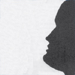
Figure 1 : Perceptions of vase & face in competition
.
A good example of a high level of ambiguity is provided by the well known vase/face illusion illustrated in Figure 1, in which we can see either a vase or two silhouetted faces. However, it is important to notice that, although we can choose between the vase or the two faces interpretations, we cannot stop the ambiguity of the situation providing a degree of tension. The force of this can be sensed by comparing the right hand side face with the identical face in Figure 2 in which there is no left hand side face to create the vase shape. Clearly, by removing the ambiguity between the vase and the two faces interpretations, the face is easier to look at. The question for artists is whether they want to maximise ease of looking or to create works with some degree of tension.
.
Figure 2 : Face only – no competition
Escaping ambiguity
As explained below, it can be argued that all paintings exhibit an ambiguity between their pictorial contents and their presence as objects with real surfaces. The the only way the escape this is to make use of one or more of the strategies that are available to us for that purpose. Not counting that of looking away altogether, these depend on concentrating attention on details at the expense of wider context, which can be done either by focusing down or by moving closer. However, although both these manoeuvres work well enough for reducing ambiguity in everyday visual perception, our eye/brains can seldom completely exclude the influence of alternative interpretations in paintings..
Real picture surface versus illusory pictorial space
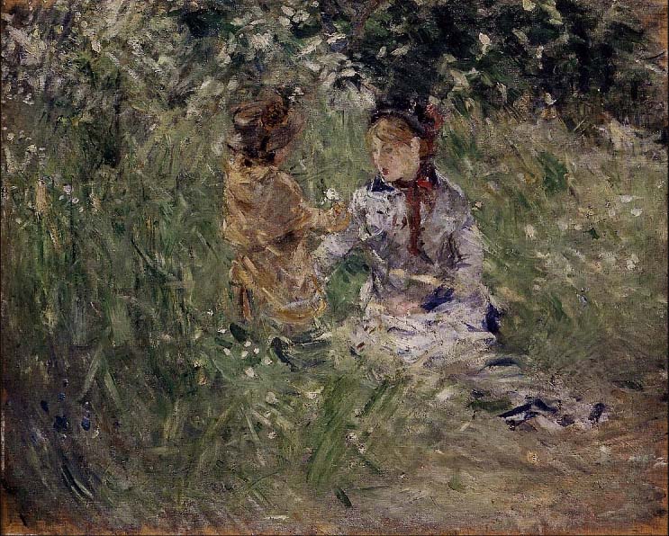
Figure 3 : Berthe Morisot – “Julie with Passie in the garden at Bourgival”
.
One type of ambiguity has had a pivotal place in the history of painting. It is that between perceptions of an illusory pictorial space and awareness of the real picture surface. Historically speaking, it became important when the Impressionists and other early Modernist Painters were looking for ways in which their hand-painted images could combat the threat posed by the high levels of realism produced by the newly available photographic method. They feared that the fact that it was so easily and quickly obtained in photographs, would undermine their livelihood.
Luckily for them and for the history of painting, they saw photographic images as deceiving the eye and hit on the now seemingly absurd idea that this deception was morally reprehensible (an idea that was still influencing artists in the 1960s and beyond). Abruptly, for progressive painters at least, the trompe-l’oeil, which for so long had been the goal of artists, became something to be avoided at all costs.
The solution found by these Modernist painters was to introduce ambiguity. Their idea was to provide a counterpoint to perceptions of illusory pictorial space by emphasizing the reality of the picture surface. The painting, by Berth Morisot, illustrated in Figure 3, provides a good example of how brush marks and surface texture can be used as a means of preventing the trap of deception. What these pioneer artists reasoned was that the impossibility of being able to enter the illusory pictorial space created by the realism of the image without being aware of these indicators of real paint and real surface, meant that a salutary ambiguity would be inevitable. What they could not have guessed is that the wealth of unexplored possibilities that the picture surface/illusory pictorial space dichotomy would make available, not only to them but also to their successors during well over a century.
An example of competing cues
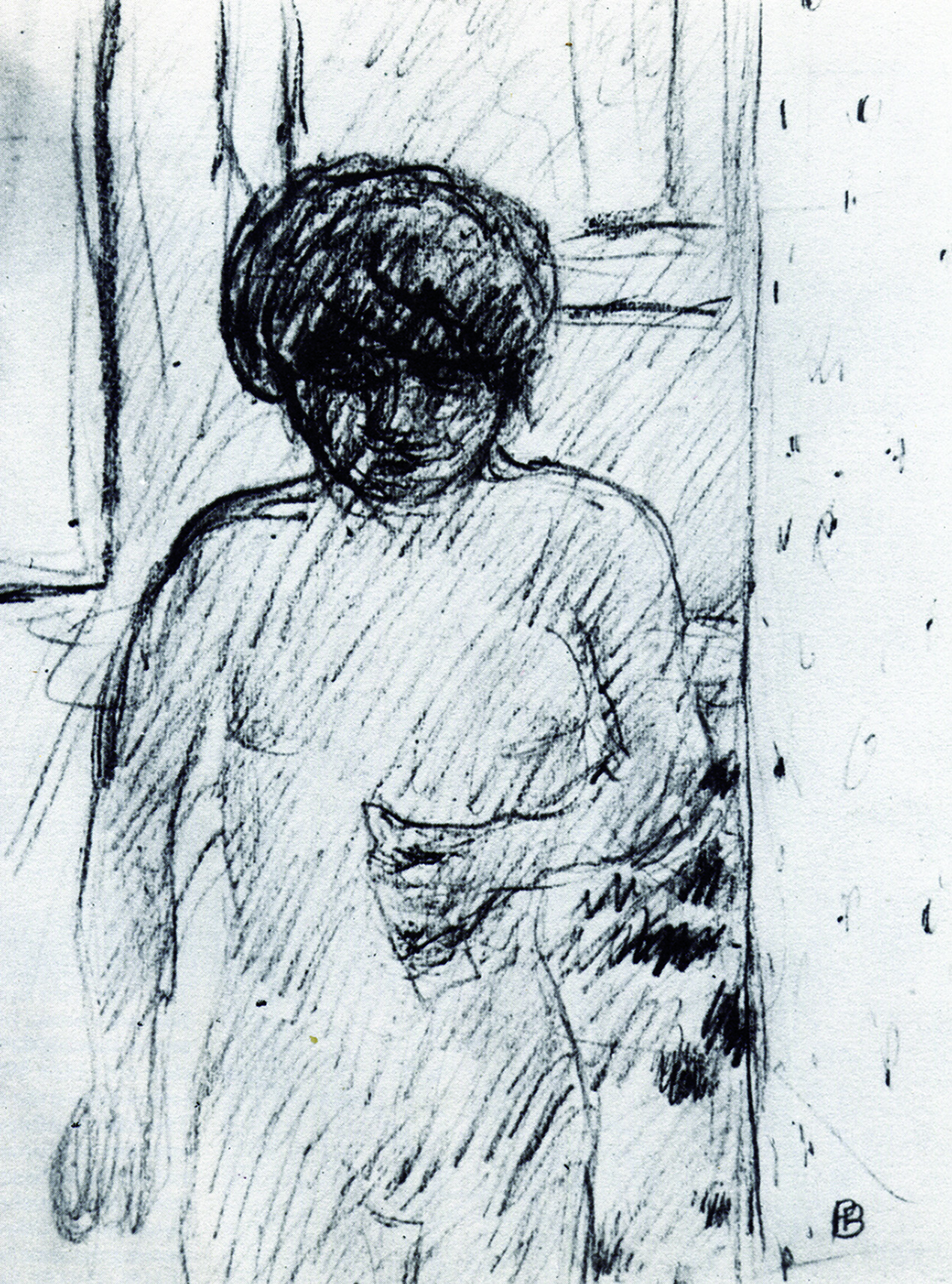
Figure 4 : Bonnard – Drawing of Marthe his companion
.
The Modernist Painters were also interested in another kind of ambiguity in which attention is drawn in competing directions. For example, Figure 4 shows Pierre Bonnard going a long way towards obscuring the features in his wife’s face, presumably with a view to allowing the telling gesture of the hand to take on more significance than it would have done had the eyes, nose and mouth been more clearly delineated. However, since this strategy completely fails to override the eye/brain’s built in tendency to give faces more importance than hands, the result is a pull in both directions. The consequent dynamic equilibrium is of central importance to the experience of looking at the drawing. Just as in Figure 1, it is difficult to look at the vase interpretation without being influenced by the two-face interpretation, it is difficult to look at either the hand or the face to the complete exclusion of the other.
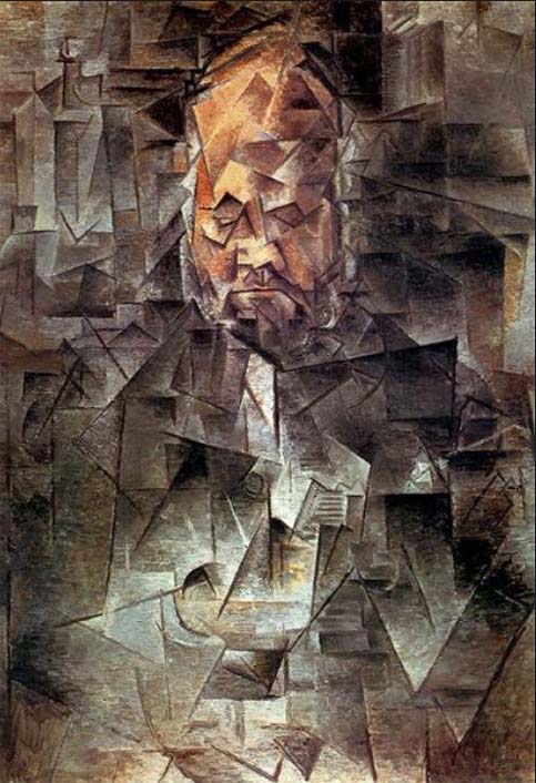
Figurative versus abstract
Figure 5: Pablo Picasso – “Ambrose Vollard””
.
Another area of competition is between pictorial dynamics based on figurative content and ones that involve non-figurative relationships such as those between colours, contours, textures, etc.. The more the Modernist Painters found their interest turning to the latter, the more they sought ways of playing down the influence of the former. A first step in this direction was that of reducing the strength of the cues that make recognition too easy (as in the case of the face in both the drawing of Marthe by Pierre Bonnard, illustrated in Figure 4, and the portrait of Ambrose Vollard by Pablo Picasso, illustrated in Figure 5). A second step was to get rid of figuration and its attention-distracting pull altogether.
Seeking to eradicate ambiguity
Figure 6 : Michael Kidner – “Penrose 093″”
.
Many artists saw great potential in the removal of figuration but did not want to get rid of illusory pictorial space, which they felt gave extra dynamic possibilities to interactions of colour, contour, texture, in front/behind relations, etc. Others were still troubled by the immorality of deceiving the eye and sought to eliminate illusion altogether. They wanted all regions of their paintings to be perceived as being flat on the picture surface, as no doubt was the intention of Michael Kidner when making the work illustrated in Figure 6.
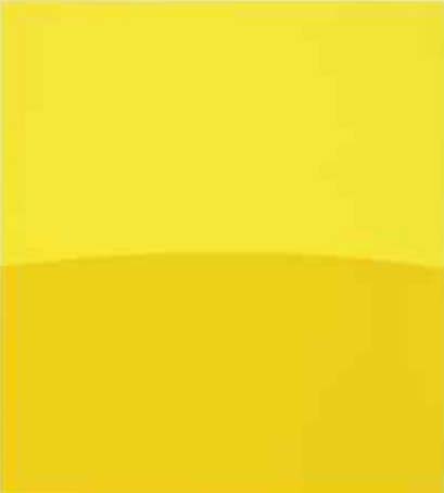
However, these purists were soon to realise that achieving this objective might prove more difficult than they had imagined. It seemed that no matter how hard they struggled, if a picture surface, had more than one region of colour on it, their eye/brains would find ways of creating perceptions of illusory pictorial space within it. In other words, they seemed unable to prevent some of the regions of colour appearing to be either in front of or behind others. Even the simplest two colour painting, such as the one by Ellsworth Kelly illustrated in Figure 7, would not do, for it gives at least some people the impression of a landmass, a horizon and a sky.
.
Figure 7 – Ellsworth Kelly – “Two Yellows”
.
Sculpture?
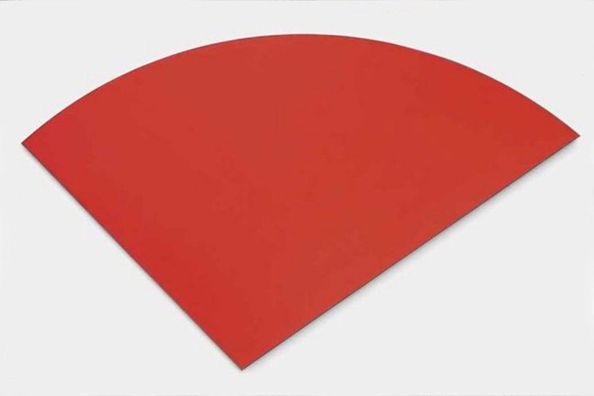
Figure 8 : Ellsworth Kelly – “Curve”
.
In the end, the only solution seemed to be one colour paintings, of which many appeared in the 1950s and 1960s. These included the series of blue paintings, embarked upon by Yves Kline in 1957, and several works by Ellsworth Kelly on the lines of Figure 8. The only ambiguity remaining lay in the question whether these were correctly classified as “paintings”. Some might think it more appropriate to describe them as “sculptures” or, merely, as “objects hanging on a wall”. For those artists who identified (in my view falsely) the search to remove the ambiguity as being of the essence of “Modernism in Painting“, it was time for “Post Modernism“.
Harmony and discord
To find out what this has to do with “harmony and discord” please consult previously posted chapters from “Painting with Light and Colour” and excerpts from the “Glossary”. In particular I suggest reading:
Today, I have been editing the entry for aerial perspective in the Glossary for my books. As I was making my corrections, I had the idea that readers of the Posts Page of this website might like a preview of this and future Glossary edits that I feel might interest them. So, to start the ball rolling, here is a slightly expanded version of the one on aerial perspective, with four images added.
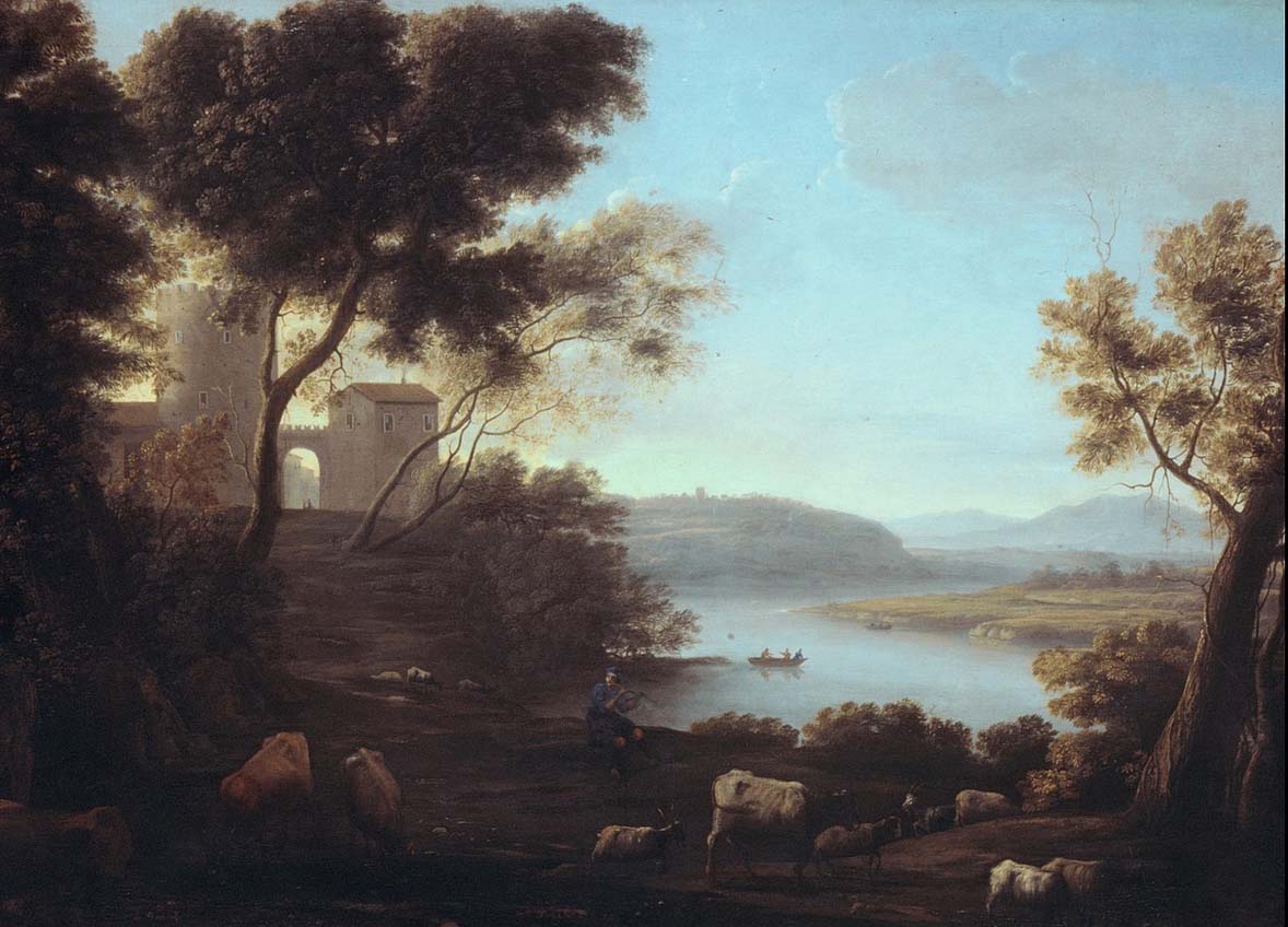
Aerial perspective: Between any viewer and the surfaces of the objects at which they are looking lies a portion of the earth’s atmosphere. In addition to the transparent gases that make up air, this contains quantities of dust and other particulate matter (such as the water droplets in mist and, more evidently nowadays, various kinds of pollution). The effect of the intervening atmosphere on the appearance of distant hills and objects seen is well known to us all. We all perceive distant parts of landscapes being bluer and/or greyer and lighter than nearer parts, and objects seen through mist or fog appear progressively greyer and lighter as the distance between them and us increases. Many artists dating back to the Italian Renaissance, most famously Leonardo da Vinci (1452 – 1519) and Claude Lorrain (1600 – 1682), have demonstrated the value of applying these principles in paintings. So convincing was their effect, that they were adopted as “rules” by the French Académie Royale de Peinture et de Sculpture soon after it was founded in the mid seventeenth century. No one would dispute that the images in Figure 1 and Figure 2 produce a sense of progressive distance.
.
Figure 1 : Leonardo da Vinci – detail of “the Virgin of the Rocks”
.
Figure 2 : Claude of Lorrain- Classical landscape
.
Warnings
Although the theory explaining aerial perspective is scientifically sound and although it virtually always has an important effect on how we perceive both distant parts of landscapes and objects on misty days, it has no discernible effect on how we perceive objects within an arms length. So at what distance does its influence become apparent? The answer is that it varies according to the composition and density of the particles floating about within it. Thus, on dry, bright days of the kind that often follow abundant heavy rain, when the air has been washed clean, the visibility of atmospheric intervention is minimised, whereas on a hot sultry or misty days, when the air is at its fullest of dust and pollution, it is maximised. In practice, this can mean that on a clear day its effect on the appearance of objects hundreds of meters away may not be discernible.
Despite these facts of appearances, over the years, I have found that many students, when they first come to my Painting School, have been in the habit of adding blue to objects much nearer than that (in one exceptional case, a newcomer, when painting a bunch of flowers in a vase, added blue to the colour of flowers and foliage at the back of the arrangement, arguing that it made it look further away). When I see this being done, it tells me is that the student in question cannot have been looking at the near/far colour/lightness relativities. If so, how can they appreciate the amazing riches of colour relations in nature? They need to learn that rules are not for following blindly, but for testing, a process which will always open doors of awareness.
To further complicate the situation, there are a number of other variables that can result in people perceiving more distant surfaces of a particular colour as brighter and more fully saturated than nearer surfaces of the same colour: In other words, the opposite of the aerial perspective rule. For example, in summertime, the green canopies of distant oak trees that are illuminated by bright sunlight will look lighter and brighter than those of nearer oak trees should they happen to be situated in the shadow of clouds. Also, a boat on a lake that is painted with a fully saturated red that is actually further away from the viewer than a boat painted with a desaturated red will still look further away. If we made a painting of them, matching as best as possible the colours as we see them, the laws of aerial perspective would predict that the further boats would be perceived as being nearer than the nearer boat. Clearly there needs to be a way of depicting distance that has nothing to do with the representation of atmospheric intervention. Luckily there are several of these, including overlap, relative size and texture cues, but only one of them necessitates the use of colour. Unfortunately, this colour-dependent way of enhancing illusory pictorial space appears to be little known, despite its solid foundations in well known history, its sound scientific underpinning and the ease of its practical application. Much of my book “Painting with Light and Colour” is devoted to giving it new life. If you want to know more, read chapters already published on this website and watch for later Posts.
Two examples of minimal effect of aerial perspective, containing contradictions to the laws as exemplified by Clause Lorrain.
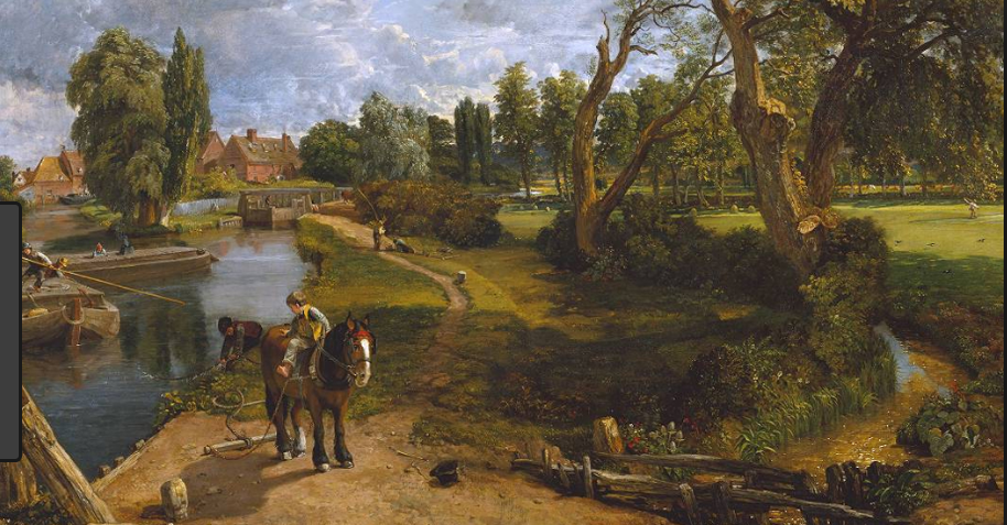
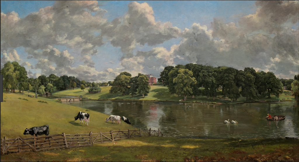
John Constable (1776 – 1837) was a great admirer of Claude Lorrain, but he looked more carefully at nature. Figure 3 and Figure 4 are images of two of his paintings that contain elements that are not consistent with a rigorous interpretation of the laws of aerial perspective. See how many you can find?
.
Figure 3 : John Constable, – “Flatford Mill”.
.
Figure 4 : John Constable “Wivenhoe Park”.
.
Now look at paintings by the Impressionists – Monet, Renoir Pissaro, Cezanne, Gauguin, Bonnard, etc. – to see how much they make use of the rules of aerial perspective. Where they do make use of them, was this the result of applying the rules or of looking carefully at nature? According to what is written above, far distant hills should always actually look bluer or greyer, but what about landscapes representing the kind of distances depicted by Constable or shorter ones?
Effect of patchy cloud cover on relative brightnessess
Finally to ram the point home, here are three photographs that illustrate how patchy cloud cover can produce contradictions to the laws of aerial perspective.
.
Figure 5 : Duller nearer/brighter further
.
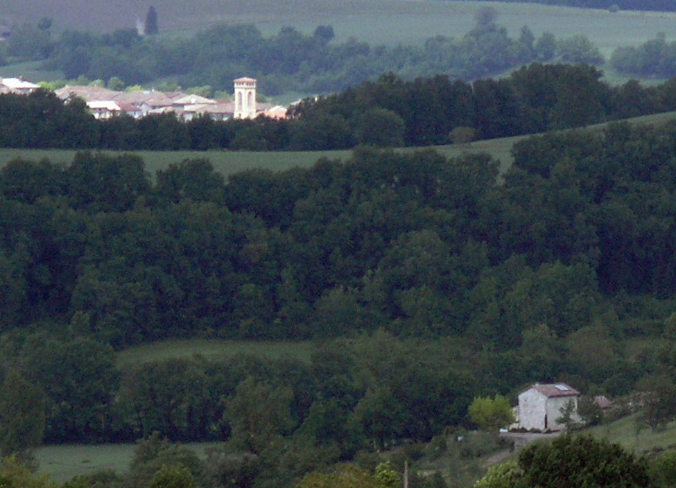
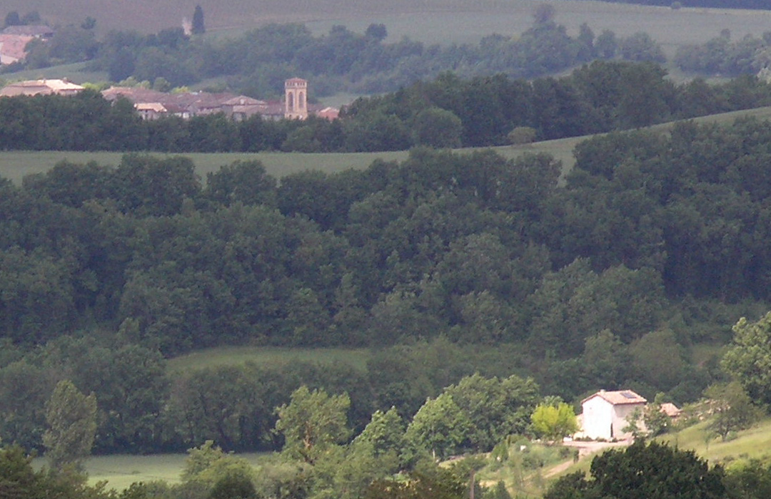
Figure 5 illustrates an exception to the law. Due to their being brightly illuminated by sunlight, the walls of the distant church tower are much brighter than those of the house in the foreground, which is in the shadow of passing clouds.
.
Figure 6 : Brighter nearer/duller further
.
In Figure 6 the situation is reversed. The walls of the house in the foreground are now brightly illuminated by direct sunlight and are much brighter than those of the church tower, which is now in the shadow of passing clouds.
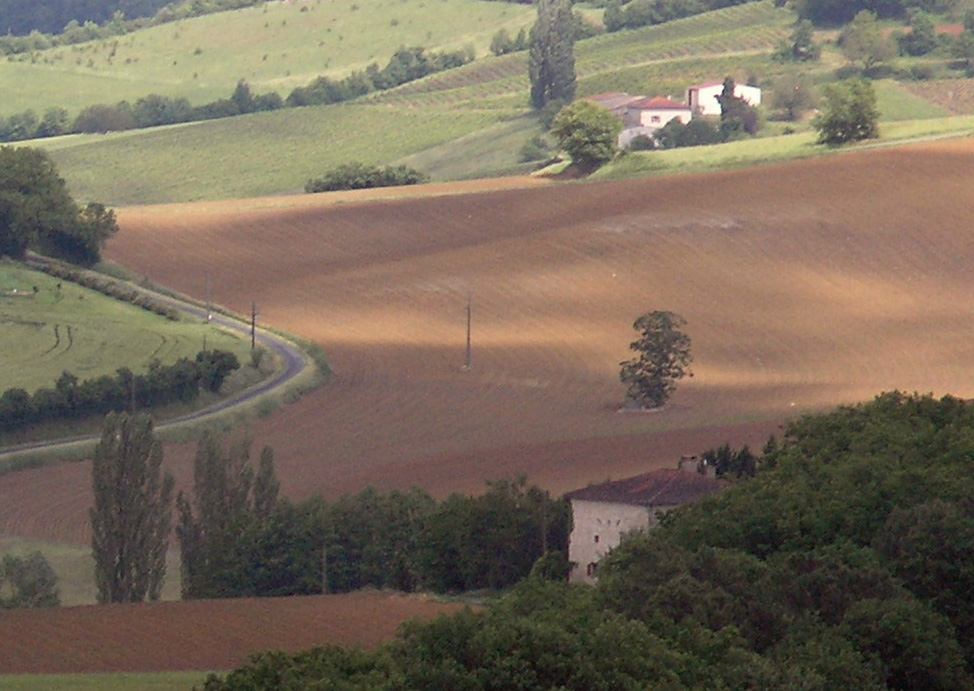
Figure 7 shows:
The far house,
The strip of green field in front of it,
The sunlit patches of brown earth in the ploughed field,
as being brighter than,
The near house,
The ribbon of green field in the bottom left of the image,
The area of brown earth immediately above it.
.
Figure 7 : Duller nearer/brighter further
.
In all three images atmospheric intervention is playing a part, but in Figure 5 and Figure 7, its effects are being obscured in the ways described.
The purpose of this Post is to provide a link to Chapter 10“Illusory pictorial space and light”, from my book, “Painting with Light and Colour”. This provides a simplified explanation of the science behind the ideas developed in earlier chapters concerning ways of creating and/or enhancing effects of illusory pictorial space by means of using mixtures containing small proportions of complementary colours. In the process it explains why the same method can be used to create harmony in paintings. It also explains why colour repetition has the potential, not only to produce visual discord, but also to generate optical excitements.
Examples of illusory pictorial space and “harmony that runs parallel to nature”
Paul Cézanne: A still life that provides an example of how making a painting that fits into the rules of Professor Bouhusz-Szyszko creates a sense of space, light and harmony.
.
Pierre Bonnard: A landscape that provides a second example of how making a painting that fits into the rules of Professor Bouhusz-Szyszko creates a sense of space, light and harmony.
.
Examples of repeated colours without mixtures of complementaries
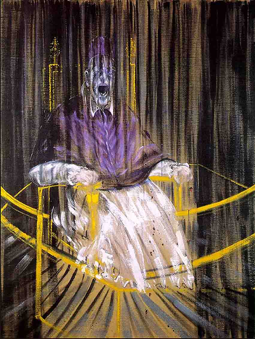
Francis Bacon: On of his Pope paintings, in which repeated colours, whether intentionally or not, enhance shock value
Jackson Pollock: Echo No 23 (detail) -The influential critic Clement Greenberg admired Pollock for creating a “space within the picture surface”.
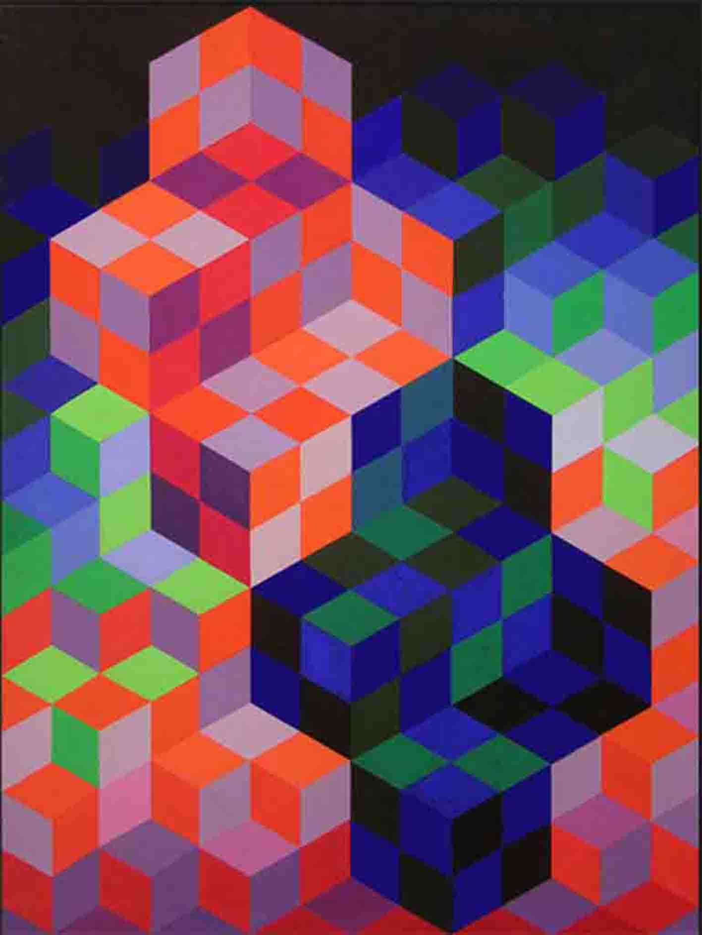
Victor Vassarely : An example of his Op Art that uses strong cognitive cues and many repeating colours to create a powerful 3D visual impact.
Other chapters from “Painting with Light and Colour”:
Members of the University of Stirling Vision Group
In many places in my books, I acknowledge the importance of the role of colleagues from University of Stirling in the development of the new science-based ideas put forward in them. In particular I mention cooperations with scientists from various departments who later were to join me in the University of Stirling Vision Group. The most important of these were:
Alistair Watson (Physics, psychology and computer imagery).
Lindsay Wilson* (at the time working on aspects of visual perception).
Also, although Peter Brophy* did not join our group, he was an ever-available and important source of information on the biochemistry of the brain.
The founding of the Vision Group.
It was in the Autumn of 1984 that Alistair, Leslie and I took the first steps in the setting up of the University of Stirling Vision Group, which was to have many meetings attended by the above named colleagues and other members of the various interested Departments. Its starting point was a package of ideas developed by Alistair and myself, and two core algorithms based on them, produced by Alistair. These were:
A “colour constancy algorithm“, capable of modelling both spatial and temporal colour constancy, which was inspired by our interpretation of how this phenomenon is achieved by human eye/brain systems. As a preliminary step to achieving this main objective, the algorithm has to pick off the information about surface-reflection. Since it was obvious that the reflected-light contained information, we speculated upon how it might be used by the eye/brain. Due to my interest in picture perception, we focused on its potential for computing surface-form, in front/behind relations, and the wavelength composition of ambient illumination.**
A “classification/recognition algorithm”, based on our interpretation of how human eye/brain systems achieves their primary task of enabling recognition.***
We could not help being excited by the early tests of these algorithms and the speculations concerning their potential. In our enthusiasm to push matters further, Alistair suggested we should seek the help of other researchers, particularly ones with expertise in:
Mathematics and computing.
Visual perception with special reference of visual memory.
It was at this juncture that, having decided on a name for what we were hoping would become a collaborative group, we contacted Leslie Smith for his mathematical and computing skills. But this was only a start. Once Leslie was on board, we approached Bill Phillips, whose long standing interest in visual memory had led him to take the plunge into the recently emerging domain of neural networks and learning algorithms. After many Vision Group meetings, much sharing of ideas, many hours spent working on implementations of algorithms, and the writing of a number of working papers, we decided to submit a suite of five grant applications to the Science and Engineering Research Council, who had let it be known that they were looking for groups of researchers working on the use of computers to model the functional principles of neural system. The stated aim of the SERC was to set up a small number of “Centres of Excellence” in this domain. Not only were two of our grant applications accepted (one submitted by Bill Phillips and one submitted by Leslie Smith), but also our university was encouraged to create a brand new Centre for Cognitive and Computational Neuroscience . This empire absorbed the University of Stirling Vision Group which ceased to have an independent existence. Its coming into existence also coincided with my departure from Stirling on my way to founding my Painting School of Montmiral, where I intended to put theory into practice both in my own work and in my teaching. I also had hopes of confirming and, with any luck, extending the theory. Also after leaving Stirling University, Alistair and I were founder members of a small software development company which used ideas developed within the Vision Group as a basis for creating an image manipulation tool. ****
__________
* The links to Bill, Leslie, Lindsay and Peter relate to their current status. Alistair, Karel and Ranald all retired or died before the Internet became the essential information source it has since become.
** My book is full of examples of how fruitful this speculation proved to be.
*** In 1987 Alistair published: “a new method of classification” in Pattern Recognition Letters, Volume 6, Issue 1, June 1987, Pages 15-19
What we see is not light, but experiences created by neural networks within the eye and the brain (what I often refer to as “eye/brain systems”). Although it is true that the visual world that we know could not happen in the absence of the patterns of light that enter our eyes, it is only made manifest to us as a result of what is going on inside our heads. This Post provides a link to Chapter 9 of my book “Painting with Light and Colour”, which describes two demonstrations that show just how great can be the difference between an image predicted on the basis of readings from a light meter and the one we actually experience.
Edwin Land’s demonstrations
The demonstrations have a personal importance because they played a key role in the story of my quest to explain the paradox inherent in the dogmas of Marian Bohusz-Szyszko(explained in Chapter 2). They were devised by Edwin Land, the famous inventor, as a part of his investigation of the phenomenon of “colour constancy”.
For another relevant source of information on Land’s demonstration please consult “Land’s colour constancy demonstration”, an edited version of a chapter from my book “What Scientists can Learn from Artists”. You might also want to read the original article in “Scientific American, December 1977”. In this Land explained what he described as his “Retinex theory of colour vision”.
The multicoloured display used by Land as the cover for his 1977 article in the “Scientific American”
.
Other chapters from “Painting with Light and Colour”:
The main purpose of this Post is to explain what I mean by “Seurat’s new idea”. Most people would probably leap to the conclusion that I am referring to the “Pointillist method” that he developed, and for which he is justly renowned. But the method was never the main idea, which was to “paint with light” (as opposed to merely “painting light”). No previous artist had attempted to do this.
Artists that preceded the Impressionists, at least since the Italian Renaissance, had given priority to depicting effects of natural or artificial light on the appearance of objects and scenes in their paintings. They made impressive progress with this project by conceiving matters in terms of whole-field lightness relations (chiaroscuro). Seurat’s new idea opened up the previously unexplored possibility of introducing the dimension of colour into the mix. In doing so, whether directly or indirectly, Seurat was responsible for opening the way for the exploration of new worlds of colour related experience.
Part of the reason for this was simply the huge increase in the number of colours that Seurat’s method brought to the notice of his contemporaries. Of particular interest for the Impressionist and for all artists coming after Seurat shared his method was that, from now on, chiaroscuro was no longer the only way of imbuing paintings with a sense of light. A main reason for this was that the same levels of nuance that had previously been obtained by means of lightness variations alone could now be achieved by compressing colour variations into much narrower ranges of lightnesses: By the 1960s, art school students were being taught that anyone aspiring to be a colourist should confine themselves to using equal lightness colours.
The idea of compressing lightness space played an important role in the remarkable explosion of colourfulness that is characteristic of innumerable paintings produced after Seurat exhibited “La Grande Jatte” in 1886. This revolutionary development been set on its way by the discovery by scientists in the late eighteenth and earlyy nineteenth century that colour is not a property of surfaces in the external world, but a creation of eye/brain systems. In the wake of this mind blowing reality and the availability of an ever increasing range of pigment colours produced as spinoffs from the Industrial revolution, earlier Modernist artists were using brighter colours and juxtaposing complementary pairs before Seurat came on the scene. However, two requirements of the Pointillist method pushed matters significantly further. These were:
The systematic use of juxtaposed complementary colour pairs, within the optically mixed arrays of tiny dots that characterise Pointillism.
The need to conceive of colour-mixing in terms of a colour circle with many more segments than the six segment one (consisting of three primaries and their three complementaries) favoured by the Impressionists. Seurat’s idea meant that he had to represent as many parts of the visible spectrum as possible. To do this he needed to make use of the widest range of the most fully saturated pigment colours available.
The ramifications of all this revolutionised painting, including the new understandings relating to the depiction of:
“Illusory pictorial space”
“Surface” and “surfacelessness”.
In summary, these innovations not only hugely increased the range and subtlety of colours, colour combinations and colour interactions that could be achieved in paintings, but also provided the possibility of enhancing all light-related qualities in them.
For more details click on the link below to Chapter 8 of my book “Painting with Light and Colour”. For those who have not read the previous four chapters, the next section provides a short resume of them (links to the chapters themselves can be found at the bottom of this page).
Short resume of previous chapters
Chapter 4: Describes the Renaissance approach to painting light, which centred on local and whole-field lightness relations with particular reference to finding the darkest and lightest regions in the scene (chiaroscuro) and gradations of lightness across surfaces. In this scheme of things the depiction of shadows was a matter of painting “what you see”, which seemed reasonable enough, but brought with it all sorts of unsuspected problems.
Chapter 5: Focuses on the scientific revolution in the understanding of light and colour that had its origins in the work of Isaac Newton and the insights of the numerous scientists who realised that all sensory experiences including those that relate to colour and effects of light are made in the head. Newton clarified the physical nature of light. The perceptual scientists introduced concepts like the“three primaries”, “induced colour”, “complementary colours” and “colour/lightness contrast effects”.
Chapter 6 : Shows that the Impressionists had an agenda which included the idea of emphasising the reality of the picture surface and playing off against one another the ephemeral and the permanent aspects of appearance.
Chapter 7: Uses photographs to elucidate the meaning of the words “opaque”, “translucent”, “glossy” and “matt”. Particular attention is given to effects on appearances of interreflections and viewing angles.
The diagrammatic origin of Seurat’s new idea
As it does not appear in Chapter 8, but earlier in the book, I am including in this Post the diagram from a physics book that kick started Seurat’s new idea. It was from this that he learnt that the white daylight light that strikes a surface interacts with it in one of two ways:
One part enters the surface and is scattered around inside, before being scattered back out again. While inside, some wavelengths are absorbed. The remainder are scattered-back-out again to produce the limited wavelength combinations that give us “body colour”.
The remainder never enters the surface, but is reflected back directly from it (as from a mirror), such that it leaves it without changing its wavelength composition to produce “reflected light”.
The component that interested Seurat is the “reflected light”. By combining his understanding of this with the discoveries of perceptual scientists mentioned above, Seurat believed that he could represent it in paintings by means of mosaics of tiny dots containing juxtapositions of complementary, or near-complementary, pairs.
The diagram that seeded Seurat’s new idea. It is the reflected back “white” light that informs the eye/brain about surface-solidity, surface-form, in front/behind relations and ambient illumination.
Posts relating to other chapters from “Painting with Light and Colour”:
When new students at The Painting School of Montmiral are first faced with a live model in a figure drawing class, the majority of them give little time for preparation, even for long poses. Within a matter of seconds, even experienced artists have embarked upon active mark-making. It does not seem to occur to them that, before drawing the first line, it might be useful to spend time familiarizing themselves with the situation that faces them. If this is the case, they will almost certainly be denying themselves an important opportunity.
The feeling-based drawing lesson
At the heart of my book, “Drawing on Both Sides of the Brain“, is a feeling-based drawing lesson that is described in three chapters. Chapter 9(link below) is about getting ready for drawing the first line. Chapter 10 (to follow) gives a blow by blow account of the main lesson in which:
Precise instructions are given concerning the preparation and execution of every line and every relationship.
Detailed reasons are offered for each and every one of these instructions. These relate to scientific studies of how artists coordinate their visual-analytic and line-output skills when drawing from observation.
Chapter 11 (to follow) suggests follow up exercises.
Preparation in previous chapters
All the chapters preceding Chapter 9 have been preparing for this lesson. Thus, they have discussed:
The pros and cons of widely used teaching methods.
The importance of scientific findings in the development of artists ideas.
How more recent scientific findings relating to the eye/brain’s analytic-looking and motor-control systems can help with issues of accuracy, line production speed, self-confidence and self expression.
Preparation in Chapter 9
Chapter 9 is likewise getting things ready for the drawing lesson, but in a much more specific sense, starting with practical issues such as setting up the easel/drawing board, establishing a viewpoint, deciding whether to shut an eye, etc. But it also introduces a certain amount of science-based information that will be useful in explaining reasons for the instructions used in the drawing lesson.
As Chapter 9 contains footnotes that refer to diagrams with explanations to be found in the Glossary, I have included three of these:
Figure 1 is the flow diagram representing the main factors that contribute to the analytic-looking cycle.
Figure 2 indicates regions of the neocortex (new brain) involved.
Figure 3 provides a mapping of eye movements showing glides and saccades.
Figure 1
The boxes and arrows in Figure 1 can be related to regions in the neocortex illustrated in Figure 2. Notice that Visual Area 1, which takes input from the retina via the optic nerve, supplies information not only for the preconscious processes that enable recognition, but also for the subsequent consciousness-related ones that accompany analytic-looking (This is why it is labelled “twice used information resource”).
In addition, the diagram indicates the key role of memory stores (whether short-term or long-term) in enabling both recognition and learnt-actions. It also calls attention to the importance of context and feeling in building them up and ofwhole-life experience in determining how they do so. But perhaps the most important lesson that can be drawn from it is that recognition takes place before analysis. Thus it can be asserted that, in an important sense, “we know what we are looking at before we are consciously aware of it”.
Recognition also takes place before the implementation of learnt-actions, such as those that guide artists when drawing contours or making any other kind of mark. Accordingly, we can draw “what we know” about an object-type on the basis of the multi-modal, preconsciously acquired information made available by the very limited number of looks that are required to enable recognition (seldom more than one or two). In other words, the eye/brain acts as if further analysis of the object itself is unnecessary. The diagram also indicates the role of non visual-inputs in enabling recognition. For example, we may recognise something, in whole or in part, by its sound, smell or feel and can in princple complete the process of doing so without confirming what it is visually.
Figure 2
Figure 2 maps a number of the functional divisions in the neocortex (new brain). These can be related to the stages of the analytic-looking cycle as diagrammed in Figure 1. Thus:
The arrow labelled “visual cortex” points to the location of “visual area 1” in Figure 1
The region from there down to “temporal lobe” corresponds to the labels “preconscious multimodal processing” and “recognition” in Figure 1.
The motor cortex mediates “learnt actions” in Figure 1.
The parietal lobe underpins “conscious analytic-looking” and “the constancies of shape, size, and orientation” in Figure 1.
However, the area in Figure 1 labelled “context” and “feeling-based memory reflecting whole life experience” is more difficult to place, but would include:
Parts of the “frontal lobe” with its links to the emotional centres in the old brain. These are thought to be involved in the choice between “good” and “bad” actions and the determination of “similarities” and “differences” between things or events, both of which are essential to developing the skills that underpin drawing from observation (as explained in Chapters 9 – 11).
The frontal lobe, along with old brain regions including the hippocampus, is also thought to play an important part in the creation and retention of long-term memory.
Figure 3
Figure 3 is based on a photographic record of typical eye movements in which slow moving glides (wobbly blue lines) are interspersed with faster moving saccades (straight red lines with arrows to represent speed). The glides provide a constant stream of same/different information, while the saccades enable an intermittent averaging of input that is useful for neural computations that require knowledge of ambient illumination. The average glide/saccades combination lasts approximately one third of a second.
Other Posts that publish chapters from “Drawing on Both Sides of the Brain”
The word “abstract” is commonly used to refer to a wide variety of paintings. Therefore, there is clearly some confusion as to precisely what it means. This is partly because its usage by artists and critics has evolved over the years and partly because its subtleties have been degraded by an uninformed public. One unresolved issue is where to draw the line between “figurative” and “non-figurative”. Few nowadays would describe Paul Cézanne as an abstract artist (see image below), yet his working philosophy exemplifies the original meaning given to the word.
_________________________
This Post, like many others, is an illustrated excerpt from “Having fun with creativity”, Chapter 10 of “Fresh Perspectives on Creativity”. What is meant by “having fun”, is enjoying a process by which thoughts, however trivial or wrongheaded, lead to a mushrooming of other thoughts and, thereby, to an exploration of issues that otherwise might be passed over. What follows, not only touches on the subjects of abstraction and construction in painting, but also how these relate to the processes by which the eye/brain systems synthesise meaning from visual input. The four sections are headed: 1–ABSTRACTION, 2-CONSTRUCTION, 3-CHANGES IN MEANING and 4-IMAGES OF PAINTINGS (illustrating, “Abstracting the essence” and “Constructing from the basic building blocks of visual perception”).
1-ABSTRACTION
What is an abstract painting?
So what qualifies as being an abstract painting? An explanation as to why the word “abstract” was chosen in preference to other words offers a start to the answer. Why not “extract” or “subtract”? It is worth asking such questions because doing so can help a process of refining understanding. It enables the use of same/difference judgments within the domain of words as a means of creating and/or nuancing our sense of their meaning. Thus:
The word “extract” means take something out of something.
The word “subtract” means take something away from something.
In either case the original something is diminished. In contrast:
The word “abstract” means distilling the essence of something, with the implication that this can be done without loosing essential meaning.
Accordingly, the word “abstract” seems best of the three because it implies the possibility of finding what is valuable with the least collateral damage. This is why it was chosen.
Eye/brain issues
However, there is still much ambiguity that requires clarification. If we take the example of the “abstract” of a scientific paper, it is easy to see that however well written, something must have been lost, since otherwise there would be no need for the paper itself. In the case of artists’ abstractions from natural scenes, the situation is less clear, particularly since the image of every scene that comes to our consciousness is produced in the first place through the mediation of eye/brain processing systems that arrive at their conclusions by means of a complex blend of selective and constructive processes. We look at a coffee mug differently according to whether our intention is to drink from it or to make a drawing of its outline. When we want to drink from it, we will normally bypass all information about it except that which is necessary for picking it up and putting its brim to our our mouth. When we draw its outline, we need to make judgements of relativities of position, length, orientation, curvature, etc., and we can safely ignore the information needed to drink from it.
Nor, in this context, should we ever forget that what we experience as “seeing” depends heavily on information coming from non-visual sources accessed (a) by other sensory systems and (b) by memory-stores that have been built up and refined during a lifetime. Thus, both the knowledge that it is coffee time and the smell of coffee, provide context that helps our visual systems to home in on the coffee mug. When we are confronted by a landscape, the way we look at it and the information we derive from it are determined by a mixture of current contingencies and our life’s experience. No two people would find the same essence in it. Indeed, it is now clear that in creating conscious visual experience, our eye/brain systems ignore a great deal more of the information coming into our eyes than they make use of. A mathematician might suggest that they ignore an infinite amount of it.
So how do these facts help us to think about looking at paintings? What differences are there between looking at a real world object and an image of it found in a painting? Generally speaking, when we look at a painted image, situated in illusory pictorial space, the information available will be much less than can be accessed from the real world object. For example, no matter how photographically realistic it may be, an image painting onto a flat surface will not provide the eye/brain systems with the kind of spatial-depth information that is created by means of either stereopsis or motion parallax. Likewise, a sketchily produced portrait will contain much less information than an actual face.
But what is the effect of this impoverishment of available sources of information on the efficiency of the eye/brain visual systems? Does it make their task more difficult? Not necessarily so. As indicated above, all correct classifications are achieved without taking a great deal of potentially relevant information into account. It is worth remembering that efficiency can be defined as achieving an objective with the least possible effort. In the case of the impressive efficiency of eye/brain systems, this means overlooking as much visually available information as is feasible. If we take full advantage of contextual information coming both from other sensory systems and from memory, it can mean overlooking practically all of it. Elsewhere, I give the example of a blur of redness being a sufficient cue to identify a familiar dress in a familiar wardrobe in which it is known that no other red dresses have been placed.
This impressive degree of parsimony has interesting implications for artists. For example, does it mean that a blur of red could adequately represent the dress in a painting? The answer to this question depends on what is meant by the phrase “adequately represent”. In the obvious sense, the answer must be “no”. Nobody would expect the woman in question to reach out for the painted image of a red dress in the wardrobe in the expectation of being able to wear it. On the other hand, the red in the painting might trigger either “feelings” or “memories” associated with the history of the dress that the real dress would not. If it does, how could this influence the experience of people looking at paintings? Two questions, bring us nearer to an answer:
Could feelings be stimulated by a particular red as itself. For example, it is perfectly possible for the colour of an individual stick of chalk pastel to access deeply embedded associations that trigger powerful emotions. If so, could these be added to the experience generated by a pastel painting of the red dress? Of course they could: I thought of the example because I know of an artist for whom love of her pastel sticks was integral to her way of making paintings.
If the the act of seeing the patch of red paint triggers “memories”, how much information could be added from memory stores? And, would these additions be more or less authentic than the information that would be accessed by the woman, if confronted by the actual dress? Since, the real object presents a maximum of information about its characteristic, there is no doubt about the theoretical answer to this question: the real dress has every advantage. But the question for the artist is not whether the red dress would provide more information, but how much of it would be used in practice and for what purposes?
Remember that efficiency can be defined as getting the best results by means of the least amount of effort. In the case of locating the real dress in the real wardrobe, this means identifying it with the least amount of looking. As explained above, the eye/brain systems regularly achieve wonders of parsimonious looking by making maximum use of “context” and “memory stores”. It follows that, the very familiarity of both the dress and its location would make it possible to achieve the goal of finding the dress while overlooking the totality of information other than the blur of redness.
However, the question arises as to whether this massive overlooking mean that the pictured dress might have the advantage over the real one when it comes, either to the amount of information about the dress actually acquired or to the potential for providing stimuli for the creative imagination? In both cases, the answer must be in the affirmative, since it could be argued that a pictured dress:
Would provoke the eye/brain systems into extra analysis, on account of its being less familiar than actual dress.
Would leave extra room for flights of the imagination, on account of its lack of interpretation-constraining details.
In other words, there are good reasons for concluding that, in practice, if not in necessarily in theory, an image of a depicted object perceived as being in illusory pictorial space will regularly, if not always:
Provide the eye/brain with more information than the real world object it represents.
Act as a better catalyst for the creativity of the imagination.
Needless to say, this is one of the many advantages that paintings have over nature.
The influence of others
Another possibility is that the dress-owning woman may fail to make a connection between the patch of red in the painting and the dress it was intended to represent, but that a friend does make a connection. If the friend shares her experience with the woman, by doing so she will be adding another level of context and, thereby, in all probability, causing a change in the meaning of the patch of colour for the dress-owning woman. Significantly, the revised significance could be achieved without making any changes to the actual colour.
But this is not all. One thing of which we can be quite certain of is that the representation of the dress in the head of the friend will be very different to that in the head of its owner. There is no possibility that both will have the same associations between the dress and happenings in their very different life stories. The interesting implication for artists is that what applies in the case of the two friends, also applies to them. When they apply a colour to a painting, they can have no way of knowing all the associations it might trigger in any one other person. Speaking generally, all human beings can say or do things that act as catalysts to the experience of others that are inaccessible to themselves. Indeed, it is difficult to see how communication between individuals could take any other but in this essentially catalytic and creative form.
2-CONSTRUCTION
But all this talk about “abstraction” in paintings and by the eye/brain systems has a soft underbelly for, as we all know, for some time now, the word “abstract” has been routinely applied to paintings that have absolutely no reference to nature, let alone to some essence extracted from it.
In the early 20th century, a number of painters and sculptors acknowledged the significance of this flight from representation by calling themselves “Constructivists” . These pioneers of non-figurative art adopted a radically new approach to their work that had much in common with the physicists of the day, who were on the trail of the building blocks of matter and the principles by which they are combined. Thus, the artists sought to identify the “primitives” of visual perception and to find objective principles for assembling them into art works.
By the fact of approaching paintings in this way, these artists saw themselves as challenging the long held assumption that painting should start from nature. Accordingly, it would be inappropriate to describe their work as distillations of it essence. For a growing number of them, including Kupka, Malevitch, Kandinsky and Mondrian, an alternative was needed that would be founded on a combination of the most basic elements they could think of and simple principles of construction. Over the years, this change of emphasis was reflected in the emergence of a host of different words or phrases to describe how different artists approached building on these foundations – “Constructivist”, “Non-objective”, “Concrete”, “Op”, “Systems”, etc., but all could be places under the umbrella of “Constructivism”.
3-CHANGES IN MEANING
As time passed the situation became more and more complicated. On the one hand there were critics trying to provide more precise classification and on the other there were artists exploring an ever expanding range of possibilities. Distinctions got blurred and terms like “Abstract Expressionism” confused the issue. The artists who were known by this name, were no longer abstracting from nature but rather attempting to make manifest their innermost feelings or allow universal forces to become manifest through them. In this situation, while artists were likely to choose and cling to one or other of the cavalcade of different meanings, the generality of people adopted the catch-all, common usage of today. For them the word “abstract” means anything that is not too closely tied to representation.
Conclusions
Students sometimes ask me to explain “abstract art” to them. As this request is almost invariably made by people whose focus has been on representation, I tend to answer in terms of the origins of the word. I point out that artists living in the second half of the 19th century, influenced by recent developments in the science of visual perception, became aware that all paintings could be described as an “assemblage of regions of colour on a picture surface”,*as interpreted by eye/brain processing systems. Once this conceptual step had been taken, it was only to be expected that, for some artists at least, the idea of looking to nature as the fount of all inspiration was bound to be questioned. From then on, it was only a matter of time before many artists either loosened their ties with representation or completely cut themselves off from it.
As for deciding which word we should choose when talking about any particular painting or group of paintings, including ones we have painted ourselves, my answer would be to take your choice in the light of the considerations discussed above. Perhaps, the main objective should be that you yourself understand the issues, at least well enough to be able to explain them to anyone who asks questions about your work. Meanwhile, the general public will continue to think of “abstract” as more or less anything non-figurative and pretty well everyone will have personal opinions about what counts as figurative. The difficulty lies in deciding on which point on the figurative/non-figurative continuum.
4-IMAGES
Abstracting the essence
Paul Cézanne sought to represent the permanent, underpinning constancies of natural appearances. He had little interest in depicting the ephemeral surfaces of nature, which, according to him, the Impressionists were doing their best to capture in their paintings. His aim was to tap into what he saw as the essence of nature.
Like Cézanne, Pierre Bonnard had no desire to paint fleeting effects of natural appearances. Rather, his objective was to capture the experience of coming across a scene for the first time. This explains why his method was to catch the moment by roughing out what he was seeing by means of a quick feelings-based pencil study and then “get away from nature as quickly as possible”.**After that it was a matter of holding onto the memory of the feelings and the colour nuances long enough to guide him through a first stab at a painting. The rest was a matter of allowing the memories and the feelings to mature and guide the progress of the painting. In this way he hoped to recreate something that reflected the essence of his experience.
Pablo Picasso‘s idea was to get closer to the essence of our everyday experience of visual appearances, which regularly involves integrating information coming from different viewpoints into one perceptual construct. Piet Mondrian moved through figuration to abstraction, before turning to construction. In the painting illustrated here, he was seeking to abstract the essence of a tree in terms of the pictorial rhythms it suggested to him.
Jackson Pollock sought to go beyond personal taste and make manifest aspects of the common ground in human experience. This he believed could be accessed by getting in touch with the collective unconscious posited by Carl Jung. To bypass his personal prejudices, he entered a trance like state that, according to him, allowed an essence of humanity to “come through” into his painting.
Constructing from the basic building blocks of visual perception
Piet Mondrian abandoned abstraction as a result of his efforts at constructing what he described as a “spiritual space”. According to his philosophy this prioritised the elimination of illusory pictorial space. This is why he determined that his paintings would provide neither object reference nor perceptions of in-front/behind relationships.
Georges Vantongerloo used mathematical procedures as a method of determining the structure of his compositions. In this respect he was a precursor of the many later artists who were to adopt systematic approaches to the composition of their paintings.
Bridget Riley sought to create optical excitements using systematic transformations based on the rules of linear perspective.
Michael Kidner’s project was to use simple systems to take him beyond the control of personal taste into unimaginable worlds. In constructing this massive painting he used a code, based on variations in the vertical dimension of otherwise standardised vertical, rectangular, black elements, to represent regular transformation of the curvatures of a four sided column (see below), as revealed by systematic changes in viewpoint. Key to the variations produced in the painting was the fact that each of the contours of the the four surfaces of the column were based on different mathematically determined wave forms. In a very real sense, Michael’s procedure could be described as a much more recent variation on cubism. The above painting with the column in front
* Quotation from the Nabis artist Maurice Denis.
** Quotation from Bonnard.
_________________________
Other posts from “Having Fun with Creativity”, Chapter 10of“Fresh Perspectives on Creativity”
Experience with new students suggest that there is a need for clarifications on the meanings of the word “colour” and a number of related words and phrases. The following excerpt from the Glossary to my books on drawing and painting provide answers to the questions listed below, and many others.
What is meant by “body colour”?
What is the difference between “brightness “ and “lightness”?
What is meant by “reflected light”?
How can colour be used to enhance perceptions of illusory pictorial space?
Are “black” and “white” colours?
Are cast shadows “black“?
What follows relates to several already published Posts. For example:
In everyday language the word “colour” has four main meanings. The first three of these can be explained in terms of the interaction between surfaces and the light that strikes them as diagrammed in Figure 1.
.
Figure 1: The two ways light interacts with surfaces, giving information about surface-reflection profile and body colour
.
“Surface-reflection” : A part of the incident light is reflected directly back from the surface without changing its wavelength combinations. This is“surface-reflection” and is one of several sources of information that enables the eye/brain to create the experiences of surface-solidity, surface-form and in front/behind relationships.
“Body-colour”: The remainder of the incident light enters surfaces and interacts with the pigments in them, such that some of its wavelengths are absorbed (i.e; turned in to non-visible electromagnetic energy) and the remainder is scattered about within the surface, before being scattered back out again into the eyes of the viewer. It is this scattered-back-out light that gives surfaces their “body-colour”, enabling us to see the surfaces as their characteristic colour (e.g. red, blue, brown, grey, skin colour, leaf colour, earth colour, sky colour, etc.).
“Transmitted light”: In some cases, a surface can be viewed from the side opposite to the light source, in which case, it is said to be “translucent”. When this is the case, the light that enters a surface and interacts with the pigments in it is scattered out on the other side, into they eyes of a viewer. Accordingly it is described as “transmitted light”. It is this that that gives us the colours of stain-glass windows and translucent leaves when seen against sunlight. In the virtual absence of surface-indicating reflected-light, we perceive such colours as both surfaceless and formless. Two other examples of familiar, perceptually surfaceless colours are the blue of the sky and the colours of the rainbow.
The fourth meaning is more prosaic:
Paint or pigment colour: The word “colour” is also used to describe any selection from the gamut of paints, pastels or crayons used by artists to give colour to their paintings. Thus we talk about the “colours” contained in our paint box, or of the “lemon yellow” and “cobalt blue” tubes of paint to be found in it.
Colour 2: Colour, light and physics
While in everyday language “colours” are referred to with words like “red”, “blue”, “yellow”, “pink”, “brown”, “grey”, etc., and we are all familiar with what they mean, physicists have preferred to describe them in terms of electromagnetic energy and combinations wavelengths and levels of intensity. Accordingly, they are likely to describe the three cone-receptor types in the retina at the back of the eyes as being relatively sensitive to “short”, “medium” and “long” wavelengths. However, even physicists can lapse into referring to them, more colloquially, as “blue”, “green” and “red”, a slippage which can lead to significant misunderstanding. If we wish to understand the nature of colour vision, it is important to realise that knowing the wavelength of the light coming into the eyes from a surface is by no means the same as knowing its colour. Light has no colour: Colour is a creation of eye/brain systems gathering and comparing information from arrays of inputs (as explained elsewhere in these Posts, as well as in the chapters of my books).
One consequence of this fundamental truth is that, although there is indeed a correspondence between wavelength profiles and the colour perceptions that they stimulate, this is not as simple as many people seem to believe. It is only occurs if all the wavelength profiles entering the eyes from all parts of the scene being analysed during the colour-creating process are taken into account. Likewise, our experience of colour in paintings does not depend simply on the absorption/reflection properties of individual regions of pigment colour but rather on the absorption/reflection properties of all the regions of pigment colour on the entire picture surface. In other words, they depend on “whole-field-colour-relations”.
Figure 2: A diagrammatic representation of the colour sphere
.
Colour 3:
As with all words with a long history, the word “colour” has evolved in terms of its meanings and it is therefore it is important to be careful when using it. Most commonly it is used to describe visual sensations that are experienced as attributes of surfaces or regions of surfaces in the external word. We talk of “red” roses or “green” grass because we have learnt to use these words to describe our experience of “red” and “green” objects that we come across in daily life. However, in the eighteenth century, scientists of visual perception realised that colour is not anything of the kind. Rather it is a creation of eye/brain systems based not only on information coming into the eyes from the surface that is being perceived as coloured, but also from the surfaces that surround it. In short, they realised that the experience of colour is both brain-made and context-sensitive. Together these two insights made it clear that the colour of a surface cannot be equated with wavelength combinations of the light reflecting from it, as physicists had been doing. For more on this see the section on colour constancy under the constancies in this Glossary.
Soon after the physicists made new contributions to the progress of understanding about colour by going deeper into the subject of the information that the eye/brain picks up from surfaces. What they found was that it is made up of two components with very different properties. In this series of books these are called “body-colour” and “surface-reflection”. Figure 1 shows that when daylight, containing all the visible wavelengths strikes a surface it is divided into two parts:
One part penetrates the surface. When inside, some of its wavelengths are absorbed and others, having been scattered around inside, are scattered back out again into the eye of an observer. This is the “body colour” (what we see as the green of leaves, the yellow of ripe corn, the flesh colour of flesh, etc.). As far as I know, nobody has estimated the number of different body colours in the visible world, but there are clearly at least many thousands.
Another part never enters the surface. Rather it is reflected directly off it according to the rule the angle of incidence is equal to the angle of reflection. Since no light is absorbed during this process, the incident light and the reflected-light contain the same wavelength combination. In the diagram both are shown as being the same “white” light.
In the interests of simplifying its message, Figure 1 only shows one ray of incident light. In the real world light arrives at surfaces from a combination of primary light sources (coming from one or more different directions) and a multiplicity of secondary light sources of different of intensities (coming from a multiplicity of different directions). While primary light sources can have fairly predicable wavelength/intensity profiles, secondary light sources never do: The likelihood of any two combinations of them being the same is negligible. The resulting complexity is such that no part of any one surface reflects the same wavelength/intensity combination as any other part of it. Likewise, no two surfaces in any scene reflects the same wavelength/intensity combination. Physicists would describe the consequent variety of in the composition of the reflected-light that results as “infinite”. However, for the perceptual scientist, the limitations on the sensitivity of their visual systems restrict the number of nuances of which human eyes can be aware. How many is disputed, but it is generally agreed to be in the millions.
Colour 4 : black and white are colours
In the 1980s Semir Zeki, when investigating area V4 of the visual cortex, found twenty-two “colour coded cells”. These respond to body-colour independently of their wavelength profiles. The twenty-two not only included “violet”, a colour that has no simple wavelength equivalent, but also “black” and “white”. This means that the eye/brain responds to achromatic regions of surfaces in precisely the same way as it responds to regions of blue, green yellow, orange and red. This definitively resolved the question as to whether black and white are colours.
Although Zeki’s dicoveries provided incontrovertical proof that colour is made in the head, this conclusionhad been reached and generally accepted by scientists of visual perception well over 150 years earlier when they were trying to make sense of the phenemenon of colour-constancy.
Colour 5: Shadows
More recently, the discoveries of the physicists have been combined with the ideas of the perceptual scientists to explain how the eye/brain is able to separate surface-reflection from body-colour. Details of how this is done are given in “What Scientists can Learn from Artists”, Chapters 13 and 14. However one part of the computation depends on the sudden changes in the profile of the reflected-light that regularly occur at the edges of regions of colour (whether at edges of regions of different pigmentation within the same surface or at edges of the surfaces themselves) being equated with changes in body-colour. However it turns out that the computations concerned cannot distinguish sudden changes in actual body-colour from those that occur at the edges of cast shadows (due to sudden changes in intensity relative to adjacent illuminated regions of surface). Accordingly our eye-brain systems classify these erroneously as “body-colour”. Accordingly, as far as the eye/brain is concerned the colour of shadow is just as much a colour in its own right as the blue of the sky, the red of a tomato, the yellow of a lemon, the green of a leaf, the white of snow or the black of soot.