
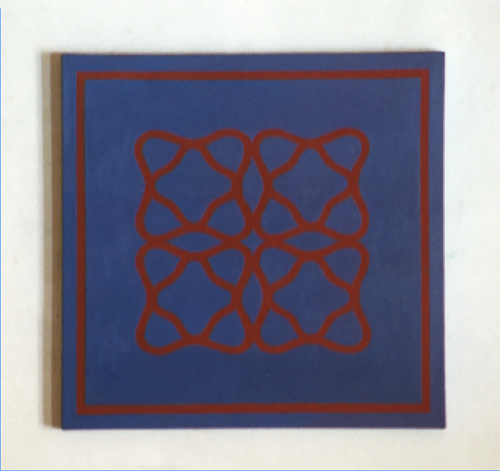
The purpose of this Post is to provide a link to “Surface and Colour”, Chapter 24 of my book “Painting with Light and Colour”. It continues the emphasis of the previous three chapters of discussing practical uses of viewing conditions as a means of extending the range of the experiences available when looking at arrangements of colours painted on flat surfaces. As a means of doing so, it gives a detailed account of how the viewing conditions discussed both inspired and were put to use in the making of one particular nine panel painting. As in all my paintings, a priority was to create an illusory pictorial space, of indeterminate depth, within which the colours are liberated from the picture surface with a view to allowing them to interact more dynamically and in additional ways.
CHAPTER 24 – COLOUR AND SURFACE
![]()
![]() Other Chapters from BOOK 2 of “Painting with Colour and Light”
Other Chapters from BOOK 2 of “Painting with Colour and Light”
- Chapter 19 – Colour and the feelings
- Chapter 20 – Optical mixing and its legacy
- Chapter 21 – Colour contrast effects
- Chapter 22 – Thin Lines
- Chapter 23 – More on viewing-conditions
Chapters from BOOK 1 of “Painting with Colour and Light”
- Introduction: the little known Science behind the many innovative practical suggestions.
- Chapter 1 : The dogmas
- Chapter 2 : Doubts
- Chapter 3 : The nature of painting
- Chapter 4: Renaissance ideas
- Chapter 5 : New Science on offer
- Chapter 6 : Early Modernist Painters
- Chapter 7 : The perception of surface
- Chapter 8 : Seurat and Painting with Light
- Chapter 9 : Seeing Light
- Chapter 10 : Illusory pictorial space and light
- Chapter 11 : Colour mixing – definitions and misconceptions
- Chapter 12: The colour circle: Misunderstandings
- Chapter 13 : Finding a maximum of colours
- Chapter 14 – Colour mixing made easy
- Chapter 15 – Colour mixing by layering
- Chapter 16 – Reviewing previous chapters (1)
- Chapter 17 – Reviewing previous chapters (2)
- Chapter 18 – “All you need to know about painting”-2
Other Posts on colour and light in painting:
- What are colourists? (1): Some of the many meanings of the word
- What are colourists? (2): Difference between meaning of the word for Venetian Colourists and for Modernist Colourists?
- What does the word “colour” mean?
Go to top of page
Go to list of all other contents
![]()
Thank you for sharing this. I’ve been lucky to see this series of panels in person multiple times. So much to contemplate and engage with each time I see them. Wonderful.
Hello Francis, Thank you for sharing these ideas, experiences, and artworks. I saw these paintings at the end of my first visit to Montmiral and I can attest to their mysterious glow and to the way each looked identical. I could only discern one slight difference in blues between a painting in the top and one in the bottom rows, despite your insistence that every colour was different!
One of the challenges of this work is how to communicate your voyage of discovery to non-expert audiences. That is a challenge in any field of endeavour – the cutting edge is a long way ahead of even the well-informed co-worker. You’ve addressed that with this chapter, but it is still a ‘specialist read’, so I feel this wider communication challenge is yet to be resloved.
I remember you left it to us students to work out your intentions and it’s taken time, specifically reading these chapters to work out that the perceived similarity of each painting was a sign of its success [because each was in fact painted with different colours.] Perhaps I was too shy to ask at the time, but possibly an accompanying concise artist statement might have assisted understanding and wider appreciation. Generally, I’m not a fan of statements, because folk tend to read them and not to look carefully, but there are always exceptions!
With greater understanding, gained from these posts and from our conversations, I see that these paintings demonstrate mastery of colour in terms of science, visual perception and psychology. A highly unusual, [probably unquique] combination of skills and experience.
You’ve created work of beauty and great subtlety which deserve a larger audience.