Shading and surface form

What colour are shadows and shading?

This POST provides a link to “Shading  and surface form”, Chapter 27 of my book “Painting with Light and Colour”. It may surprise many that it comes in PART 2, which is dedicated to painting with colour. The reason is that the visual systems that are used to create colour consider blacks, whites and greys to be colours and, accordingly, they treat the blackness, greyness and whiteness of shadows, shading and highlights as colour.

Surface-solidity, spatial-separation and ambient-allumination

However, this fact of visual perception does not mean that the reflected-light does not provide information to other visual systems, working in parallel. In particular, the systems that tell us about surface-solidity, spatial-separation and ambient-illumination continue to perform their function. As explained in PART ONE of this volume, although they enable us to sense these properties, they never make them visible in the way body-colour is visible.

The problem of invisibity

The “invisibility” of these properties confronts artists trying to represent them with the seemingly insoluble problem of deceiving the eye/brain into “seeing” something that they cannot see. Luckily due to the research of Seurat, Cézanne, Bonnard, Marian Bohusz-Szyszko and others, a simple and, accordingly, practical resolution of this seeming paradox is available. Moreover, due to research undertaken by myself and colleagues, its efficacy can be explained in scientific terms (see many chapters in Book One of this volume and Chapters 13 and 14 of “What Scientists can Learn from Artists”)

The solution

The practical solution provided to me by Professor Bohusz-Szyszko is to ensure (a) that there should be no repetitions of colour in any part of the surface of paintings and (b) that all the paint that is actually visible to viewers of the painting should be made up of mixtures containing some proportion, however small, of complementary or near-complementary, pigment colours. In this conntext,  it is important to emphasise  that this solution should be kept in mind when painting shadows, shading and highlights.

CHAPTER 27 – SHADING AND SURFACE FORM

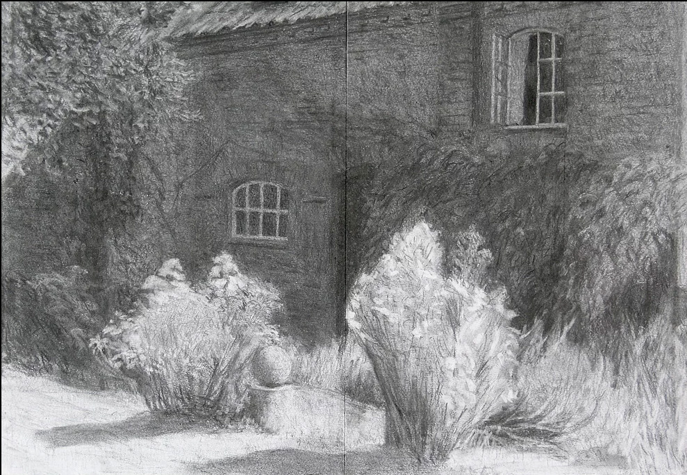
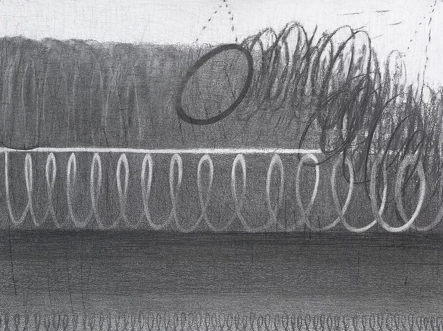
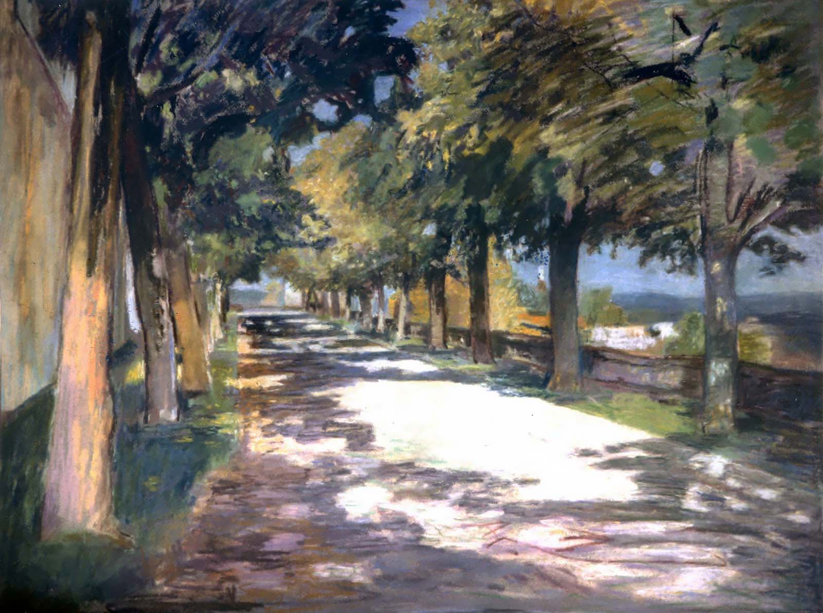
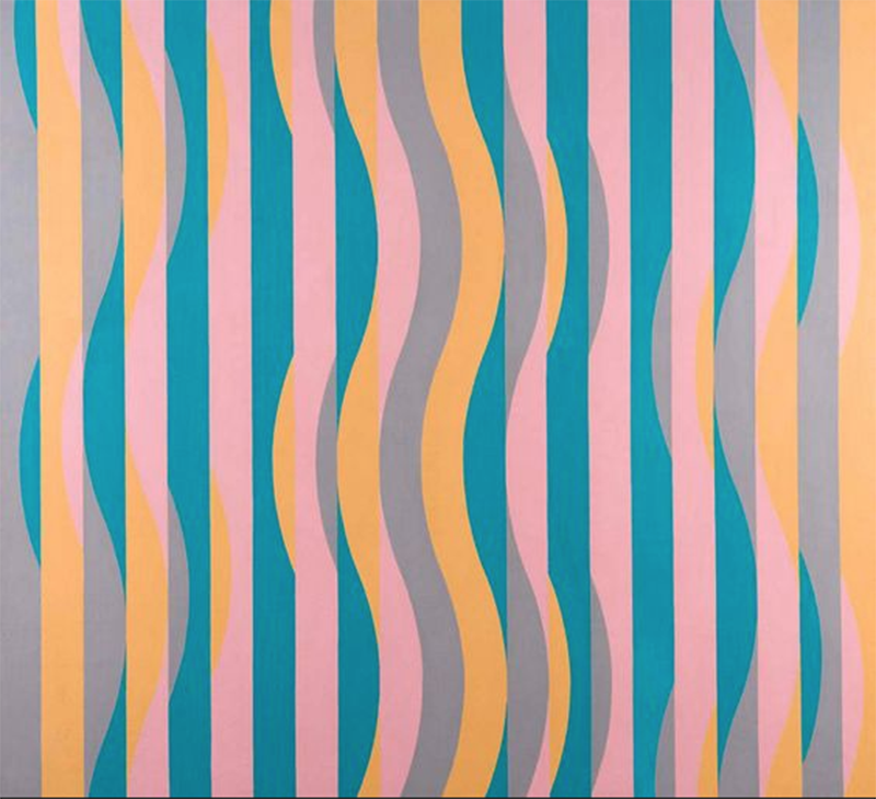
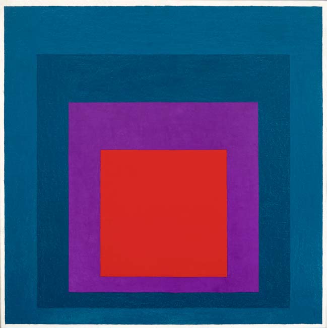
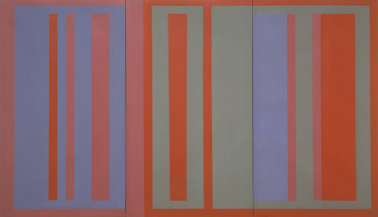
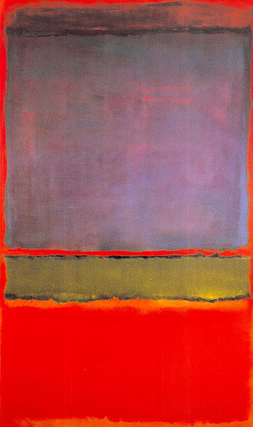
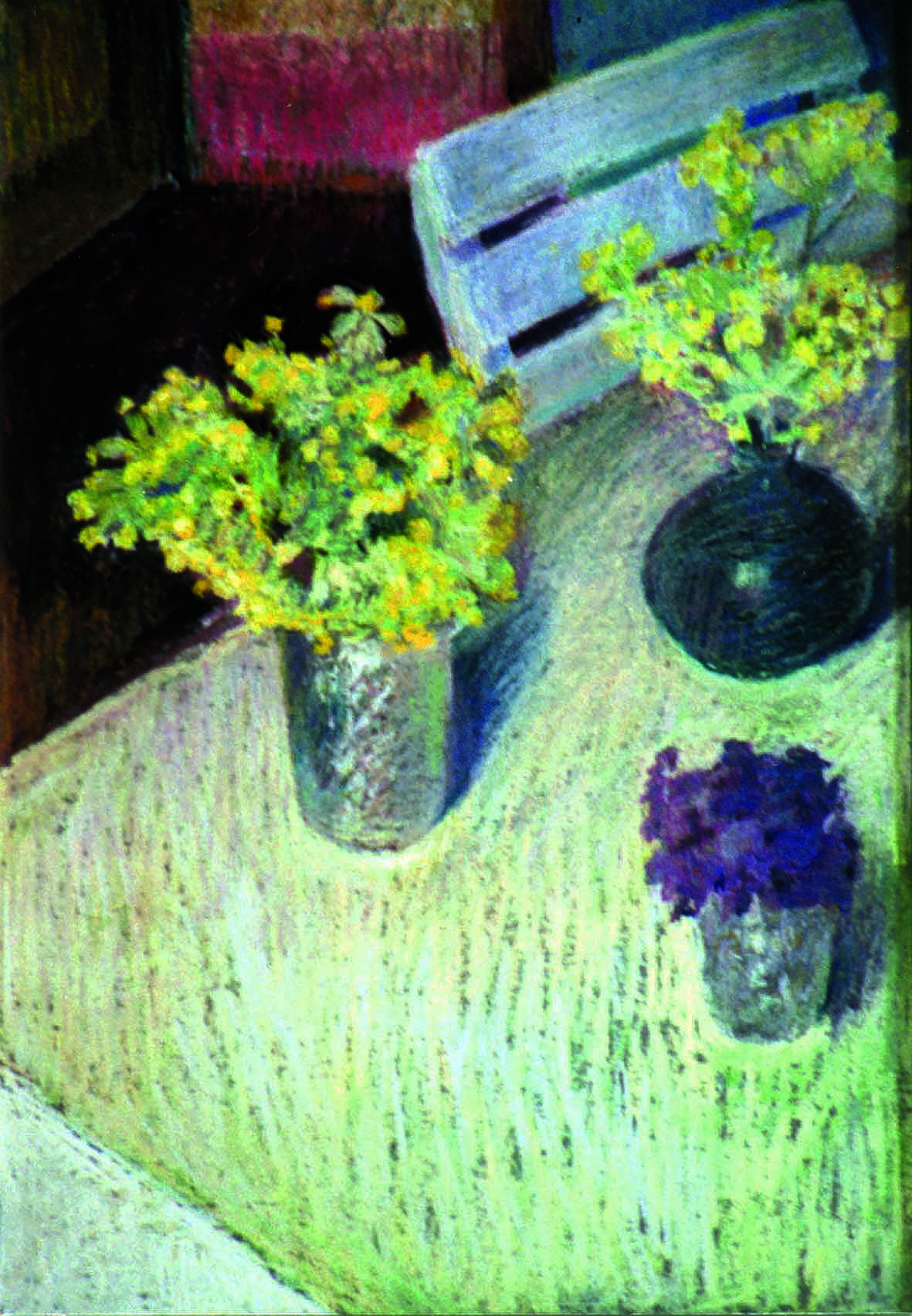
Two images and a question to consider

surfaces
Cowslips and violets

surfaces
Flowers in a vase

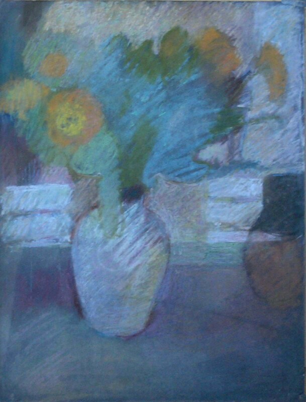
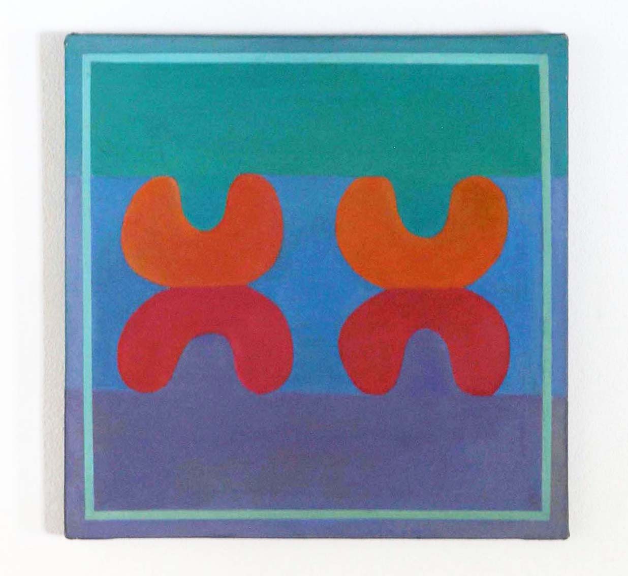
Question: Do all the “mistakes” and inconsistencies in the “flowers in vase” painting matter?

Other relevant chapters from Book 2: “Painting with Colour”

Other relevant Posts on colour and light in painting:

Go to top

Go to list of all other contents


Chiaroscuro

The main purpose of this POST is to provide a link to Chapter 25 of my book “Painting with Light and Colour” to which I have given the title “chiaroscuro” (the light/dark dimension). But first a word to explain why this is situated in the part of the book on “Painting with Colour”, rather than the part on “Painting with Light”, as most people would expect.

Black is a colour

The reason for this anomaly follows from the facts of visual perception (a) that colour is made in the brain and (b) that the brain classifies shadows, shading and highlights as colour. This counterintuitive state of affairs is a consequence of the way the eye/brain combination separates out surface-reflection from body-colour. Thus, the neural algorithm responsible for this impressive feat, confounds the sudden changes in reflected-light that occur at the edges of regions of cast-shadows and highlights, with the sudden changes at the edges of regions of body-colour.  For similar, though slightly more difficult to explain reasons, it also classifies gradations in the lightness profiles of surfaces as gradations in body-colour (for more on these reasons, see Chapter 9 of this volume and Chapter 14 of my book  “What Scientists can Learn from Artists”).

Link to chapter 2

CHAPTER 25 – CHIAROSCURO

Two chiaroscuro masterpices

Chiaroscuro
Sarah Elliott – Figurative charcoal drawing

chiaroscuro
Sarah Elliott – Non figurative charcoal drawing

Chapters from “Painting with Light ” (Part 1 of this volume)

Go to top

Go to list of all other contents

Colour and Surface

The purpose of this Post is to provide a link to “Surface and Colour”, Chapter 24 of my book “Painting with Light and Colour”. It continues the emphasis  of the previous three chapters of discussing practical uses of  viewing  conditions as a means of extending the range of the experiences available when looking at arrangements of colours painted on flat surfaces. As a means of doing so, it gives a detailed account of how the viewing conditions discussed both inspired and were put to use in the making of one particular nine panel painting. As in all my paintings, a priority was to create an illusory pictorial space, of indeterminate depth, within which the colours are liberated from the picture surface with a view to allowing them to interact more dynamically and in additional ways.

CHAPTER 24 – COLOUR AND SURFACE

Space and Surface

colour and illusory pictorial space
One of the eight experimental panels

Other Chapters from BOOK 2 of “Painting with Colour and Light”

Chapters from BOOK 1 of “Painting with Colour and Light”

Other Posts on colour and light in painting:

Go to top of page

Go to list of all other contents

More on viewing conditions

This Post introduces Chapter 23 of my book “Painting  with Light and Colour”. It is the second of three chapters that concentrate on “viewing conditions”. Because all three are concerned with issues arising from my own science-influenced researches, you are almost certain to find a lot that is new to you. To give you a bit of a foretaste of what to expect, I have included  below a slightly edited a reprise of its “Introductory”. It follows the link to a .PDf version of the chapter.

CHAPTER 23 – MORE ON VIEWING CONDITIONS

Reprise of Introductory

This chapter continues the story of how my interest in thin lines led to previously unknown, or little explored, ways in which viewing conditions can affect the pictorial dynamics of paintings. Sometimes the changes they bring about are dramatic. At others, they can be extremely subtle or even virtually invisible. Those that influnce the way we experience paintings can be well worth taking into account.

Three paintings that give viewing conditions a dynamic role

viewing conditions
Three thin line paintings from the Stirling series. The bottom two are from the first project and the top one is from the second.

viewing

Other Chapters from BOOK 2 of “Painting with Colour and Light”

Chapters from BOOK 1 of “Painting with Colour and Light”

Other Posts on colour and light in painting:


Go to top of page

Go to list of all other contents

viiewing

The integrity of the picture surface

Google says that the “integrity of the picture plane” is a phrase coined by the influential art critic Clement Greenberg in his essay “Modernist Painting”. It concerns the issue as to whether the fact of creating an “illusory pictorial space” interferes with perceptions of the “objectness” of the actual picture surface.  This was a question of primary importance to the “Early Modernists” from the late 1860s onwards. For them, as explained in  Chapter 6 of my book “Fresh Perspectives on Creativity”, the fact of the possibility of being aware of the actual surface of paintings was one of the reasons for what they believed to be their inherent superiority relative to photographs. Their belief was that, since “deception is immoral”, painters must avoid it at all costs. Despite the difficult-to-comprehend nature of this evidently questionable argument, it stuck for about a century. Thus, in the 1960s, it was still a potent aspect of the teaching of my two mentorsProfessor Bohusz Szyszko and Michael Kidner.  The difference between the “Early Modernists” and Clement Greenberg was that the former (and  Professor Bohusz-Szyszko) thought it possible to depict illusory pictorial space without destroying the integrity of the picture surface. In contrast, Clement Greenberg asserted the impossibility of any such thing, as did Piet Mondrian and a number of earlier painters, plus a whole list of later artists, including Michael Kidner and Ellsworth Kelly.

As those who have read “Painting with Light”, the first Book in this Two Book Volume (see contents list), will realise, the early Modernists and Professor Bohusz-Szyszko got it wrong. The use of unmixed repeated colours did not disrupt the picture-surface, but rather the illusory pictorial space. They do so because our eye/brains read them as being on the picture surface and, consequently, as jumping out in front of any illusory pictorial space. It is thus, the integrity of illusory pictorial space that is disrupted.

integrity

Two paintings that illustrate different meanings of the phrase “integrity of the picture suface”

integrity

picture surface
Cézanne: one of the Fôret du chateau noir paintings

integrity

picture surface
Ellsworth Kelly : Shaped painting on gallery wall – an experience of pure red


Go to top

Go to list of all other contents


Thin lines

A confluence of issues

This Post introduces Chapter 22 from my book “Painting with Light and colour”. It uses one of my paintings to discuss many issues that relate to viewing conditions.  These all apply to all paintings, but it is difficult to find information about them in other books. Indeed, it was not until I began work on paintings including numbers of thin lines that I became fully aware of many of them. My awakening was a result of the coming together of many strands of the story I have been telling in my series of four books.

  • The dogmas of Marian Bohusz-Szyszko (see Chapter 1),
  • The “systems” ideas of Michael Kidner (see Chapter 8 of my book on “Creativity“),
  • My interest in the debates relating to “illusory pictorial space” (see Chapters 7-10 in “Painting with Light”, the first part of this volume),
  • My interest in the Modernist Painters obsession with what they described the “integrity of the picture surface”* and its dynamic implications in the history of “Modernism in Painting**
  • The use of thin lines as a means of exaggerating and, thereby, exploring “simultaneous colour contrast effects” (see previous chapter).

blank

Important warning

In general, whenever images of paintings are transferred to the computer screen, many of their qualities are lost. Sometimes this can be an advantage, but never for paintings that follow the dogmas of Professor Bohusz-Szyszko. This is particularly true for the images using thin lines discussed in this chapter and the next. Often, you will just have to take it on trust that the effects discussed are as described.

blank

An image of a painting with twelve of orange thin lines

Pictorial space

CHAPTER 22 – MORE ON THIN LINES

blank

Footnotes

* If you ask Google “What is a Modernist painter”, you get the following excellet summary:  Modern art includes artistic work produced during the period extending roughly from the 1860s to the 1970s, and denotes the styles and philosophies of the art produced during that era. The term is usually associated with art in which the traditions of the past have been thrown aside in a spirit of experimentation.” However, if you had asked Manet, Cézanne, Van Gogh,  Matisse, etc., etc., whether traditions of the past had been thrown aside, you would find that it was by no means all of them.

** Google says that the “integrity of the picture plane” is a phrase coined by the influential art critic Clement Greenberg in his essay “Modernist Painting”. It concerns the issue as to whether the fact of creating an “illusory pictorial space” interferes with perceptions of the “objectness” of the actual picture surface.  This was a question of primary importance to the “Early Modernists” from the late 1860s onwards. For them, as explained in  Chapter 6 of my book “Fresh Perspectives on Creativity”, the fact of the possibility of being aware of the actual surface of paintings was one of the reasons for what they believed to be their inherent superiority relative to photographs. Their belief was that, since “deception is immoral”, painters must avoid it at all costs. Despite the difficult-to-comprehend this questionable argument, it stuck for about a century. Thus, in the 1960s, it was still a potent aspect of the teaching of my two mentorsProfessor Bohusz Szyszko and Michael Kidner.  The difference between the “Early Modernists” and Clement Greenberg was that the former (and  Professor Bohusz-Szyszko) thought it possible to depict illusory pictorial space without destroying the integrity of the picture surface. In contrast, Clement Greenberg asserted the impossiblilit of any such thing, as did Piet Mondrian and a number of earlier painters, plus a whole list of later artists, including Michael Kidner and Ellsworth Kelly.

As those who have read “Painting with Light”, the first Book in this Two Book Volume will realise, the early Modernists and Professor Bohusz-Szyszko got it wrong. The use of unmixed repeated colours do not disrupt the picture-surface, but rather the illusory pictorial space. They do so because our eye/brains read them as being on the picture surface and, consequently, as jumping out of any illusory pictorial space, which is allways behind it. It is thus, the integrity of illusory pictorial space that is disrupted.

blank

Earlier chapters from “Painting with Light and Colour”:

Painting with Colour: Introduction

This Post provides a link to the introduction to BOOK 2 of “Painting with Light and Colour“. It deals with what I have described as “body colour” and is  subivided into four PARTS:

  • Part 1: Colour and feeling (Chapter 19).
  • Part 2: Local colour interactions (Chapters 20-24)
  • Part 3: Shadows, shading and highlights (Chapters 25 -28)
  • Part 4: Concluding syntheses based on both “Painting with Colour” and “Painting with Light”( Chapters 29-31)

INTRODUCTION TO BOOK 2: “PAINTING WITH COLOUR”


Three paintings

These provide illustrations of a small proportion of the subjects touched upon:

Light, colour and Chiaroscuro
Figure 1 : Colour, Light and shade : The Esplanade, Castelnau de Montmiral – Chalk pastel

Light, colour and Chiaroscuro
Figure 2 : Colour and Light : Breath Pastel No 18

Light, colour and Chiaroscuro
Figure 3 – Colour only – mixed media – Michael Kidner

List of already Posted chapters from “Painting with Light”:

Other Posts on colour and light in painting:

Go to top of page

Go to list of all other contents


Optical mixing and its legacy

Lesser known outcomes

Ealier, in Chapters 8, 9, and 10, much was written explaining about how “optical mixing” was central to  Seurat’s ideas about “painting with light”. Here it is used to introduce lesser or unknown aspects of the subject of interactions between adjacent regions of  colour (the subject of this and the next four chapters). The more familiar aspects have been given less space because they have already been treated authoritatively in books by Joannes Itten * and Joseph Albers** of the Bauhaus,*** as well as in countless other books and magazine articles, with varying degrees of reliability.

optical mixing
Detail from “La Grand Jatte” by Georges Seurat

CHAPTER 20 – A LEGACY  OF OPTICAL MIXING

Links to the three chapters mentioned above:

Like Chapter 20, these earlier chapters also take “optical mixing” as their starting point. However, their concern is not with contrast effects but with other topics:

Other earlier chapters from “Painting with Light and Colour”.

Footnotes

*      Johannes Itten

**    JosephAlbers

***  The Bauhaus

Go to top of page

Go to list of all other contents

Colour contrast effects

Simultaneous Colour Contrast

This Post introduces Chapter 21 of my book “Painting with Lightand Colour”. It focuses on a subject that is dealt within every book, every article and in every classroom in which the subject of colour dynamics is treated. It was first described by Michel Eugène Chevreul in 1839. The name he gave to it was “simultaneous colour contrast“.

Its potential for use in paintings was popularised by Eugene Delacroix. It was picked from him by the Impressionists and many of their Modernist Painter successors. In the twentieth century when so many artists turned to non-figurative productions, it came to be treated as a subject in itself. A particularly influential part in this process was played by teachers at the Bauhaus. Of special importance were Johannes Itten and Joseph Albers, both of whom produced  books exploring the possibilities of colour contrast effects . Both had a widespread and lasting influence on artists and art education. The purpose of this chapter is to introduce their ideas as a preparation for going beyond them. Doing so will provide the subject matter for this chapter as well as chapters 22, 23 and 24.

interaction

CHAPTER 21 – LOCAL COLOUR INTERACTIONS

Three paintings exploring colour-contrast effects

interaction

interaction
Joseph Albers : from homage to the square series

interaction

interaction
Robin Denny: Baby is three

interaction

interaction
Mark Rothko: Violet Green and red

interaction

A lot more about colour-contrast coming shortly

Chapte 22 : Thin Lines

Chapter 23 : Viewing conditions

Chapter 24 : Colour and surface.

interaction

Earlier chapters from “Painting with Light and Colour”:

Go to top

Go to list of all other contents

Colour and Feeling

The role of the feelings in creativity

This Post makes available the Chapter 19 of my book “Painting with Light and Colour”. Its purpose is to confront the issue of “feeling” in the appreciation and use of colour in painting.

Although this is the only chapter in this book which uses the word “feeling” in its title, it is far from being the only place where the fundamental importance of the feelings in artistic creativity is mentioned. Even when it is not mentioned specifically, its importance is assumed.

Indeed, one of the key proposals that underpins the series as a whole is that the brain’s “feel system” is essential for ALL “learning” and ALL “creativity” and, moreover, that this is the case in ALL domains of human activity.

While it is common experience that the feelings play a key role in providing the  “motivation” that is necessary for everything we do or avoid doing, few seem to realise just how deeply  embedded it is in the way our brains work.  Above all, it is the arbiter that allows us to use “feedback”, a characteristic that means it is involved in determining the outcome of ALL decision making. Thus, it is inextricably involved in determining judgements between:

  • Each individual’s assessment of what is “Good” and what is “bad”,
  • Degrees of “Similarity” and “difference”.

(For more on this fundamental subject, use the two links at the bottom of this page (below the image of the Patrick Heron painting) to access two chapters from  of two of my other books. Both have much to say about the role of feeling, in all its manifestation, including ways in which the brain’s “feel systems” are involved).

.

CHAPTER 19  – COLOUR & FEELING

.

Three paintings

Colour and feeling
Francis Pratt : From the “Indian” series

.

colour and feeling
Joseph Albers: From “Homage to the square” series

.

colour and feeling
Patrick Heron – colour field painting

.

Two chapters that focus on the role of the feelings, from my other books

.

Chapters from Book 1 of “Painting with Light and Colour”

Go to top of page

Go to list of all other contents