
Preparing for work
This ‘Post’, as well as providing a link to Chapter 17 of my book “Painting with Light and Colour”, concentrates on a number of practical matters that need to be taken into account before starting to paint. Most of the suggestions concern all mediums. Where there are differences, these will be pointed out. As a bonus two highly complex images are used to illustrate practical ways of differentiating a multiplicity of colours.
![]()
CHAPTER 17 – PREPARING FOR WORK
![]()
Ways of differentiating a multiplicity of colours
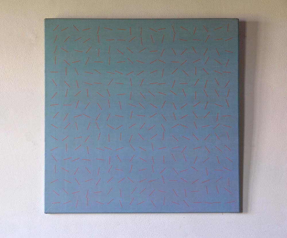
The two images below are used to illustrate different approaches to ensuring that no repetition of colour occurs. The first, a pastel painting of a forest scene, was made by means of unaided visual analystic strategies and the second, a constructivist composition using acrylic paint, required the use of systematic mixing procedures.
![]()

![]()
![]()
Differentiating by eye
Figure 1 is a pastel painting. As explained in Chapter 16, to obtain a large range of subtly different pastel colours, it is necessary to have a sufficiently large number of colours to work with. It is well worth remembering that, just as important as having a sufficiency of pure pigment colours available, is to have each of them represented at a range of lightness levels. Particularly important is to include both the lightest and the darkest possible levels. To make the painting of the forest illustrated above, I probably used something like 16 base colours at 7 lightnesses levels.
I have two complementary approaches to ensuring that no colour is the same as any other colour:
- The first depends on the fact that any repeated colours jump out of illusory pictorial space (See Chapter 10). The result is an ambiguity between a real surface and an illusory pictorial space interpretation. These provide the eye/brain with an insoluble interpretive problem (as explained in previous chapters). The result is both disturbing and attention grabbing.
- The second depends on the fact that our analytic-looking systems are extremely good at detecting very small differences between any two compared colours.
Thus, the first strategy for ensuring that no colour is the same as any other colour, is first to allow attention to be drawn to the colours that jump out of the illusory pictorial space and, then, to differentiate between them by adding subtle touches of colour. When doing so, it is useful to remember that almost imperceptible differences can have a transformative effect.
The second strategy is to make comparisons between all the regions of colour on the picture surface, however small they may be. In a painting as complex as the one imaged in Figure 1, this means a very large number of comparisons, which is why it took such a very long time to complete.
Differentiating by means of systematic procedures.
Figure 2 is an acrylic painting that posed the problem of creating an array of 289 different oranges that, at first glance, viewers could easily mistake for being the same. This requirement implied, not only that neighbouring colours on the same row would not be perceived as being different but also neighbours from both the row below and the row above. The solution adopted was to premix and store in separate pots, a sequence of oranges, each of which was just noticeably different (JND) from its neighbours. Any mixture between any two in this sequence would produce colours that coud not be distinguished by eye. Accordingly, any progression of mixtures between them, would produce an invisible progression analogous to the progression colours that occurs between any adjacent parts of a uniformly painted flat surface (for example a wall). It is only when you compare colours situated at a distance from one another that the fact that a progression has taken place becomes evident.
![]()
Links to earlier chapters
- Introduction: the little known Science behind many of the original practical suggestions.
- Chapter 1 : The dogmas
- Chapter 2 : Doubts
- Chapter 3 : The nature of painting
- Chapter 4: Renaissance ideas
- Chapter 5 : New Science on offer
- Chapter 6 : Early Modernist Painters
- Chapter 7 : The perception of surface
- Chapter 8 : Seurat and Painting with Light
- Chapter 9 : Seeing Light
- Chapter 10 : Illusory pictorial space and light
- Chapter 11 : Colour mixing – definitions and misconceptions
- Chapter 12: The colour circle: Misunderstandings
- Chapter 13 : Finding a maximum of colours
- Chapter 14 – Colour mixing made easy
- Chapter 15 – Colour mixing by layering
- Chapter 16 – Reviewing previous chapters (1)

Go to top of page
Go to list of all other contents
It is helpful to read about these practical means of creating non-repeated colors in a painting. They are challenging though and take a lot of time as you say. I wonder if an example of two repeating colors ‘jumping out’ would be visible if presented on a post. It would be helpful to see a ‘before’ version of the jumping out, and an ‘after’ version, once a differentiation has been made. Perhaps this is truly only possible in person. None the less, an obvious example would be helpful to see the difference. It is great to read about the different strategies you use with varying media and painting styles. Thank you!
Thanks for this Post Sarah and thanks in particular for wondering if the jumping out of repeating colours would be visible, if presented on a computer screen. The answer is, “Perhaps a little”, due to Gestalt groupings, but not in the sense I am meaning. To jump out, there has to be a real-picture surface to jump out onto and an illusory-pictorial-space to jump out from. It is its inability to resolve the incompatibility of these two interpretations that perturbs the eye/brain.
The fact that the repeated colours challenge our visual systems in this irresolvable way, also explains why, when looked at on a computer screen, images of many paintings can be easier on the eye than the originals. I have been known to joke that, while images of “bad” paintings regularly look better on backlit screens than do their real world counterparts, images of “good” paintings regularly look worse. Although this is by no means necessarily true, it will surely be so, if the artist’s aim was to create the “harmony that runs parallel to nature”, sought after by Paul Cézanne.
A fascinating and highly significant post which somehow I missed reading… although I think the ideas are discussed in other chapters; I’m glad I’ve read this now.
This chapter is particularly helpful because it gives practical examples of how and why the ideas are important and how to go about making them work for the informed artist. The chapter and subsequent discussion also illustrates the technical difficulties demonstrating these ideas remotely through screens which is a significant teaching problem, and a hurdle in getting these ideas wider reach. A challenge that makes the real-world painting School of Montmiral especially important.
Despite all your understandable reservations; I still feel Sarah’s suggestion of a demonstration of before and after images is worth further consideration. It could be exaggerated in order to be obvious and be accompanied with footnotes summarizing the challenges and explaining that the differences have been exaggerated because they wouldn’t otherwise be visible via screen. However, I do see the issue with screens and understand your rejection of this idea.
As an aside, this has relevance to the judging of art competitions, where the first round is often done by digital submission- which as an artist living a fair distance away from the centres of art power is a great relief- not another 700 mile round trip only to be rejected at the first round! But it is an issue because the effects you champion are generally too subtle to be seen digitally.
Great to see 2 images of your work I haven’t seen before. The process of looking and comparing colours is what I’ve spent so many years doing, it’s quite strange to have it described.