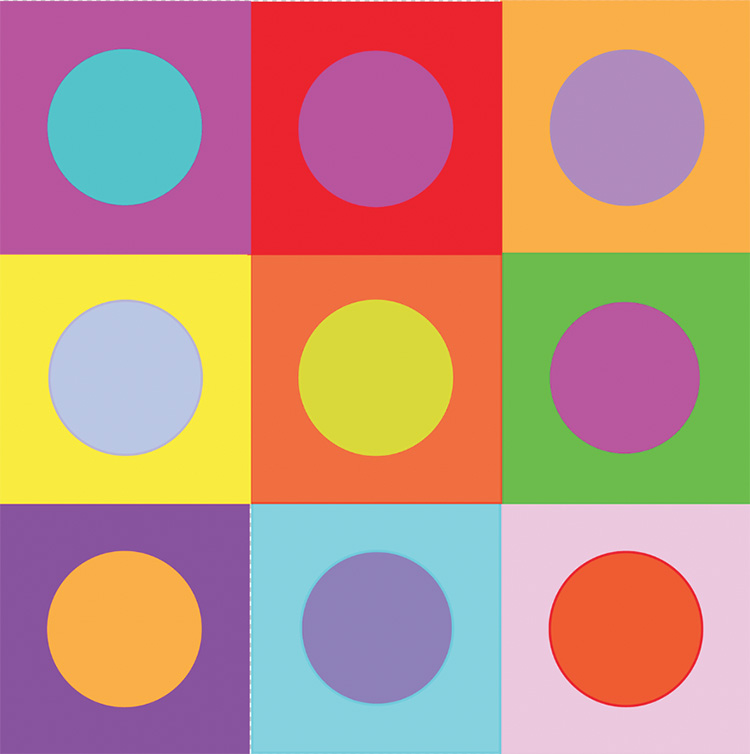
Introduction to the Post on “local colour interactions”
This Post is the second that offers a link to a .PDF version of a chapter from “What Scientists can Learn from Artists”. The purpose of making this more scientifically oriented information available on this website is to encourage readers to go deeper the ideas presented in my practice-oriented books on drawing, painting and creativity (see “Contents List” on the “Posts Page”). Chapter 11, the chapter featured here, focuses on new and unfamiliar things of potential value to artists that can be said on “local colour interactions”, a subject that has featured widely both in books and in the classroom. Its father figure is Eugene Chevreul, the Chemist at the Goblin tapestry works, who was responsible for the phrase “simultaneous colour contrast”, and the best known publications on the subject are by Johannes Itten and Joseph Albers, both teachers at the Bauhaus. Of more recent books covering the subject, I can recommend “Colour : A workshop for artists and designers”, by David Hornung.
With so many authoritative writings on the subject, it might be supposed that I would have little to add, particularly since, as a general policy throughout my books, I have done my best to avoid wasting time on subjects that have previously been exhaustively covered in convincing ways. It is for this reason that my chapter on “local colour interactions” concentrates on subjects that do not appear in the publications of Chevreul, Itten, Albers, Hornung or, as far as I know, of anyone else. What I have to say is based on research triggered by the excellent teaching I received at my art school and issues arising in my own paintings. Its novelty comes either from original or less well know scientific research that deals with matters of potential interest to artists.
.
The link to the .PDF file
.
CHAPTER 12-BODY COLOUR AND LOCAL INTERRACTIONS
.
.
Other chapters from “What Scientists can Learn from Artists”
These deal in greater depth with subjects that feature in the volumes on the practice of drawing, painting and creativity.
- Chapter 9 – Constraint in artistic aids and practices
- Chapter 10 – Blindsight and the bakery facade
- Chapter 11 – Movement, surface form and spatial layout
- Chapter 12 – Body colour and local colour interactions
- Chapter 13 – Colour Constancy
- Chapter 15 – The other constancies
Published chapters from book 2 of “Painting with Light and Colour”:
That is to say, the one that focuses on issues relating to local colour interactions, as opposed to how reflected-light influences appearances.
- Chapter 11 : Colour mixing – definitions and misconceptions
- Chapter 12: The colour circle: Misunderstandings
- Chapter 13 : Finding a maximum of colours
- Chapter 14 – Colour mixing made easy
- Chapter 15 – Colour mixing by layering
Other published Posts on colour and light in painting:
- What are colourists? (1): Some of the many meanings of the word
- What are colourists? (2): Difference between meaning of the word for Venetian Colourists and for Modernist Colourists?
- What does the word “colour” mean?
Go to list of all other contents
Once again, fascinating. Thank you Francis.
Excited to read this, especially as I just saw two ‘square’ paintings by Albers today! So much to learn about colour…endlessly fascinating!
Thank you, Francis. The paintings and illustrations are brilliant. And, though more technical for me than normal, it was a really good read.