Posts page for the Painting School of Montmiral

Colour mixing: clarifications

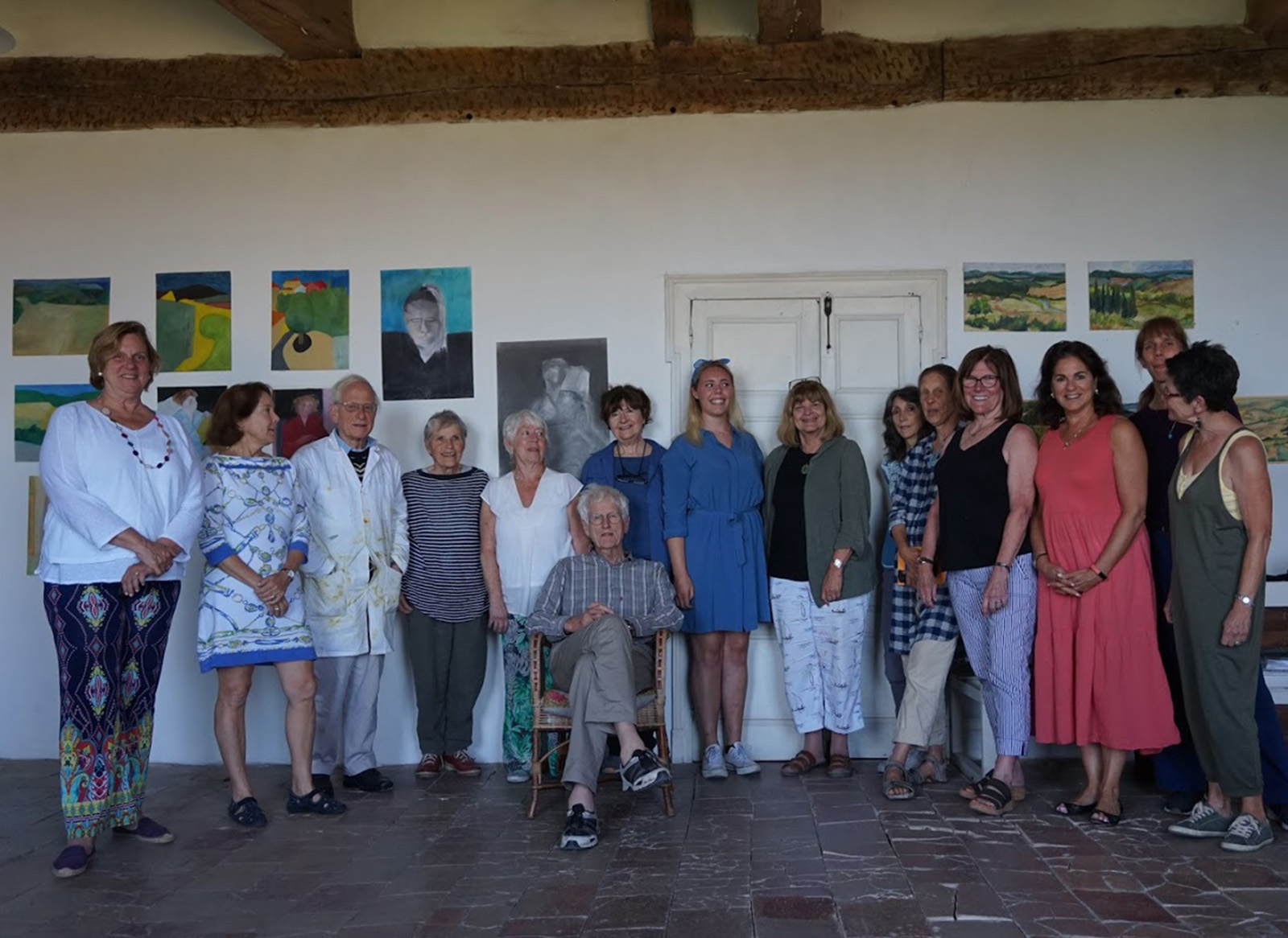
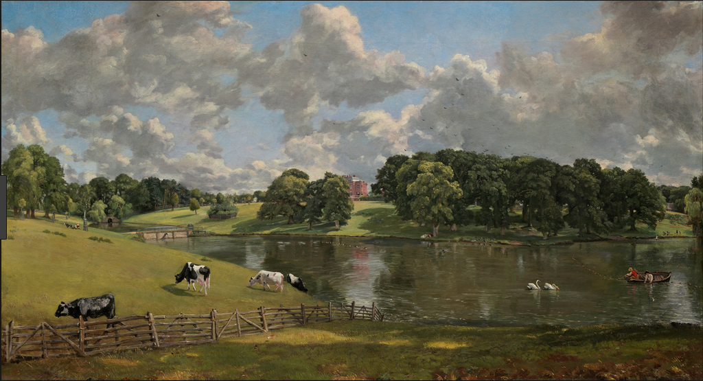
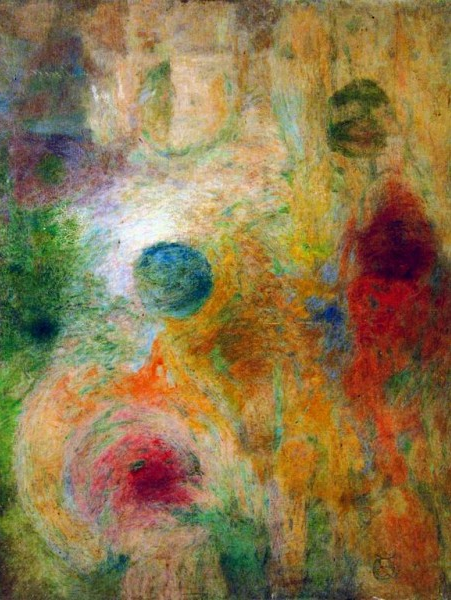
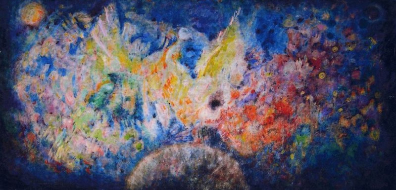
Recently I was asked if I could post the five colour mixing chapters from my book “Painting with Light and Colour” (Chapters 11 – 15).  I will be surprised if you do not find that many of the ideas in them are new, interesting and practical. At the bottom of the page is a link  to Chapter Eleven, the first of the four chapters, whose title is, “Colour mixing – definitions and misconceptions”. To whet your appetite (below the image) I have included a slightly edited version of its “Introductory”.

Coloour mixing 1
Figure 1 – A young student exploring some of  the practical colour mixing ideas explained in the four colour-mixing chapters of my book

Introductory to Chapter Eleven

Introductory
At the outset of my life as an artist, my conception of colour-mixing was of a dry and mechanical subject. I thought of it as no more than one of those necessary basic skills that could easily be picked up along the road. To my surprise, nothing turned out to be quite so routine as it had seemed, and one line of enquiry led to another in a most seductive way. Each new development plunged me deeper into the history either of science or of art, until an engagingly coherent story emerged. The result was a practical understanding of a kind that might be difficult to find elsewhere.

“Most how-to-do-it art books have sections on colour-mixing and there are a number of tomes that offer technical information for professionals.  These latter tell us that scientists have understood the physics underpinning colour-mixing theory for a very long time: Certainly they have done so since James Clerk Maxwell’s lecture on colour vision, given at the Royal Institute, two years before the First Impressionist Exhibition in 1874.

In view of the availability of all these  sources of information, it might be thought that there is nothing left to add. Unfortunately, this is far from the case. The problem is that:

  • Too many painters are being seriously misled by the half-truths and even falsehoods which have entered into the stock in trade of popular colour-mixing theory.
  • Science has far from stood still since the 1870s. Particularly since the 1970s, scientists have been finding out a great deal of new information about how eyes and brains work and, as a result, have arrived at a number of new understandings that could help artists in practical ways, which are not being made use of by the artistic community.

For these reasons and others, it is clear to me that there is a need for the up-to-date approach to practical colour mixing that is supplied by the next chapters.

One approach to clarifying matters is to place the information presented in an historical context. Doing so reveals that:

  • Some of the best of ideas have been obscured by the passage of time.
  • The evolution of colour-mixing theory, owes much to parallel development of the histories of science and of art.
  • The story of when, how and why artists adopted new colour-mixing practices, provides many insights into their potential uses in painting.

With respect to the links between the discoveries of the scientists of visual perception and the practice of the artists, the evidence is usually sparse and often ambiguous. To compound the problem history (not least the history of science) becomes distorted because it is told by people who write with the benefit of hindsight and sometimes from the perspective of a particular prejudice.

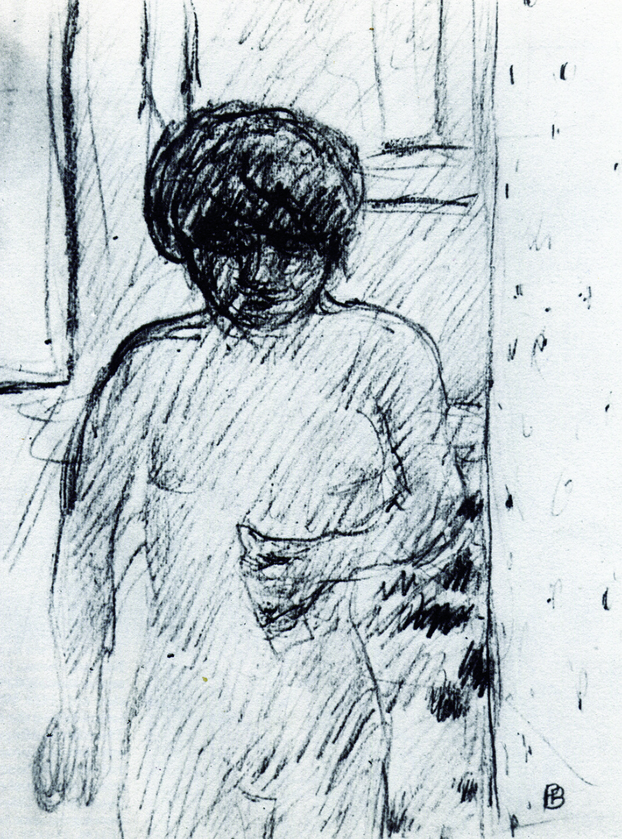
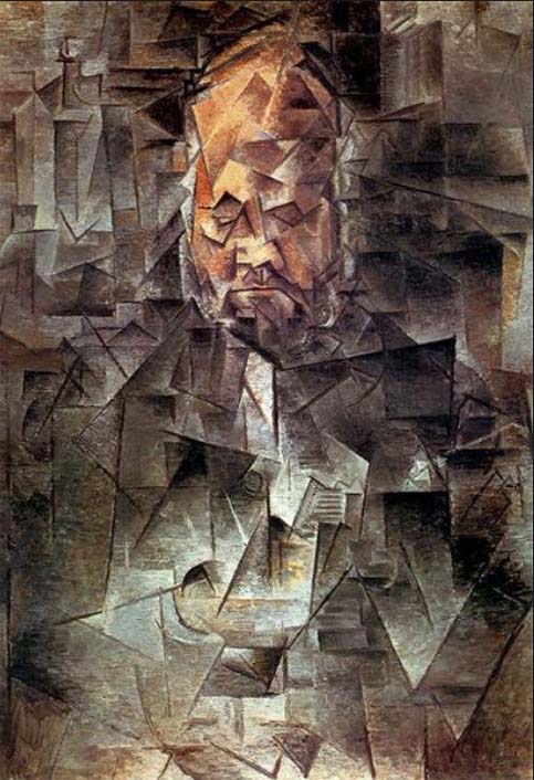
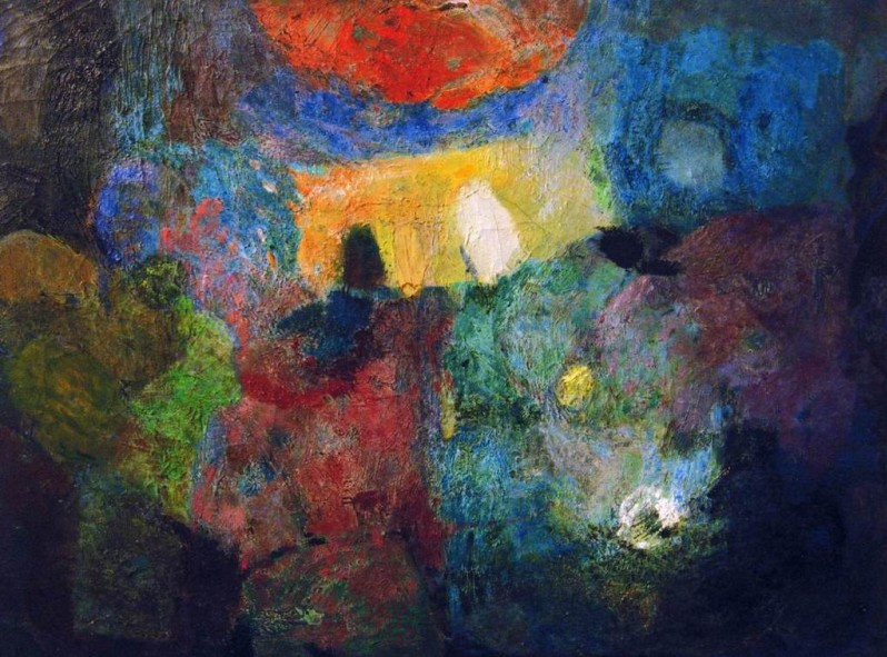
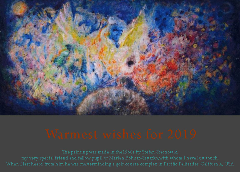
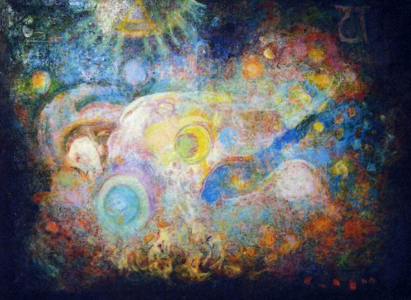
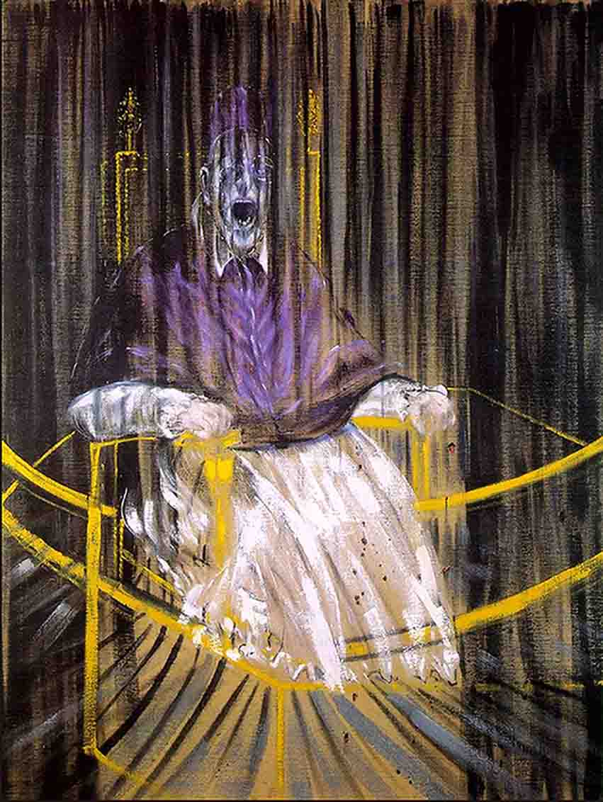
It may surprise some people to find how many famous scientists are credited both with more originality and much more fully developed and rounded versions of their ideas than they actually had. A mismatch of this kind may be suspected in the relation between the confusions inherent in the early development of the ideas developed by Seurat and Cézanne and the neat synthesis of them by Professor Bohusz-Szyszko. Similarly it is unlikely that any of the early Impressionists had as clear a conceptual framework concerning the real surface/illusory space dynamic as was eventually to evolve from their pioneering ideas. While these are very interesting areas for discussion, the process of trying to unearth and pin down exactly what the early pioneers had in mind is a work for scholars. The focus of this book is artistic practice and it is the more refined picture as developed by the more recent artists and theorists that are the most useful in terms of their practical value.

We start a short survey of these by providing some basic definitions as used in this book:

.

CHAPTER 11 – COLOUR-MIXING-DEFINITIONS & MISCONCEPTIONS

.

Other Chapters from “Painting with Light and Colour”.

Other Posts on colour and light in painting:

Chapters from “What Scientists can Learn from Artists”

These deal in greater depth with subjects that feature in the other volumes

Return to top

Return to list of contents


2019 newsletter, with 2020 dates and prices

Dear friends,

The 2019 season is over. Despite having to cope with exceptionally hot weather, both sessions went well. A number of old stagers declared their session to be “the best ever“. New students, who came here from either USA or Scandinavia, were equally enthusiastic, most vowing that they would be returning in 2020. It is always a pleasure to see returnees many of whom have become valued friends and the new dynamic brought by newcomers is always welcome. One innovation was giving  my talks towards the end of the day and restricting them to a maximum of only half an hour.

Two innovations were forced on us:

  • As Hélène was not available to provide breakfast at her house, we started the day at La Baladin de la Gresigne, with its capacious terrace and its panoramic views (see photos below). Food was served by the much appreciated Frederique.
  • Angela, who has cooked marvelous mid session meals for nearly thirty years, is not so young as she was and decided to call it a day. As a replacement we decided to take students to a restaurant. We chose La Cabanon in the neighbouring medieval hilltop town of Puycelsi. While all who knew Angela will have missed her cooking, the innovative menu produced by the young chef at La Cabanon was much enjoyed and, as a bonus, we benefited from the chance to do a little tourism. Nobody will be surprised that we plan to do the same combination next year.

As usual my daughter Katherine provided the meals on the first, second and last days. As usual, her her beautifully presented and delicious offerings received many compliments.

For your enjoyment I have gathered a small selection of photos that students and others provided over the summer and I have made a slideshow of them. Sorry there are important omissions but that is what happens if you rely on others with their own agenda. Apologies to anyone who has been left out. It is hard to focus on taking photos and teaching at the same time.

.

.

Next year we have to face up to the fact of Sarah’s departure on a two year MFA course in Boston University. She has been a wonderful help for me and to students over many years now. To replace her as best I can, I have invited two former students to help with the teaching. Both studied with me early on in their career as artists. Cathy Layzell first experienced my teaching some twenty years ago when I was teaching sessions in Norfolk, England. Later she came out to Montmiral a number of times. She is now an established artist living in South Africa. Ken Marunowski came to Montmiral for the first of several sessions some ten years ago, before deciding to dedicate his life to painting and is now an exhibiting artist.  Both have experience of teaching. A paragraph and photos introducing them now replaces the one about Sarah at bottom of the “Structure of Workshops” page of this website.

Finally, we have updated the “Booking Information” page.  To meet additional costs, we have decided to to increase the price of coming by €30. We have also decided on the dates for next year, which are slightly different to previous years:

  • Saturday 20 June – Saturday 4 July 2019
  • Saturday 18 July – Saturday 1 August 2019

Notice there will only be two weeks, instead of three, between sessions. One student pointed out that it will make it easier for those like her who wish to come for two sessions.

I look forward to seeing as many of you as possible next summer.

Warmest regards,

Francis


Some more photos for your enjoyment

The other day I took some photos from the terrace of the “Baladin de la Gresigne” where the students now meet for their breakfast. The sunflowers are no longer in their full glory but I think you will agree that the views remain splendid. The photo of the facade was taken some while ago.

Newsletter september 2019
The front entrance of La Baladin de la Gresigne.
Newsletter september 2019
Looking across the fields from the terrace of the “Baladin de la Gresigne”.
Newsletter september 2019
The fading sunflower field that was such a feast of yellows earlier in the year.
Newsletter september 2019
The ancient forest of La Gresigne: Classified as one of the “Great Forests” of Europe.
Newsletter september 2019
A house in the valley.
Newsletter september 2019
A corner of the terrace at the “Baladin de la Gresigne”.


Ambiguity and its uses

When I arrived at art school in the late 1960s, ambiguity was one of the first things we were expected to think about. Over the years I have learnt what an important role it has played in artist’s thinking over the last on hundred and fifty years.

Definition

Ambiguity occurs whenever two or more interpretations are in competition with one another. They may be within any domain of sensory experience or across domains, but here it is considered in relation to the visual domain.  The purpose of this Post is to present some of the reasons why ambiguity should be of fundamental interest to artists, particularly if they are:

  • Wish to depict illusory pictorial space.
  • Seeking to create either harmony or discord in their paintings.

An illustration of ambiguity

abiguity
Figure 1 : Perceptions of vase & face in competition

.

A good example of a high level of ambiguity is provided by the well known vase/face illusion illustrated in Figure 1, in which we can see either a vase or two silhouetted faces. However, it is important to notice that, although we can choose between the vase or the two faces interpretations, we cannot stop the ambiguity of the situation providing a degree of tension. The force of this can be sensed by comparing the right hand side face with the identical face in Figure 2 in which there is no left hand side face to create the vase shape. Clearly, by removing the ambiguity between the vase and the two faces interpretations, the face is easier to look at. The question for artists is whether they want to maximise ease of looking or to create works with some degree of tension.

.

Ambiguity
Figure 2 : Face only – no competition


Escaping ambiguity

As explained below, it can be argued that all paintings exhibit an ambiguity between their pictorial contents and their presence as objects with real surfaces. The the only way the escape this is to make use of one or more of the strategies that are available to us for that purpose. Not counting that of looking away altogether, these depend on concentrating attention on details at the expense of wider context, which can be done either by focusing down or by moving closer. However, although both these manoeuvres work well enough for reducing ambiguity in everyday visual perception, our eye/brains can seldom completely exclude the influence of alternative interpretations in paintings..

Real picture surface versus illusory pictorial space

Ambiguity
Figure 3 : Berthe Morisot – “Julie with Passie in the garden at Bourgival”

.

One type of ambiguity has had a pivotal place in the history of painting. It is that between perceptions of an illusory pictorial space and awareness of the real picture surface. Historically speaking, it became important when the Impressionists and other early Modernist Painters were looking for ways in which their hand-painted images could combat the threat posed by the high levels of realism produced by the newly available photographic method. They feared that the fact that it was so easily and quickly obtained in photographs, would undermine their livelihood.

Luckily for them and for the history of painting, they saw photographic images as deceiving the eye and hit on the now seemingly absurd idea that this deception was morally reprehensible (an idea that was still influencing artists in the 1960s and beyond).  Abruptly, for progressive painters at least, the trompe-l’oeil, which for so long had been the goal of artists, became something to be avoided at all costs.

The solution found by these Modernist painters was to introduce ambiguity. Their idea was to provide a counterpoint to perceptions of illusory pictorial space by emphasizing the reality of the picture surface. The painting, by Berth Morisot, illustrated in Figure 3, provides a good example of how brush marks and surface texture can be used as a means of preventing the trap of deception. What these pioneer artists reasoned was that the impossibility of being able to enter the illusory pictorial space created by the realism of the image without being aware of these indicators of real paint and real surface, meant that a salutary ambiguity would be inevitable.  What they could not have guessed is that the wealth of unexplored possibilities that the picture surface/illusory pictorial space dichotomy would make available, not only to them but also to their successors during well over a century.

An example of competing cues

ambiguity
Figure 4 : Bonnard – Drawing of Marthe his companion

.

The Modernist Painters were also interested in another kind of ambiguity in which attention is drawn in competing directions. For example, Figure 4 shows Pierre Bonnard going a long way towards obscuring the features in his wife’s face, presumably with a view to allowing the telling gesture of the hand to take on more significance than it would have done had the eyes, nose and mouth been more clearly delineated. However, since this strategy completely fails to override the eye/brain’s built in tendency to give faces more importance than hands, the result is a pull in both directions. The consequent dynamic equilibrium is of central importance to the experience of looking at the drawing. Just as in Figure 1, it is difficult to look at the vase interpretation without being influenced by the two-face interpretation, it is difficult to look at either the hand or the face to the complete exclusion of the other.

Figurative versus abstract

Ambiguity
Figure 5: Pablo Picasso – “Ambrose Vollard””

.

Another area of competition is between pictorial dynamics based on figurative content and ones that involve non-figurative relationships such as those between colours, contours, textures, etc.. The more the Modernist Painters found their interest turning to the latter, the more they sought ways of playing down the influence of the former. A first step in this direction was that of reducing the strength of the cues that make recognition too easy (as in the case of the face in both the drawing of Marthe by Pierre Bonnard, illustrated in Figure 4, and the portrait of Ambrose Vollard by Pablo Picasso, illustrated in Figure 5). A second step was to get rid of figuration and its attention-distracting pull altogether.

Seeking to eradicate ambiguity

Ambiguity
Figure 6 : Michael Kidner – “Penrose 093″”

.

Many artists saw great potential in the removal of figuration but did not want to get rid of illusory pictorial space, which they felt gave extra dynamic possibilities to interactions of colour, contour, texture, in front/behind relations, etc. Others were still troubled by the immorality of deceiving the eye and sought to eliminate illusion altogether. They wanted all regions of their paintings  to be perceived as being flat on the picture surface, as no doubt was the intention of Michael Kidner when making the work illustrated in Figure 6.

However, these purists were soon to realise that achieving this objective might prove more difficult than they had imagined. It seemed that no matter how hard they struggled, if a picture surface, had more than one region of colour on it, their eye/brains would find ways of creating perceptions of illusory pictorial space within it. In other words, they seemed unable to prevent some of the regions of colour appearing to be either in front of or behind others. Even the simplest two colour painting, such as the one by Ellsworth Kelly illustrated in Figure 7, would not do, for it gives at least some people the impression of a landmass, a horizon and a sky.

.

Ambiguity
Figure 7 – Ellsworth Kelly – “Two Yellows”

.

Sculpture?

Ambiguity
Figure 8 : Ellsworth Kelly – “Curve”

.

In the end, the only solution seemed to be one colour paintings, of which many appeared in the 1950s and 1960s. These included the series of blue paintings, embarked upon by Yves Kline in 1957, and several works by Ellsworth Kelly on the lines of Figure 8. The only ambiguity remaining lay in the question whether these were correctly classified as “paintings”. Some might think it more appropriate to describe them as “sculptures” or, merely, as “objects hanging on a wall”. For those artists who identified (in my view falsely) the search to remove the ambiguity as being of the essence of “Modernism in Painting“, it was time for “Post Modernism“.

Harmony and discord

To find out what this has to do with “harmony and discord” please consult previously posted chapters from “Painting with Light and Colour” and excerpts from the “Glossary”. In particular I suggest reading:

Relevant chapter

Relevant excerpts from the Glossary

Go to top


Aerial perspective: Theory & warnings

Today, I have been editing the entry for aerial perspective in the Glossary for my books. As I was making my corrections, I had the idea that readers of the Posts Page of this website might like a preview of this and future Glossary edits that I feel might interest them. So, to start the ball rolling, here is a slightly expanded version of the one on aerial perspective, with four images added.

Aerial perspective: Between any viewer and the surfaces of the objects at which they are looking lies a portion of the earth’s atmosphere. In addition to the transparent gases that make up air, this contains quantities of dust and other particulate matter (such as the water droplets in mist and, more evidently nowadays, various kinds of pollution). The effect of the intervening atmosphere on the appearance of distant hills and objects seen is well known to us all. We all perceive distant parts of landscapes being bluer and/or greyer  and lighter than nearer parts, and objects seen through mist or fog appear progressively greyer and lighter as the distance between them and us increases. Many artists dating back to the Italian Renaissance, most famously Leonardo da Vinci (1452 – 1519) and Claude Lorrain (1600 – 1682), have demonstrated the value of applying these principles in paintings. So convincing was their effect, that they were adopted as “rules”  by the French  Académie Royale de Peinture et de Sculpture soon after it was founded in the mid seventeenth century.  No one would dispute that the images in Figure 1 and Figure 2 produce a sense of progressive distance.

.

Aerial perspective
Figure 1 : Leonardo da Vinci – detail of “the Virgin of the Rocks”

.

Aerial perspective
Figure 2 : Claude of Lorrain- Classical landscape

.

Warnings

  • Although the theory explaining aerial perspective is scientifically sound and although it virtually always has an important effect on how we perceive both distant parts of landscapes and objects on misty days, it has no discernible effect on how we perceive objects within an arms length. So at what distance does its influence become apparent? The answer is that it varies according to the composition and density of the particles floating about within it.  Thus, on dry, bright days of the kind that often follow abundant heavy rain, when the air has been washed clean, the visibility of atmospheric intervention is minimised, whereas on a hot sultry or misty days, when the air is at its fullest of dust and pollution, it is maximised. In practice, this can mean that on a clear day its effect on the appearance of objects hundreds of meters away may not be discernible.
  • Despite these facts of appearances, over the years, I have found that many students, when they first come to my Painting School, have been in the habit of adding blue to objects much nearer than that (in one exceptional case, a newcomer, when painting a bunch of flowers in a vase, added blue to the colour of flowers and foliage at the back of the arrangement, arguing that it made it look further away). When I see this being done, it tells me is that the student in question cannot have been looking at the near/far colour/lightness relativities. If so, how can they appreciate the amazing riches of colour relations in nature? They need to learn that rules are not for following blindly, but for testing, a process which will always open doors of awareness.
  • To further complicate the situation, there are a number of other variables that can result in people perceiving more distant surfaces of a particular colour as brighter and more fully saturated than nearer surfaces of the same colour: In other words, the opposite of the aerial perspective rule. For example, in summertime, the green canopies of distant oak trees that are illuminated by bright sunlight will look lighter and brighter than those of nearer oak trees should they happen to be situated in the shadow of clouds. Also, a boat on a lake that is painted with a fully saturated red that is actually further away from the viewer than a boat painted with a desaturated red will still look further away. If we made a painting of them, matching as best as possible the colours as we see them, the laws of aerial perspective would predict that the further boats would be perceived as being nearer than the nearer boat. Clearly there needs to be a way of depicting distance that has nothing to do with the representation of atmospheric intervention. Luckily there are several of these, including overlap, relative size and texture cues, but only one of them necessitates the use of colour. Unfortunately, this colour-dependent way of enhancing illusory pictorial space appears to be little known, despite its solid foundations in well known history, its sound scientific underpinning and the ease of its practical application. Much of my book “Painting with Light and Colour” is devoted to giving it new life. If you want to know more, read chapters already published on this website and watch for later Posts.

Two examples of minimal effect of aerial perspective, containing contradictions to the laws as exemplified by Clause Lorrain.

John Constable (1776 – 1837) was a great admirer of Claude Lorrain, but he looked more carefully at nature. Figure 3 and Figure 4 are images of two of his paintings that contain elements that are not consistent with a rigorous interpretation of the laws of aerial perspective. See how many you can find?

.

aerial perspective
Figure 3 : John Constable, – “Flatford Mill”.

.

aerial perspective
Figure 4 : John Constable “Wivenhoe Park”.

.

Now look at paintings by the Impressionists – Monet, Renoir Pissaro, Cezanne, Gauguin, Bonnard, etc. – to see how much they make use of the rules of aerial perspective. Where they do make use of them, was this the result of applying the rules or of looking carefully at nature? According to what is written above, far distant hills should always actually look bluer or greyer, but what about landscapes representing the kind of distances depicted by Constable or shorter ones?

Effect of patchy cloud cover on relative brightnessess

Finally to ram the point home, here are three photographs that illustrate how patchy cloud cover can produce contradictions to the laws of aerial perspective.

.

aerial perspective
Figure 5 : Duller nearer/brighter further

.

Figure 5  illustrates an exception to the law. Due to their being brightly illuminated by sunlight, the walls of the distant church tower are much brighter than those of the house in the foreground, which is in the shadow of passing clouds.

.

aerial perspective
Figure 6 : Brighter nearer/duller further

.

In Figure 6 the situation is reversed. The walls of the house in the foreground are now brightly illuminated by direct sunlight and are much brighter than those of the church tower, which is now in the shadow of passing clouds.

Figure 7 shows:

  • The far house,
  • The strip of green field in front of it,
  • The sunlit patches of brown earth in the ploughed field,

as being brighter than,

  • The near house,
  • The ribbon of green field in the bottom left of the image,
  • The area of brown earth immediately above it.

.

aerial perspective
Figure 7 : Duller nearer/brighter further

.

In all three images atmospheric intervention is playing a part, but in Figure 5 and Figure 7, its effects are being obscured in the ways described.


Back to top

Back to list of contents


.


January 2019 newsletter

Hello everybody,
.
I hope you all received my New Year’s Greetings e-card (copy below). A big thank you to all those who sent greetings to me and Sarah. In case you missed it, I am sending it again here along with the two images that go with it, one of the new back facade of the Painting School and the other our New Year’s greetings card. For your pleasure, I have also added four images of paintings by my friend Stefan Stachowicz, including the one features on the card.
.
2019 Newsletter
Oil painting by my friend Stefan Stachowicz, fellow student of Professor Marian Bohusz-Szyszko, made in the late 1960s
.
You will find the three other images of Stefan’s paintings below.
—————————-
.

The January 2019 newsletter for Painting School students

Hello everybody,
As always in January, I am sending a newsletter to remind you of the dates for the coming season. They are:
.
Saturday 15 June – Saturday 29 June.
Saturday 20 July – Saturday 3 August.
.
Other details can be found on the website bookings page.
.
I am hoping to see as many old faces as possible, particularly since there is some doubt as to whether it will be possible to continue having sessions in 2020. So far, bookings are very encouraging, so please let me know as soon as possible if you want to come.
.
A big change that will occur in 2019 concerns Helene Ancelet who no longer wants to be tied to making her house available to us in June and July. As a result, after being such an integral part of the story of the Painting School, she will not be available to help us with breakfasts. After consultation with students, it was decided to arrange for them to be provided at the “Salon du Thé” – Le Baladin”, in “Place de la Rose”. They will be taken either on the balcony, with its splendid views or, if the weather is not suitable, in a dedicated room. Students who have come in recent years will understand why it has such high ratings on Trip Advisor.
.
Another change is that the time came when I could no longer put off the renovation of the back facade. I much regret the loss of how it was, but I think you will like its new look (see attached photo).
.
Over 2018, I have been continuing to publish chapters of my books and other thoughts on our website’s “Posts Page” (you will find a list of them when you click on the link). Each chapter has an introductory section which both adds to the ideas in it and provide additional images. I am grateful to all the people who have made comments, partly because of their generally enthusiastic nature and partly because I have been given to understand that the more comments the higher our Google ranking. I also welcome comments on the information and images I have contributed on our Facebook page.
.
Please keep in touch. I always enjoy hearing from you.
.
Warmest regards,
.
Francis
.

The renovated facade

2019 Newsletter
View of the renovated back facade of the Painting School, showing outside of the main studio and kitchen windows


New Year’s greetings e-card

2019 Newsletter
New Year’s greeting card for 2019

More paintings by Stefan


2019 Newsletter
Oil painting by Stefan Stachowicz


2019 Newsletter
Another oil painting by Stefan


2019 Newsletter
The oil painting by Stefan used for the 2019 New Year’s greetings card


Other posts under “Painting School News” and “Miscellaneous”

.

PAINTING SCHOOL NEWS

MISCELLANEOUS

.

Back to the top of the page

.

Keeping in touch

Each year I put a copy of the annual October newsletter our website,  so here it is:

Annual Newsletter October 2018

Dear all,

The time has come for my annual newsletter.

This has been a special year for the Painting School of Montmiral, for it is now 30 years since our first season. At the end of the evening meal on the last Friday of both the June and the July/August sessions, we celebrated this with cake and candles. To assist me in blowing out the candles for the June session was Marie-Thérèse, who had first come as a student in 1988.

Marie-Thérèse was with me again at the end of the last meal in August, when we were joined by Hugh Moore, who had first come for the same session as Marie-Thérèse in 1988 and who has since come as a student 30 times), and Hélène, who was living with me at the time. I add some photos taken to commemorate the two occasions.

Both sessions went well. On the second session some students, who had been here several times before, said it was “the best ever”. But I was hesitant to agree since there have been so many sessions that I have perceived as going particularly well. I would prefer to say that it was only “one of the  many best”. When I look back over the years and when I look at the “student work” page of the website I feel so lucky in so many of the people who have joined us here in Montmiral. Although, not without its difficult moments (luckily very occasional), it has been a fulfilling experience for me. Thank you all.

As I hope many of you know, I am gradually publishing my four books on the Painting School website. You can find a list of the chapters and extracts that have been made made available so far by clicking on the ”Posts Page” of the website. I would welcome any comments, particularly since it seems that comment activity is one of the best ways to improve the website’s Google ranking.

The dates for 2019 :

Saturday 16 June to Saturday 30 June
Saturday 20 July to Saturday 3 August.

Prices for 2019 (note new information)

As last year, the cost will be €1460, except in certain circumstances. Thus, there will be special rates for:

  • People who wish to share a bedroom.
  • Less well off younger people interested in pursuing an artistic career.
  • Artists and art teachers.

If you, or any one you know that may be interested, are in any of these categories, please contact me about possible reductions.

For more detailed information and the web booking form, please go to the “Bookings Page” of our website.

I do hope some of you can come next summer and, if not, it is always good to hear from you.

Warmest regards,

Francis

June Session 2018

Enjoying the food that Katherine cooked for the celebratory meal, which climaxed with champagne and cake
Marie-Thérèse and me getting ready to blow, with Sarah and Jacqueline in the background
The blowing out, with Sarah and Jacqueline looking on.

July/August session 2018

Marie-Thérèse, me, Hugh and Hélène with the cake
Sitting back after the blowing out

Ubuntu and the generosity of genes

Three quotations

A couple of years ago I was introduced to the word “ubuntu”. I was told it came from South Africa* and could be translated as “I am because we are”. I found myself being deeply moved by what seemed to me to be the evident truth and deep implications of this phrase.

I wrote it down on a small piece of paper and stuck it up above my desk, along with other pieces of paper on which I have written down other sayings that strike me as expressing fundamental insights. Two examples are:

  • “The more you know, the freer you are”, which comes from Daniel Barenboim, world renowned pianist and conductor.
  • “I do not think that I am cleverer than anyone else. Those who do great mathematics spend night and day and constant attention to it”, which comes from  Carl Friedrich Gauss, said by many mathematicians to be the greatest ever of their kind.

Ubuntu

Often, when I am out walking or when I am sitting on the balcony, I find thoughts swishing around in my head in seemingly random ways. But this randomness is clearly an illusion for, at these times, experiences and insights that in the past have struck special chords in my feelings have a habit of popping unexpectedly into my mind. One day recently, while enjoying one of these agreeable reveries, I found the word “ubuntu” being unexpectedly linked to the concept of “the selfish gene”. Ever since I read the book by Richard Dawkins** in which he coined the phrase, I have baulked at accepting the bleak manifestation of determinism that its  author proposes.

But as I sat contentedly in the warm glow of the sun, I found that the awkward juxtaposition of the notion of the selfish gene with the concept of “ubuntu” was seeding thought processes that suggested a challenge to Richard Dawkins’ idea.

No doubt, the reason it came to me at this particular time had something to do with subjects I have been reading about recently, most notably:

  • The origins of life from its first microbial manifestations.***
  • The history of our species from a genetic perspective.****
  • The necessary and symbiotic functions performed by the multitudes of microbes in out gut.*****

All these subjects are bound to stimulate reflections on nature’s way of sustaining life on our planet. I can only assume that they played a part in forging the idea that popped into my mind. It was that if only Richard Dawkins had looked at the situation in a less blinkered way, he would have found every reason, not only to increase the number of pages in his book but also to change its title to the “The Generous Gene”.

Ubuntu and the generous gene

The idea was so simple. It was that the spirit of “ubuntu” could be extended by adding the words “… and we are because we exist in the living world”. For me it seems obvious that, if it is true that our existence depends on us being members of the group of human beings, it is equally true that our existence depends us being participants in the world we all live in, as created by the “Big bang” and made meaningful to us by the evolution of life on earth.

But what is the nature of this world? Of the many approaches to finding answers to this question, two are relevant to the way my thoughts were leading me:

  • That our world is characterised by a seemingly unlimited examples of “symbiosis”, the phenomenon of two or more living organisms depending directly on each other for existence – whether they be the most primitive eukaryotes that have inhibited our planet for some two billion years, or more recently evolved plants or animals. Indeed the evidence is clear that it is deeply ingrained in every context where life is found . There can be no doubt that the fact that species provide reciprocal services for each other is a fundamental attribute of the living world as we know it.
  • That our world relies on what, at first sight at least, seems to be an extremely wasteful way of ensuring the continuation of the species, but which, when looked at from a wider perspective, turns out to be necessary to it.  One way of describing this key to the survival of our species is “genetically programmed generosity”.

Think of the number of acorns produced by an oak tree every year. Richard Dawkins would see this as an insurance policy for the continuation of the oak tree species and he would be right. But in the meanwhile (which may last for a matter of  hundreds of years) the acorns fall to the ground and are eaten by animals, insects and larvae, or are decomposed by microorganisms. In this way they, not only sustain the life of a multiplicity of living beings but also enrich the soil for future use by plants of any variety whose seeds happen to find themselves lodging in it.

Think also of the salmon that is said to lay thousands of eggs to ensure that a sufficient number of their offspring survive to make certain of the continuation of the species. Nobody knows exactly how many of these extremely vulnerable beings survive long enough to continue the reproductive cycle, but 2 per cent of the original number has been suggested. So what happens to the other 98 per cent? The same as happens to the acorns: they become food for other creatures and organisms and, thereby, play their part in sustaining the life of the oceans and the planet.

Nor are these isolated examples, the strategy of abundance is to be found in all aspects of nature’s way of doing things, and in most, if not all of them, an outcome is the increased wellbeing of a multitude of communities. I find myself forced to the conclusion that, if the absurd anthropomorphism of calling a gene “selfish” is permitted to Richard Dawkins, it surely legitimate to characterise the genes that are responsible for programming this abundance as “generous”.

For these reasons I propose to extend the meaning of the word “ubuntu”. My version is:

 .

“I am because we are, and we are because we exist in the living world”

.

I feel sure that the wise Zulus who gifted us the wisdom encapsulated in the word “ubuntu” would approve. So, I assume, would ecologists and environmentalists. Surely, all of us, as human being, should be grateful for three gifts that are our birthright?

  • The gift of being alive.
  • The gift of being members of our species.
  • The gift of existing in such a mutually supportive natural environment.

.

Footnote: Extending Nelson Mandela’s praise of ubuntu


ubuntu
To this, I am adding that we are also human thanks to the generosity of the genes that are responsible for the awe-inspiring richness of the microbial worlds within us and for the infinite diversity of the natural environment, upon both of which which we depend.
.
——————————————
References:

Celebrating 30 years-June 2018

The slideshow

We took advantage of the meal at the end of our June session to celebrate the thirtieth anniversary of the Painting School, which had it first season in 1988. In addition to relishing the usual feast made by my daughter Katherine, several of us made toasts, had a cake with candles and  finished with some music. The slide show below shows photos taken, by Sarah and various students, before, during and after the last meal of the June session. It shows:

  • People finding their places and eating.
  • Myself, Marie-Therese and Sarah making toasts.
  • Sarah, my grandson Milo and his friend Khorene, putting candles on the cake.
  • Appreciating the candlelit cake.
  • Marie-Thérèse (who came as a student on 1988) and I blowing out the candles.
  • Sawyer entertaining us with one of his Punk compositions.
  • Katherine* and Loucine doing vocal improvisations to chords chosen and played by Sawyer.
  • The now half empty room.

Enjoy.


.


Painting space with colour

The new science

The purpose of this Post is  to provide a link to Chapter 10 “Illusory pictorial space and  light”,  from my book, “Painting with Light and Colour”. This provides a simplified explanation of the science behind the ideas developed in earlier chapters concerning ways of creating and/or enhancing effects of illusory pictorial space by means of using mixtures containing small proportions of complementary colours. In the process it explains why the same method can be used to create harmony in paintings. It also explains why colour repetition has the potential, not only to produce visual discord, but also to generate optical excitements.

.

CHAPTER 10 – ILLUSORY PICTORIAL SPACE & LIGHT

.

Examples of illusory pictorial space and “harmony that runs parallel to nature”

painting space
Paul Cézanne: A still life that provides an example of how making a painting that fits into the rules of Professor Bouhusz-Szyszko creates  a sense of space, light and harmony.

.

painting space
Pierre Bonnard : A landscape that provides a second example of how making a painting that fits into the rules of Professor Bouhusz-Szyszko creates  a sense of space, light and harmony.

.

Examples of repeated colours without mixtures of complementaries


painting space
Francis Bacon : On of his Pope paintings, in which repeated colours, whether intentionally or not, enhance shock value


painting space
Jackson Pollock : Echo No 23 (detail) -The influential critic Clement Greenberg admired Pollock for creating a “space within the picture surface”.


painting space
Victor Vassarely : An example of his Op Art that uses strong cognitive cues and many repeating colours to create a powerful 3D visual impact.


Other chapters from “Painting with Light and Colour”:

Other Posts on colour and light in painting:

Chapters from “What Scientists can Learn from Artists” that go more deeply into  some of the subjects referred in the Posts above


List of all other Posts

Return to top

Vision Group acknowledged

Members of the University of Stirling Vision Group

In many places in my books, I acknowledge the importance of the role of colleagues from University of Stirling in the development of the new science-based ideas put forward in them. In particular I mention cooperations with scientists from various departments who later were to join me in the University of Stirling Vision Group. The most important of these were:

  • Alistair Watson (Physics, psychology and computer imagery).
  • Leslie Smith * (computing).
  • Bill Phillips * (visual memory and brain function).
  • Karel Gisbers (neurophysiology).
  • Ranald McDonald (statistics and common sense).
  • Lindsay Wilson * (at the time working on aspects of visual perception).

Also, although Peter Brophy * did not join our group, he was an ever-available and important source of information on the biochemistry of the brain.

The founding of the Vision Group.

It was in  the Autumn of 1984 that Alistair, Leslie and I took the first steps in the setting up of the University of Stirling Vision Group, which was to have many meetings attended by the above named colleagues and other members of the various interested Departments. Its starting point was a package of ideas developed by Alistair and myself, and two core algorithms based on them, produced by Alistair.  These were:

  • A colour constancy algorithm, capable of modelling both spatial and temporal colour constancy, which was inspired by our interpretation of how this phenomenon is achieved by human eye/brain systems. As a preliminary step to achieving this main objective, the algorithm has to pick off the information about surface-reflection. Since it was obvious that the reflected-light contained information, we speculated upon how it might be used by the eye/brain. Due to my interest in picture perception, we focused on its potential for computing surface-form, in front/behind relations, and the wavelength composition of ambient illumination.**
  • A “classification/recognition algorithm”, based on our interpretation of how human eye/brain systems achieves their primary task of enabling recognition.***

We could not help being excited by the early tests of these algorithms and the speculations concerning their potential. In our  enthusiasm to push matters further, Alistair suggested we should seek the help of other researchers, particularly ones with expertise in:

  • Mathematics and computing.
  • Visual perception with special reference of visual memory.

It was at this juncture that, having decided on a name for what we were hoping would become a collaborative group, we contacted Leslie Smith for his mathematical and computing skills. But this was only a start. Once Leslie was on board, we approached Bill Phillips, whose long standing interest in visual memory had led him to take the plunge into the recently emerging domain of neural networks and learning algorithms. After many Vision Group meetings, much sharing of ideas, many hours spent working on implementations of algorithms, and the writing of a number of working papers, we decided to submit a suite of five grant applications to the Science and Engineering Research Council, who had let it be known that they were looking for groups of researchers working on the use of computers to model the functional principles of neural system. The stated aim of the SERC was to set up a small number of “Centres of Excellence” in this domain.  Not only were two of our grant applications accepted (one submitted by Bill Phillips and one submitted by Leslie Smith), but also our university was encouraged to create a brand new  Centre for Cognitive and Computational Neuroscience . This empire absorbed the University of Stirling Vision Group which ceased to have an independent existence. Its coming into existence also coincided with my departure from Stirling on my way to founding my Painting School of Montmiral, where I intended to put theory into practice both in my own work and in my teaching. I also had hopes of confirming and, with any luck, extending the theory. Also after leaving Stirling University, Alistair and I were founder members of a small software development company which used ideas developed within the Vision Group as a basis for creating an image manipulation tool. ****

__________

* The links to Bill, Leslie, Lindsay and Peter relate to their current status. Alistair, Karel and Ranald all retired or died before the Internet became the essential information source it has since become.

** My book is full of examples of how fruitful this speculation proved to be.

*** In 1987 Alistair published:  “a new method of classification” in Pattern Recognition Letters, Volume 6, Issue 1, June 1987, Pages 15-19

****  Fluid Mask: a commercial outcome

Full list of Posts

Back to top of the page