Posts page for the Painting School of Montmiral

Featured

Pictorial space and Modernist painters

Introduction

This article on “Modernist painters and illusory pictorial space” was written in response to Posts Page comments by Ken Marunowski (see comments section of Chapter 10 : Illusory pictorial space and light)

Clement Greenberg, Jackson Pollock and a space within the picture surface

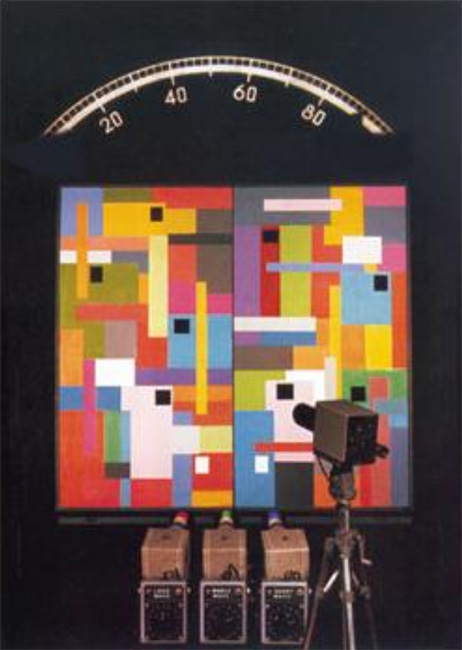
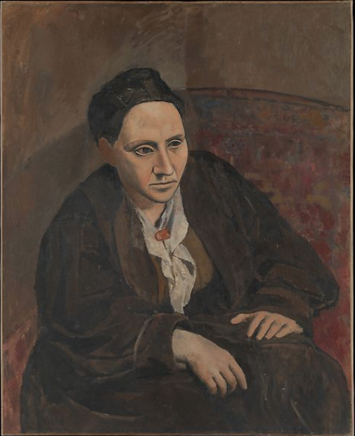
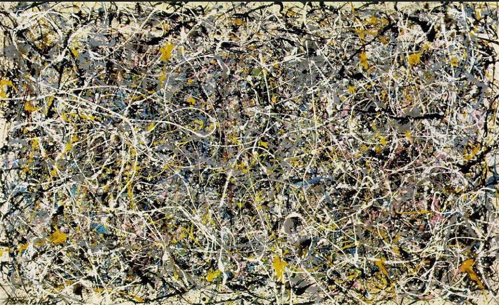
Clement Greenberg was a high profile mid twentieth century art critic whose thoughts on Modernism in Painting influenced a generation of artists. He had much to say on the paintings of Jackson Pollock to which he accorded  a special importance. One of the reasons why was that he saw in them an unprecedented type of “pictorial space”. This he called  “a space within the picture surface”

.

pictorial space
Figure 1 : As predicted by Professor Bohusz-Szyszko’s rules for creating a “harmony that runs parallel to nature”, the many repeated colours in this typical painting by Jackson Pollock can be perceived as jumping out from the picture surface, thereby creating in front/behind relations and what Greenberg described as a”space within the picture surface”.

.

A moralistic reaction against photographs

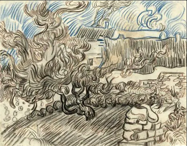
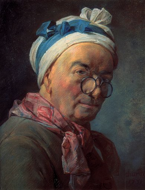
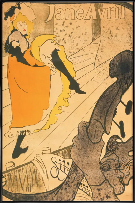
His  claim had a history. In the late 1860s. a number of young artists saw a threat in the degree of realism manifested in images taken by the recently invented camera. The  approach they chose for countering it was purely conceptual. It was based on a two step rationalization. First, they argued that realism of photographic images was such that it deceives the eyes and, second, that deception is “immoral”.

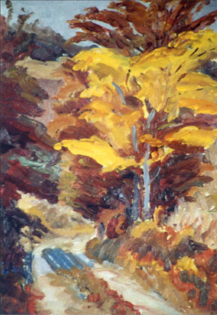
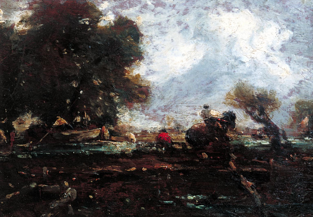
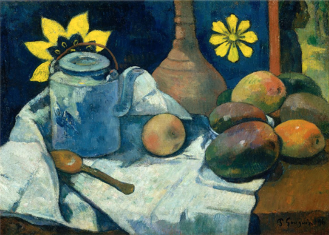
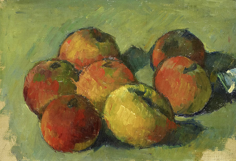
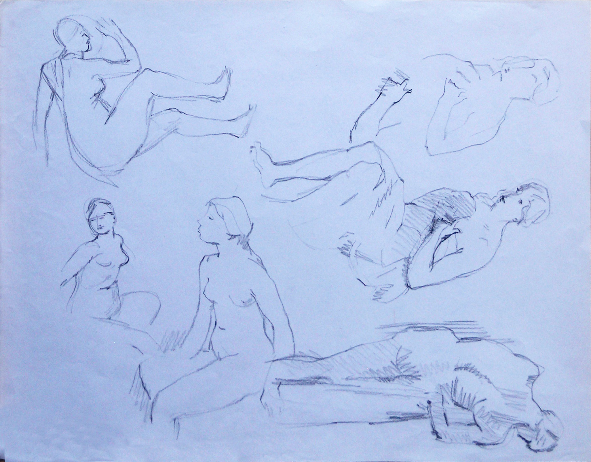
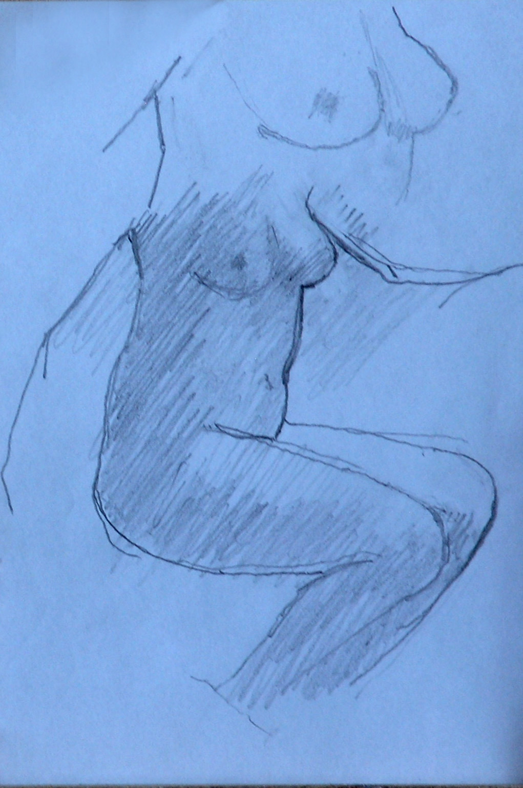
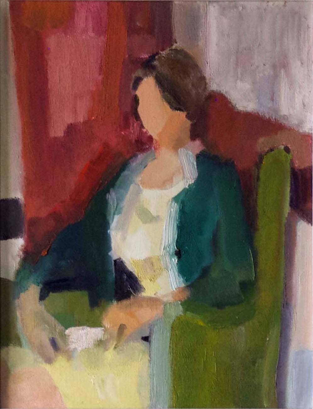
The way these artists, later known as the Impressionists, sought to avoid analogous immorality in their own figurative paintings was to emphasise the reality of the actual picture surface. Their main strategy for doing this was accentuate “surface texture” and “personalised mark-making”. Luckily for the history of painting, one outcome was that they discovered the exciting potential of exploiting the dynamic relationships between the reality of the picture surface and the illusion created by the figurative aspects of their work.

.

pictorial space
Figure 1: A main pioneer of the exploration of  personalized mark-making was Berth Morisot, as illustrated in her painting  “Girl on divan”.

.

Two new developments

.

pictorial space
Fig 3 : Compositions like this are immediately recogniseable as being by Piet Mondrian. As in the vase/faces illusion, we can either see the white, red and yellow rectangles jumping out of the black framework or visa versa. The in front/behind implications provide an example of the kind of space Mondrian  described as a “spiritual space”. This kind of space is analogous to the “space within the picture surface” that Clement Greenberg saw in the much more complicated paintings of Jackson Pollock.

.

In the course of time, the successors of these early Modernist painters discovered that figuration is not necessary for creating illusory pictorial space. They found that perceptions of it could be evoked in non figurative paintings, by means of  “cognitive cues”, the most important of these being “overlap” and depth-indicating “diagonals”.

.

Diagonals
Fig 4 : According to the rules of linear perspective, the diagonal lines in this painting by Bart Van Der Leck (1876-1958) can be seen as receding and, therefore, indicating the “illusory pictorial space” that was anathema to Mondrian.

.

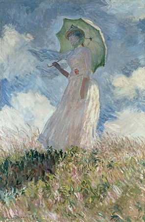
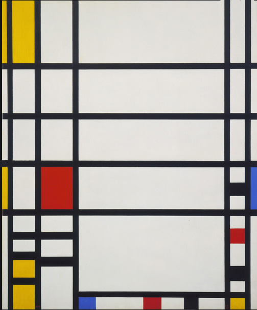
However, despite the exciting possibilities offered by real surface/illusory pictorial space dynamics, Piet Mondrian and other purists could not help concluding that any kind of illusory pictorial space was a “deception” and, accordingly, both “immoral” and to be avoided at all costs. Nor did  they consider this to be a trivial matter. Mondrian permanently  broke off his close, working relationship with Bart van de Leck because he had included a diagonal in one of his paintings.

Poor Mondrian had to soldier on alone. At times he must have felt despairing. However hard he tried, he could not find a way of altogether eliminating perceptions of illusory pictorial space. Eventually, his deeply religious worldview rescued him. It suggested a way of rationalising himself out of  the morality problem, namely, to rename the  “pictorial space” that he was unable to eradicate as “spiritual space”.

An illusory space within the picture surface

Seemingly unaware of Mondrian’s discoveries, Greenberg discerned what he described as “a space withing the picture surface” in the paintings of Jackson Pollock. This he argued was fundamental different from the “illusory pictorial space” found in the work of his Modernist Painter predecessors. However, although influential for a number of years, his claim did not convince number of later artists and theorists. Although these had no difficulty in seeing the space that Greenberg has identified, they insisted that it was illusory and they were right to do so. We now know that they were seeing was the same kind of illusory pictorial space found in the the“vase/face illusion”, in which the vase can be perceived as being either in front of or behind the inward looking faces .

The problem that now arose was that this kind of illusory space provoked an optical disturbance of a kind that some saw as an undesirable (described in the chapter on “negative spaces” in “Drawing on Both Sides of the Brain”). To remove this in the interests of creating a pure, undisturbed colour experience, artists of the 1950s and 1960s, felt obliged to eliminate all traces of Greenberg’s “space within the picture surface”.

.

Three colours
Figure 1 : This was the first painting I saw by Michael Kidner. Each of the three colours are repeated in six different contexts. If  the psychologists of visual perception and Joseph Albers are to be believed, this should mean that none of the three colours looks quite like any of the other eight of its kind. Michael wanted to eliminate pictorial space. Did he succeed? Ellsworth Kelly would have said “No”.

.

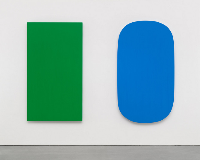
However, when they tried to do so, they found the task they has set themselves to be more difficult than they had bargained for. Indeed many decided that they were faced with an insoluble problem. They had come to the conclusion that, as long as there is more than one region colour on the picture surface, there is no way of avoiding some degree of visual tension. The reason was no longer necessarily the repeated colours of Mondrian and Pollock, it could also be the figure/field separation that occurs at the earliest stage of perceptual processing, in which the object (figure) is picked out at the expense of its context/background (field). In the view of artists like Ellsworth Kelly, the only remaining way of producing pure colour experience would be by means of single colour paintings. As these could be described as “coloured objects hanging on a wall”, the question that then arose was whether they should be classified as “paintings” or as “sculptures”. Many seem to have plumped for the latter.

.

pictorial space
Figure 7 :“Ellsworth Kelly, “Diptych: Green Blue” (2015). In this late painting, the artist wanted to produce two examples of pure colour experience. Did he succeed? Or, is the way we perceive the separate colours influenced by their proximity to one another? Notice the shadows under the colours that show that they are not painted on the same picture-surface, but rather as separate, intentionally isolated objects.

In 1968, the Museum of Modern Art in New York provided the art world with what turned out to be a watershed exhibition. Its title, “The Art of the Real” ,was deeply significant. From the conceptual point of view, it signed the death knell of one of the most influential strands of the broad tapestry of “Modernism in Painting”. For those that believed this to be the only strand, the future of painting had to be in some manifestation of Post Modernism”.

None of this necessarily deterred artists from carrying on regardless with all the different possibilities.  They will always be free to embark on new explorations of:

  • Trompe l’oeil
  • Real surface/illusory pictorial space dynamics
  • Space within the picture surface
  • Explorations of the “art of the real”.

All are to be found in work produced up to the present day.

Footnote 1

As a footnote I think it worth mentioning that the issues discussed above were central to the teaching of both my main mentors.

  • Professor Bohusz-Szyszko felt the main importance of his rules was that they ensured what he described as “the integrity of the picture surface”.
  • Michael Kidner followed Greenberg and Pollock in believing in the importance of eliminating illusory pictorial space, as defined by them. He also made good use of what they described as “the space within the picture  surface”, in other words what I  have been likening to the illusory pictorial space exemplified in the vase/face illusion.

Footnote 2

Incidentally, Professor Bohusz-Szyszko told me that the fact that his rules ensured the “integrity of the picture surface” was one of the main virtues of the dogmas he shared with his students is. According to him repetitions of the same colour in different parts of a panting broke the “integrity of the picture surface, either by jumping out in front of it or by creating the illusion of holes within it. We now know that this theorising was wrong. As explained in many places in my books, what they jump out of is illusory pictorial space. What actually happens is that they are perceived as jumping from surfaces in an illusory world, and integrating with the actual picture surface. From the practical point of view this theoretical distinction does not matter for in both cases the outcome is that the eye and the brain are confronted with incompatible and therefore disturbing perceptual cues.

Featured

Colour constancy demonstration

Colour constancy sets the ball rolling

It was unequivocal evidence of “induced colour” and “colour constancy” that triggered the realisation among scientists towards the end of the Eighteenth Century that colour is not a property of surfaces in the external world but phenomenon that is made in the head. Once this idea had been digested, it gained momentum and evidence began to pour in to suggest that all visual experience is a creation of the eye/brain combination. This game-changing paradigm shift was to lead, not only to the birth of the science of “visual perception”, but also to fundamental changes in the practice of artists,  either when drawing or painting from observation or when seeking control of pictorial dynamics. This is why the “constancies” and “simultaneous contrast dynamics” play such an important role in my books on the practice of painting and drawing. It is also an important part of the reason why I have written “What Scientists can Learn from Artists”, the last volume of my four volume series that explains the science behind so many of the ideas elaborated upon in the remaining three volumes. In going more deeply into the subjects that play such an important role in these books about artistic practices, it plunges us deep into the astonishing nature of the working principles of visual perception. Apart from the sheer wonder this must surely generate, knowing about the ways these determine how we “look” and how we “see” should have a significant benefits for artists: The deeper understanding and appreciation of the extraordinary things that are happening in our heads should help artists to:

  • Deal with the many practical problems that invariably face them when drawing or painting from observation
  • Make more creative use of their physical and conceptual tools.

The next Posts I will be chapters from the science volume.

A life changing event

This Post on “colour constancy” is the first from “What Scientists can Learn from Artists”. Its inspiration derives from Edwin Land’s irrefutable demonstration of the phenomenon of “colour constancy”, which proved to be a milestone in the search for an understanding of a subject that turned out to be of key importance to the understanding of how we “perceive surface”, “sense space” and are “aware of of lighting conditions”, all subjects of key importance to the ideas presented in “Painting with Light and Colour”.   

Below are:

  • A photo of the equipment used by Land for his epoch making colour constancy demonstration.
  • A reprise of the “Introduction” to the chapter and a link to a .PDF version of it (no need to read it twice: if you read it below, you can skip it in the chapter)
  • Links to Posts from “Painting with Light and Colour”, all of which (particularly chapters 7 to 11) have a debt to research that grew out of the colour constancy demonstration.

.

colour constancy demonstration
Figure 1 : The set up for Edwin Land’s first colour constancy demonstration, comprising a multicoloured “Mondrian”, three light sources, projecting the three light primaries, and a telescopic light meter that could take intensity readings from each patch of colour separately.

.

Introduction

As explained earlier, a key event in my life was the encounter with Professor Marian Bohusz-Szyszko. The ideas he shared set me off on a lifelong journey of discovery. My first step was to set about testing his seemingly extravagant assertion that it is only necessary to follow two rules to guarantee a good painting:

    • There must be no repetition of colour on the same picture surface.
    • All the colours used must be mixtures containing at least a trace of complementary.

After four years of experimenting, I proved, at least to my own satisfaction, that there is a special quality in all paintings that abide by these two rules. It is difficult to describe, but it involves the creation of a sense of pictorial space and harmony.

Fortunately, a troubling paradox arose that would eventually have a profound effect on the development of the ideas presented in this book. It concerned the Professor’s physics-based proof of the invariable variability of colours in nature. This asserted that no two parts of any surface will reflect exactly the same wavelength combinations into our eyes due to:

    • The complexity produced by the inter-reflecting surfaces
    • Variations in viewing angles and distances
    • Atmospheric filtering

The paradox is that, if the light reflecting from two parts of a surface can never be characterised by the same wavlength combination, how could artists repeat colours on a picture surface? Even if two regions were painted with exactly the same pigment-colour, how could these appear as the same?

Other people might already have known how to resolve this mystery, but for many years I had no idea how to do so. My first inkling of a solution came after many years, as a result of reading a paper by Edwin Land, the inventor of the Polaroid camera. In it was a powerful demonstration of the phenomenon of “colour constancy” and an attempt to explaining it. What the demonstration showed was a region of colour within a multicoloured display (henceforth referred to as the MCD) being perceived as remaining the same, even when the experimenter changed the combination of wavelengths being reflected from it. I was excited because here were two colours being perceived as the same despite reflecting different wavelength combinations into they eyes? For me it was a eureka moment. However a big problem emerged for it was soon clear to me that the explanation of the colour constancy demonstration suggested by Land was not neurophysiologically plausible. An alternative had to be found. I could never have guessed at the treasure trove of discoveries that would come out of my struggles to provide it. This chapter describes Land’s demonstrations in the context of an earlier attempt at explaining colour constancy. The next chapter introduces our neurophysiologically plausible colour constancy algorithm.

The colour constancy chapter


WHAT SCIENTISTS CAN LEARN FROM ARTISTS – CHAPTER 13-COLOUR CONSTANCY


Other chapters from “What Scientists can Learn from Artists”.

.

Chapters from “Painting with Light and Colour”

Other Posts on colour and light in painting:

Go to top of page

Go to list of all other contents


Featured

Finding a maximum of colours

This Post provides a link with Chapter 13, the third of the five colour mixing chapters I promised to publish in the coming days. Its title is “Finding a maximum of colours”. As with the others Posts on colour mixing, I start with an image followed by an edited version of its “Introductory”.

maximum of colours
Plenty of colours are needed, even for painting a single flower and its context

Introductory

Estimates have been given as to the number of different colours that can be made from mixtures of the paints available to artists. The smallest of these sug-gests hundreds of thousands. At first sight such enormous numbers might seem to be daunting. However, there is no need to worry. It turns out that the huge extent of colour space that they indicate is quite easy to navigate, both in theory and in practice. Chapter 13  explains the theory, while Chapter 14 shows how it is surprisingly easy to use it in practice. You can read Chapter 13 by clicking on the link below. Chapter 14 will be made available very shortly.

.

CHAPTER 13 – FINDING A MAXIMUM OF COLOURS

.

Other Chapters from “Painting with Light and Colour”.

Other Posts on colour and light in painting:

Chapters from “What Scientists can Learn from Artists”

These deal in greater depth with subjects that feature in the other volumes

Return to top

Return to list of contents

Featured

Colour mixing: clarifications

Recently I was asked if I could post the five colour mixing chapters from my book “Painting with Light and Colour” (Chapters 11 – 15).  I will be surprised if you do not find that many of the ideas in them are new, interesting and practical. At the bottom of the page is a link  to Chapter Eleven, the first of the four chapters, whose title is, “Colour mixing – definitions and misconceptions”. To whet your appetite (below the image) I have included a slightly edited version of its “Introductory”.

Coloour mixing 1
Figure 1 – A young student exploring some of  the practical colour mixing ideas explained in the four colour-mixing chapters of my book

Introductory to Chapter Eleven

Introductory
At the outset of my life as an artist, my conception of colour-mixing was of a dry and mechanical subject. I thought of it as no more than one of those necessary basic skills that could easily be picked up along the road. To my surprise, nothing turned out to be quite so routine as it had seemed, and one line of enquiry led to another in a most seductive way. Each new development plunged me deeper into the history either of science or of art, until an engagingly coherent story emerged. The result was a practical understanding of a kind that might be difficult to find elsewhere.

“Most how-to-do-it art books have sections on colour-mixing and there are a number of tomes that offer technical information for professionals.  These latter tell us that scientists have understood the physics underpinning colour-mixing theory for a very long time: Certainly they have done so since James Clerk Maxwell’s lecture on colour vision, given at the Royal Institute, two years before the First Impressionist Exhibition in 1874.

In view of the availability of all these  sources of information, it might be thought that there is nothing left to add. Unfortunately, this is far from the case. The problem is that:

  • Too many painters are being seriously misled by the half-truths and even falsehoods which have entered into the stock in trade of popular colour-mixing theory.
  • Science has far from stood still since the 1870s. Particularly since the 1970s, scientists have been finding out a great deal of new information about how eyes and brains work and, as a result, have arrived at a number of new understandings that could help artists in practical ways, which are not being made use of by the artistic community.

For these reasons and others, it is clear to me that there is a need for the up-to-date approach to practical colour mixing that is supplied by the next chapters.

One approach to clarifying matters is to place the information presented in an historical context. Doing so reveals that:

  • Some of the best of ideas have been obscured by the passage of time.
  • The evolution of colour-mixing theory, owes much to parallel development of the histories of science and of art.
  • The story of when, how and why artists adopted new colour-mixing practices, provides many insights into their potential uses in painting.

With respect to the links between the discoveries of the scientists of visual perception and the practice of the artists, the evidence is usually sparse and often ambiguous. To compound the problem history (not least the history of science) becomes distorted because it is told by people who write with the benefit of hindsight and sometimes from the perspective of a particular prejudice.

It may surprise some people to find how many famous scientists are credited both with more originality and much more fully developed and rounded versions of their ideas than they actually had. A mismatch of this kind may be suspected in the relation between the confusions inherent in the early development of the ideas developed by Seurat and Cézanne and the neat synthesis of them by Professor Bohusz-Szyszko. Similarly it is unlikely that any of the early Impressionists had as clear a conceptual framework concerning the real surface/illusory space dynamic as was eventually to evolve from their pioneering ideas. While these are very interesting areas for discussion, the process of trying to unearth and pin down exactly what the early pioneers had in mind is a work for scholars. The focus of this book is artistic practice and it is the more refined picture as developed by the more recent artists and theorists that are the most useful in terms of their practical value.

We start a short survey of these by providing some basic definitions as used in this book:

.

CHAPTER 11 – COLOUR-MIXING-DEFINITIONS & MISCONCEPTIONS

.

Other Chapters from “Painting with Light and Colour”.

Other Posts on colour and light in painting:

Chapters from “What Scientists can Learn from Artists”

These deal in greater depth with subjects that feature in the other volumes

Return to top

Return to list of contents


Featured

MY VOLUMES ON ART PRACTICES

CONTENTS LISTS

Below are the contents lists for four interrelated volumes:

1. Drawing (book 1 & book 2)

2. Painting (book 1 & book 2)

3. Creativity   

4. Related Science

A main difference between these volumes and others on the same subjects is that they are strongly influenced by the wide ranging and innovative research undertaken by the author into how artists use their eyes when drawing and painting. spacer

OTHER MATERIAL

At the bottom of the page, in addition to the chapters from the four Volumes, there are extracts from the ‘Glossary’ (more to be published in the coming months) and a section on “Miscellaneous Subjects” (so far: “A history of Castelnau de Montmiral“, “The University of Stirling Vision Group” and “The Generosity of Genes“).

(Please scroll down to the chapter that interest you, then click to find a link to it, accompanied by introductory material and images)

______________________________

INTRODUCTORY

VOLUME ONE : “DRAWING ON BOTH SIDES OF THE BRAIN”

BOOK 1 : “DRAWING WITH FEELING”

BOOK 2 : “DRAWING WITH : “DRAWING WITH KNOWLEDGE”

The chapters so far loaded:

OTHER POSTS ON DRAWING:

VOLUME TWO: “PAINTING WITH LIGHT AND COLOUR”

BOOK 1 : “PAINTING  WITH LIGHT”

Chapters so far loaded

 BOOK 2 : “PAINTING WITH COLOUR”

ADDITIONAL POSTS ON LIGHT AND COLOUR IN PAINTINGS

VOLUME THREE :  “FRESH PERSPECTIVES ON CREATIVITY”

          The chapters so far loaded:


VOLUME FOUR : “WHAT SCIENTISTS CAN LEARN FROM ARTISTS”

The chapters so far loaded, all of which deal with subjects that feature in the other three volumes

EXTRACTS FROM THE “GLOSSARY”

MISCELLANEOUS

PAINTING SCHOOL NEWS

Request for comments on the chapters from the books.

I look forward to your comments in the section provided at the bottom of each Post. When you have made them, please leave your email address and tick the box “Notify me of new posts by email.”

Enjoy

Return to the top of the page

books


Criticisms and answers

This Post provides a link to “Chapter 12 : Criticisms and answers“, the last chapter of my book “Drawing with Feeling“. It is a short chapter which focusses, first, on possible critiques of the ‘feeling-based‘ method advocated in the drawing lesson and, then, on my responses to them


CHAPTER 12 – CRITICISMS AND ANSWERS


A selection of drawings and paintings by students

Drawing is used for making both drawings and paintings. Below I add examples of both made by my students, all of which required the use of drawing skills. Unfortunately, I do not have examples of work they produced before being subjected to the drawing lesson. I am sorry about this because the progress made can be described as either ‘significant‘ or ‘astonishing‘. For example, there are two drawings by dyslexics who came to Montmiral with extremely limited drawing skills (One, when she arrived, was much less skilled than many seven year old children, the other was in despair that he could find no teaching that could help him improve from his current naive-adult level). I wonder if anyone can pick out the images they made. Apart from these two examples, some of the works are by complete beginners, others are by relatively experienced amateurs and yet others are by professionals. Can you tell which?

The first drawing bellow illustrates the struggles that accompany the rigorous training of the feel-system that takes place during the drawing lesson. The second drawing illustrates the immediate benefit, while the other drawings provide a small sample of the variety of ways the students used what they had learnt in the longer term.


The drawing lesson
The drawing lesson: An example of the lower part of a tree trunk that took two and a half hours of talk and feel-system training to get this far. Notice the multiplicity of the mistakes and corrections.


criticisims : first drawing after the lesson
The drawing lesson: An example of a first, feeling-based, follow up drawing, taking approximately three hours


Criticisms : John Hughs drawing of esplanade wall
A drawing of esplanade wall (study for a painting)


Criticsisms: Mary Burke down the pathway-pencil
Down a pathway (a study for a painting)


Criticisms : Student: portrait of me
Quick charcoal portrait of me, when I was teaching rather than posing


Criticisms : Student : portrait of Laura
Seated woman reading


Criticisms : student : Seated woman in front of Fireplace
Seated woman posing for a drawing class, in front of a fireplace


Criticisms : Donal Bannister : Esplanade bench
A bench on the esplanade (a study for a painting)


Criticisms : george hooper doorway drawing
A ancient door in perspective (a study for a painting)


Criticisms : Student drawing of local landscape
Drawing of local landscape


Criticisms : Sarah Elliott : portrait of Fen
Portrait of a young woman


Criticisms : Loucine Hamel : portrait of Sarah
Portrait of a woman


Criticisms :Marie-Thérèse Rouffignac : Self portrait
A self portrait of a woman, in watercolour


Criticisms : Ken Marunowsky : Montmiral vista
Looking out beyond the buildings


Criticisms : Sylvia Toone : Still life
Still life with yellow teapot


Criticisms : Gordon Frickers yellow tree in oils
Pathway and trees


Hugh moore farmhouse in oil
Farmhouse in countryside


Roger Raijanovoja : dream logs burning
Dream of logs burning


Sarah Moore : Sheep tracks
Sheep’s pathways abstracted


Eliza Conyngham girl at Puycelci with chestnut
Memory of a magic moment


List of links to already published chapters from the two books on drawing

VOLUME ONE : “DRAWING ON BOTH SIDES OF THE BRAIN”

BOOK 1 : “DRAWING WITH FEELING”

The chapters so far loaded:

BOOK 2 : “DRAWING WITH KNOWLEDGE”

The chapters so far loaded:

OTHER POSTS ON DRAWING:

spacer

Go to top of page

Go to list of all other contents

spacer

The lesson: conclusion

Building on what has been learnt

Having got a feeling for using the “feel-system“, from Chapter 4 , (“The sketch and the feel system“) and experienced the challenge of making use of it when making drawings from observation in Chapter 10, (“The drawing lesson: action“) this ‘Post‘ provides a link to Chapter 11, (“The drawing lesson: conclusion“). Its role is to offer suggestions as to how to follow up and build upon what has been learnt already. In particular, an exercise is suggested that demonstrates the efficacy of the method, both for training the memory and for improving information pick-up speed without losing accuracy. With sufficient practise, these chapters on the “feel system” and its application in the drawing lesson, will enable artists to:

  • Use literal accuracy as a tool for deepening awareness of appearances,
  • Harmonise line-production with ongoing feelings.
  • Extend the meaning of “accuracy” to include any ‘exaggeration‘, ‘distortion‘ or any synthesis that reflects the “reality” of current personal experience.


CHAPTER 11 : THE DRAWING LESSON-CONCLUSION


Images and quotations

Expreesion of deep feeling
Albrecht Dûrer: Tenderness exemplified in his portrait of the artist’s Mother. As he wrote, “Love and delight are better teachers than compulsion”.


the power of disciplined free expressioon
Auguste Rodin : The many inaccuracies show how a deep knowledge of anatomy can energise a freedom of mark-making. In praise of the rigorous approach of his teacher, Horace Lecoq de Boisbaudran, he wrote: “what luck we had in falling in with such a teacher. Most of what he taught me is assuredly in me still”.


Hidden perfection
Edgar Degas : A rough looking study, but with everything in its right place. As the artist himself said, “It is all very well to copy what you see; it is much better to draw what you only see in memory. There is a transformation during which the imagination works in conjunction with the memory. You only put down what made an impression on you, that is to say the essential. Then your memory and your invention are freed from the dominating influence of nature. That is why pictures made by a man with a trained memory, who knows thoroughly both the masters and his own craft, are almost always remarkable works.” One of the best statements I know of the philosophy behind the method of Horace Lecoq de Boisbaudran.


The power of exaggeration
Vincent Van Gogh: “I needn’t rush – that’s no good – but I must work on in complete calmness and serenity, as regularly and with as much concentration as possible, as concisely and as pointedly as possible.” He also said, “I would like to be able to draw more freely and with more exaggeration”.


A lesson in the power of distortion
Toulouse-Lautrec: On meeting someone with a face that interested him, said: “Monsieur, it would be doing a great favour to me if you would come to my house and pose for a portrait. It will probably not look like you, but that is of no importance.”


The primacy of feeling
Pierre Bonnard: “You can take any liberty with line, with form, with proportions, with colours, in order that the feeling is intelligible” and “Impulse, which supersedes science is sometimes superior to science, which, in its turn, supersedes the impulse” and “You have to be patient, know how to wait. The emotion will surge up in its own time”.


A lesson in reductionism
Henri Matisse: Self portrait: “Underneath this succession of moments which constitutes the superficial existence of beings, and which is continually modifying and transforming them; one can search for a truer, more essential character” and “The effort to see without distortion takes something like courage and this courage is essential to the artist, who has to look at everything as though he saw it for the first time; he has to look at life as he did when he was a child and, if he loses that faculty, he cannot express himself in an original, that is to say, a personal way” .


a life lesson for all
Self portrait and a quotation from my book: “Fresh Perspectives on Creativity “: All we can do is get on with being ourselves, knowing full well that our weaknesses can be our strengths and that, even our strengths are no great disadvantage, if we don’t get too uppity about them.


Below are links to other chapters from my book, “Drawing on both sides of the Brain“, and to related material


VOLUME ONE : “DRAWING ON BOTH SIDES OF THE BRAIN”

BOOK 1 : “DRAWING WITH FEELING”

The chapters so far loaded:

BOOK 2 : “DRAWING WITH KNOWLEDGE”

The chapters so far loaded:

OTHER POSTS ON DRAWING:


Full list of Posts in all categories

Go to top


The drawing lesson

The drawing lesson that can be found in Chapter 10 of “Drawing with Feeling“, is the most important chapter in my book on the practice of drawing. All the other chapters either lead up to it or hinge upon it.

The key difference between the method described in this book is that it concentrates on training our capacity for getting a feeling for relativities of length, angle and position of lines drawn on the page. The method was developed on the basis of my research findings, when I was a Senior Research Fellow in the Department of Psychology at the University of Stirling in Scotland. I was later to discover that, despite many superficial differences, my drawing lesson also has much in common with the core ideas of Horace Lecoq de Boisbaudran, the highly influential 19th century teacher. The big difference between his method and mine is that while he emphasises training the memory in a general sort of way, mine, with the advantage of knowing about important 20th century advances, emphasises the aspect of memory that deals with training the “feeling system“.

The drawing lesson in this chapter is a description of the one that I give to individual students. It usually takes about three hours of highly concentrated trial, error and in-depth explanation of why the error has been made. After it, almost everybody, no matter their original level of attainment, will find that they have taken a significant leap forward in their ability to draw from observation with accuracy. The leap forward for beginners is regularly spectacular and many, already skilful, professional artists have been impressed by the improvements in both the speed, accuracy and expressiveness achieved in their drawings from observation. Some idea of their appreciation can be obtained from the “exhibiting artists” section of the student comments page. In the next chapter it will be shown how students can build on what they have learnt and, as a result, make signifiant progress, both in drawings made from memory and in line-production speed.

While the drawing lesson and its follow-ups enable students to surprise themselves (and sometimes me as well) with the progress they make in one day, they will need to follow up with the exercises suggested in the next chapter and in various other places in this book. If they do so regularly, over a period of time, they will find themselves experiencing, over and over again, the advantages of a method that is centred upon the use of comparative looking, used as a tool for expanding awareness, and of the “sensing” of relativities, as a means of guiding line output. The reward will be an ability to create drawings, whether made quickly or slowly, that are enhanced by their new found and personalised, feeling-centred, information pick-up skills.

Converting a live drawing lesson into the written word has inevitable disadvantages, particularly when it is one that requires up to three hours of sustained concentration from both student and teacher. For this reason, however clear my explanations, Chapter 10 was never going to be an easy read. A consequence of this is that getting the most out of it may prove to be hard work. If it does, I hope that you will not let this put you off, for taking as much time as is necessary to understand and implement each and every step will be well worth the effort.

The centrality of feeling

The big differences between the method explained in this chapter and other methods are the emphases on:

  • Using accuracy as a way of extending awareness, rather than as an objective in itself.
  • Enabling liberation from widely taught methods that distance us from our feelings.
  • Sensing as a way of measuring spatial relativities (of size, length, orientation and position on the page).
  • Coordinating the information pick-up system with the organisation-of-action skills system to enable fast, information-rich results.
  • Opening up opportunities for “personal expression”, through exaggeration (Van Gogh, et al.), distortion (Toulouse-Lautrec, et al.) and feeling-connected mark-making (Bonnard, et al.)”.

Before attempting to follow the instructions in Chapter 10, it might be well worth revisiting Chapter 4The sketch and the feel system. There, beside elaborating upon what I mean by the “feel-system“,  I suggest a number of simple exercises to give you experience of using it.


CHAPTER 10 – THE DRAWING LESSON


Below you will find some images and, below them, some links to already published chapters from BOOK 1, “Drawing with Feeling” and from BOOK 2, “Drawing with Knowledge” , both from the two-book Volume that I have written on the practice of drawing: “Drawing on Both Sides of the Brain“.


Six rapidly drawn images in ink and pencil

Illustrating how feeling-centred, personal responses to a pose can be conveyed in the rapidly made drawings


Drawings of Putel

Cats doing what they do best: Creating eye-catching patterns of curvatures, and softening hearts, while lazing around


ink drawing of Katherine

Catching the energy of unplanned body positions that cannot be trusted to last more than a few seconds


Drawings of Helene

How simple lines can catch a fleeting expression or a chance pose that unexpectedly catches the eye

spacer


INTRODUCTORY

VOLUME ONE : “DRAWING ON BOTH SIDES OF THE BRAIN”

BOOK 1 : “DRAWING WITH FEELING”

The chapters so far loaded:

BOOK 2 : “DRAWING WITH KNOWLEDGE”

The chapters so far loaded:


Go to top of page

Go to list of all other contents

i


A bridge to creativity

The bridge

The main body of my two part volume on “Drawing” is now complete. What is now required is a bridge to the volumes on “Painting”. This is provided by returning to the subject of “accuracy” as a catalyst to “creativity“.

It is common to find artists and teachers that scorn accuracy. These point out point out that all truly accurate drawings would be the same, no matter which artist produced them and that this would be the antithesis of creativity. But nowhere in any of my books is this use of accuracy recommended. What they do recommend is its use as a tool for both ‘looking‘ and ‘feeling‘ in new ways.

The efficacy of the ‘looking‘ part is easier to explain, for the search for accuracy gives us every chance of  expanding awareness. This must be the case for it requires us to adopt strategies that reveal aspects of appearance that we normally overlook.

In “Drawing with Feeling“, the first BOOK in this volume, the focus is on two inextricably linked approaches to seeking accuracy:

  • The analysis of relativities of size, length, orientation, curvature, position on page, etc..
  • The use of comparative looking to as a means of avoiding the many traps that the processes of visual perception have laid in our way.

Due to the fallibility of human judgement, neither of these can actually achieve total accuracy. But that is beside the point. It does not matter how inaccurate the result, the process of seeking it will have revealed new aspects of appearances and provide opportunities for finding out more about ourselves.

In “Drawing with knowledge“, the second BOOK in this volume, the emphasis is on using linear perspective and anatomy, not as rules for construction images, but as ways of guiding looking strategies. In other words as tools that encourage new awarenesses.

In the next two books, “Painting with Light” and “Painting with Colour“, the emphasis is on  how knowledge of light and colour-related phenomenon can help develop our sensitivity to colour in nature and extend and enrich our domains of exploration.

The idea that the accuracy aspiration might provide a bridge to the awakening of new feelings is harder to for some people to entertain. However it necessarily constitutes a voyage of discovery and, accordingly, provides a way of enriching the memory stores that link us to the feelings of a lifetime.


CHAPTER 22 – A BRIDGE TO CREATIVITY


Images to go with quotations

This chapter has a large number of quotations from artists, but no images accompanying them. I am therefore taking this opportunity to rectify this omission and add a few more quotations.

The first three come from artists that were working well before the arrival of the “Modernist Painters”, but who were significant precursors.

The emphasis is on ‘feeling’ and ‘memory’ and the implication that these is a connection between the two.


Bridge to Chardin
Jean-Baptiste Siméon Chardin, “Did you say that one paints with colours? Not at all, one merely uses colours. One paints with feeling.


Bridge to Couture
Thomas Couture (teacher of Edouard Manet), “Inferior artists fail to respond passionately to nature and merely follow it like a child tracing a picture.

 Constable
John Constable, “Drawing is just another word for feeling.”


Bridge to Manet
Edouard Manet, seeking the ‘effortless’ look, is known to have submitted at least one of his models to more than forty sittings. His hope seems to have been to complete his painting in one go, but he is said to have only once succeeded. Except on that one occasion, every sitting consisted of a variably long sequence of “failures”, each of which had to be scraped down ready for another try. Evidently, as one sitting succeeded another, the artist could not but help become more and more familiar with the pertinent aspects of his sitter’s appearance and this familiarity would certainly have influenced the looking strategies he used subsequently.


Monet
Claude Monet, “I want to succeed in expressing what I feel” and “No one is an artist unless he carries his picture in his head before painting it, and is sure of his method and his composition” and “Impressionism is nothing but immediate sensation. All the great painters were more or less Impressionists”


Van Gogh
Vincent van Gogh: fellow students in the Antwerp Academy were astonished to see him completing fifteen studies of the model while they were still labouring away on their first. In the Dutch artist’s view, “one drawing study on its own does not give full satisfaction, but many of them, even if they come from different sources, mutually complete one another.” He also said, “I would like to be able to draw more freely and with more exaggeration.”


Gauguin-still life painting
Paul Gauguin “My simple object, which I take from daily life or nature, is merely a pretext, which helps me by means of a definite arrangement of lines and colours to create symphonies or harmonies”. Also, he is said to have remarked that he closed his eyes in order to ‘see’.


Cézanne
Paul Cézanne was far from advocating cold objectivity when he made the statement, “The painter paints, whether it be an apple or a face. Painting is only a pretext for play of lines and colours, nothing more”. According to him “painting from nature is not copying the object, it is realising one’s sensations.” His advice was to “look at the model and feel very exactly… and express oneself distinctly and with force.”


Bridge to Bonnard
Pierre Bonnard, “Drawing is sensation. You can take any liberty with line, with form, with proportions, with colours, in order that the feeling is intelligible”.


Bridge to Degas
Edgar Degas: “Drawing is not shapes, it is one’s feelings.”  and  “It is all very well to copy what you see; it is much better to draw what you only see in memory. There is a transformation during which the imagination works in conjunction with the memory. You only put down what made an impression on you, that is to say the essential. Then your memory and your invention are freed from the dominating influence of nature.


Picasso
After eighty (some say ninety) sittings, Pablo Picasso felt that he had failed to complete his portrait of Gertrude Stein. However, without realising it, during his struggles, he had got to know the features of the sitter’s face so well that, after a period of reflection and gestation, he was able to produce his rendering of it from memory.


Matisse
Henri Matisse, “Exactitude is not the truth” and “I cannot copy nature in a servile way; I am forced to interpret it and submit to the spirit of the picture” and “I might be satisfied with a work done in one sitting, but I would soon tire of it: therefore, I prefer to rework it so that, later, I may recognise it as representative of my state of mind” 


Link to list of all chapters

Return to top of the page

Copying Michelangelo

Introductory

60 years ago, the day after I finished university studies in history, I started calling myself an artist. As I had had no training, my first step was to seek advice from those I thought ought to know how I should get started. I particularly remember Leslie Worth who lived across the road. He had become a friend of the family (his encouragement and ongoing support helped me in the early years of the Painting School of Montmiral) and, later, he was elected as President of the Royal Water Colour Society Perhaps it is a reflection of the times that two of the bits advice that he and, as far as I could ascertain, everyone else gave were: “Learn to draw” and “copy the Old Masters“. Despite wondering why I should do this when my interest was in painting, I set about finding books, illustrated with drawings by Michelangelo (advised by everyone) and others. For a time I was quite obsessed, but never felt very happy with the outcomes and never fully convinced myself that I was not wasting my time on a side issue. In retrospect, I am glad I made the effort.

Recently, I was looking back over my life’s work as an artist and, buried in dusty folders in the attic, I found a trove of the drawings I had done all those long years ago. They didn’t seem as bad as I remembered. So, when I recently started writing introductions to the three chapters of my book dealing with human anatomy, for inclusion on this website,  it occurred to me that I might share my experience. I did not dare to include my drawings in the introduction to the Chapter 21, along with the early efforts of real “masters”: Rodin, Degas, Toulouse-Lautrec and Matisse. But I wondered if my students and friends might like to see them. Accordingly, I have put a small selection of them, under the heading of “Miscellaneous“:

Learning from Michelangelo and others

Michelangelo
Based on side view of torso by Michelangelo


Michelangelo
Based on a view of a back by Michelangelo


Michelangelo
Based on a page of copies from Michelangelo


Michelangelo
Based on a page of copies from Michelangelo


Renoir et al
Based on a page of copies from Renoir and others


unknown
Source not remembered


List of all chapters so far published

Back to top of Page


Muscles, fat and clothes

Chapter 21 of my BOOK “Drawing with Knowledge“, entitled “Deformationsmuscles, fat and clothes“, is not finished. Many of the large number of images required for illustrating the issues discussed in the text have not been made. Producing them will require several photo sessions with appropriate models. In the past, I have been putting off confronting the complications this will entail, until the book is accepted for publication. Now I have decided to make use of this website edition of the book, to present a preliminary version of the chapter in its current uncompleted form. I am doing so because, even as it stands, the text is important as it goes beyond what you are likely to find in other writings on anatomy.

As its title indicates Chapter 21 discuses issues relating to surface appearances in ways that are routinely omitted in other texts on anatomy. These occur for a number of reasons and the way they influence appearances can be due to a number of causes:

  • Differences due to the fact of individual variations in properties of muscles
  • Differences due to the fact of individual variations in characteristics of subcutaneous fat
  • Pressures on muscles and fat between different body parts
  • Pressures on muscles and fat between body parts and external objects
  • Effects of gravity on muscles and fat.

Chapter 21 also discusses issues arising when a model is wearing clothes. In particular,

  • Identifying regions both where clothes touch the body and where they follow its form closely
  • Establishing where clothes leave space between them and the body
  • Discovering how the characteristics of materials and the forces of gravity effect appearances.

Clicking on the link below will access chapter 21 in its current form:


CHAPTER 21 – DEFORMATIONS-MUSCLES, FAT AND CLOTHES


When I have a more comprehensive collection of relevant images, I will be inserting a number of them below on this web page. Meanwhile, I thought you might enjoy the three images I have chosen and the questions that go with them.

  • The first is a symphony of mark-making by Berthe Morisot
  • The second is by the same artist. It illustrates how knowledge of anatomy can underpin a masterly and sensitive depiction of human body parts.
  • The third shows one of my own paintings, in which my feelings for colour dynamics dominated, to the exclusion of any concern about anatomy. The question is asked whether this is a good thing or a bad thing.

Do we need knowledge of muscles or fat?

Here are two paintings by Berthe Morisot that answer this question differently: The first painting with a tentative “no“. The second of them with a resounding “yes“. It had to be, in view of the underlying knowledge of anatomy enshrined in the quality of observation evident in the depiction of the model’s arms. Quite up to the exemplary standard of Edgar Degas.


muscles
 Berthe Morisot : portrait of young girl


muscles
Berthe Morisot : Portrait of Margaret Carr

Can other priorities override need for accuracy?

In the painting below, done in 1965, in the class of Professor Bohusz-Szyszko, I was enjoying testing out my teacher’s assertion thatall the best paintings are based on colour. As is clearly evident, anatomy took a back seat. The question is “Did this have a good or bad effect on the result?” My answer is indicated by the outcome, which was sufficiently was positive to encourage me to continue with making paintings in the same spirit.


muscles
Ann seated. Colour-dynamics were the exclusive motivation in my head.

Three final questions

  • Looking back at the top of the two Berthe Morisot paintings, do you think her priority was accuracy or expressing her feelings through the extraordinary range of mark-making dynamics she achieved, stretching from extreme delicacy to panache?
  • Do you think that Professor Bohusz-Szyszko should have added “the feelings” to his claim that “all good painting is based on colour“? For myself, I might have found his dogmatic assertion easier to accept unreservedly, if it had been extended to be, “All good painting is based on both colour and feeling, as expressed through the dynamics of the combination of colour and mark-making“? Of course, the definition of “mark-making” would have to include the deliberate suppression of marks.
  • What do you think is left out of the above?


Some quotations emphasising the centrality of the feelings:

Jean-Baptiste Siméon Chardin: “Did you say that one paints with colours? Not at all, one merely uses colours. One paints with feeling”.

John Constable:  “Painting is just another word for feeling”.

Jean-Baptise Camille Corot (teacher of Berthe Morisot): Never lose the first impression that moved us“.

Claude Monet: “Impressionism is nothing but immediate sensation. All the great painters were more or less Impressionists”.

Paul Gauguin: “My simple object, which I take from daily life or nature, is merely a pretext. It helps me, by means of a definite arrangement of lines and colours, to create symphonies or harmonies with them”.

Paul Cézanne: “painting is classifying one’s sensations of colour.

Pierre Bonnard: “you can take any liberty with line, with form, with proportions, with colours, in order that the feeling is intelligible”.

Henri Matisse: “Colours and lines are forces and the secret of creation lies in the play and balance of these forces”.


List of chapters on drawing published so far

INTRODUCTORY TO ALL BOOKS

VOLUME ONE : “DRAWING ON BOTH SIDES OF THE BRAIN”

BOOK 1 : “DRAWING WITH FEELING”

The chapters so far loaded:

BOOK 2 : “DRAWING WITH KNOWLEDGE”

The chapters so far loaded:

OTHER POSTS ON DRAWING:


Full list of Posts in all categories

Return to the top of the page


Structural basics

The need for knowledge of structural basics

Is there any real need for us to spend time learning about structural basics of anatomy? What is the point of cluttering our brains with information and rules about bone and muscle structures of the human body? In Chapter 20 (link below), I give my answer to this question. This can be compared with what I have to say about the rules for drawing objects from observation, which are presented in BOOK 1, chapter 11. These are designed to help analysis of a life class model by alerting attention to examples of the following features of appearance (examples indicated by arrows):

  • How the parts fit together (blue arrows)
  • In front/behind relations (white arrows)
  • Subtle changes of direction along the length of any selected section of contour (green arrows)
  • Comparisons between near symmetries, such as between the shape of the two shoulders or between the two eyes.
structural
Figure 1 : Blue, white and green arrows indicating key features of the pose of the young woman.*

Notice that all the same rules were applied to the analysis of the tree trunk featured in the drawing lesson in Chapter 10, or, indeed, could be applied to any other subject matter, as long as they have in front/behind relations and/or junctions between parts and/or contours containing curves (whether simple or complex). In Chapter 10, much use is made of the surroundings of the tree. In other words, the context provided by the the mown grass, the esplanade wall and the roof, gutter and windows of the house beyond it. There is a fundamental difference between these and the rules of human anatomy. Whereas my list of rules can be applied to any object-type, from any viewpoint and in any context, the rules of human anatomy relate to common features of specific object-types, seen in a limited number of poses, from limited number viewpoints.

How then could knowledge of anatomy improve your drawing of the model in Figure 1, or any other human model? As indicated above, the purpose of Chapter 20 of my book “Drawing with knowledge” (see link below) is to find answers to this question.

One of the answers is made clear by asking another question. Would knowledge of anatomy make any difference to the way you would depict the subtlety of curvatures along the length of any selected section of contour or make clear how parts fit together in your drawing? When I founded the Painting School of Montmiral over thirty years ago, my answer might well have been a guarded “no“. Today it is a guarded “yes“. I now realise how an awareness of which muscles are intertwining with which other muscles gives an added focus to our analysis of complex curvatures. I am also convinced that a better understanding of underlying structure can beneficially influence our search for visible signs of how parts fit together.

Nor is it only when drawing the human figure that knowledge of underlying structure can sharpen analysis when drawing from observation. It also helps when depicting the trunks and branches and leaves of trees. Indeed, it can make significant improvements in the depiction of all objects whose contours are made up of complex curves or characteristic ways of fitting together. What has slightly surprised me is the positive difference it makes to the quality of the drawings that result.

In the chapter you will find :

  • Simple diagrams that direct attention to basic “structural features”
  • Suggestions as to how to avoid common errors due to not making use of the context provided by other features
  • Reminders as
  • to how the “constancies of visual perception” can get in the way of the best of intentions.

After the link, I have included images of drawings made by four of the most innovative and adventurous artists among the Early Modernist Painters. It would seem that the deep  knowledge of anatomy, so clearly evidenced in them, did no harm at all to their expressive energy. The poster by Henri de Toulouse-Lautrec that precedes them and the images by Rodin, Degas and Matisse in the Post for Chapter 18  provide evidence for this.


CHAPTER 20 – STRUCTURE – BONES AND MUSCLES


The poster

structural
Jane Avril by Toulouse-Lautrec, one of the artists featured below


Drawings by artists who started by learning about structural basics

structural
Auguste Rodin : Studio drawing (with Horace Lecoq de Boisbaudran?)


structural
Edgar Degas : Study for early painting (student of Louis Lamothe)


structural
Matisse : Studio drawing (with Gustave Moreau?)


stuctural
Toulouse-Lautrec :  Studio study from plaster cast (with Léon Bonnat or Fernand Cormon?)


*The red arrow in Figure 1 signifies a need for more than one arrow type.


Earlier chapters on the uses and abuses of knowledge:

BOOK 2 : “DRAWING WITH KNOWLEDGE”

The chapters so far loaded:

OTHER POSTS ON DRAWING:


Full list of Posts in all categories

Return to the top of the page


Anatomy reviewed

Anatomy as a guide  to looking

The study of anatomy was for hundreds of years considered as an essential part of a serious artist’s education. In the twentieth century its importance waned. Nowadays, with art school teachers showing less interest in depicting nude models, it has long disappeared from the curriculum of many art schools.  However, non-vocational life-drawing classes seem to be as popular as ever.

In my book, I treat anatomy, not as a means of constructing images, but for other purposes: First as a guide for looking, second, as a means of training the memory and, third, as a consequence of the other two, as a method of enhancing the speed, accuracy and expressive potential of information pick-up skills.

Below are three images by Auguste Rodin. Significantly, he was a pupil and lifelong devotee of the influential 19th century teacher Horace Lecoq de Boisbaudran, who developed a rigorous method for training the memory.  His aim, like mine, was to help his students to liberate their personal creativity from the straitjacket of slavish copying. He strongly believed in the liberating potential of a deep knowledge of anatomy. He realised that, when you analyse appearances,  the more you have an idea, not only of what to look for but also of what your existing knowledge expects to find, the better equipped to discover their uniqueness. It provides us with the opportunity to make same/difference judgments between our expectations and the uniqueness of what we actually find. In other words, it offers a method that enables us both to use our knowledge to go beyond our knowledge into the unknown and, when we arrive, to have a good chance of expanding our awareness fruitfully.


CHAPTER 19 – ANATOMY: A HISTORICAL CONTEXT


Images by two artists with an arguably unsurpassed knowledge of human anatomy

I have chosen these two artists because there is good reason to believe that both benefited from the ideas of Horace Lecoq de Boisbaudran. Rodin was a student of his in the middle of the 19th century and , at the beginning of the 20th century, forcefully acknowledged his own lifelong debt to his teaching.  Degas was a great friend of Alphonse Legros, who was known as Lecoq Boisbaudran’s star student and who was well known to be a proselytizer  of his ideas.  It seems to be no coincidence that the best statement I know of Lecoq Boisbaudran’s philosophy is the following quotation from by Degas:

“It is all very well to copy what you see; it is much better to draw what you only see in memory. There is a transformation during which the imagination works in conjunction with the memory. You only put down what made an impression on you, that is to say the essential. Then your memory and your invention are freed from the dominating influence of nature. That is why pictures made by a man with a trained memory, who knows thoroughly both the masters and his own craft, are almost always remarkable works; for instance Eugène Delacroix.”

The emphasis on the need for a “trained memory” and a thorough knowledge of the artist’s “craft” reflects the core idea that meaningful “freedom of expression” only comes to those who have experienced rigorous methods of finding out what you are looking at, such as those proposed by Horace Lecoq de Boisbaudran. Degas would surely have argued that the expressive freedom shown in the drawings below owed much to the his own and Rodin’s deep and hard won knowledge of human anatomy.

Auguste Rodin

Anatomy
Sleeping model – 1890s : Despite freedom of  mark-making, never straying far from accuracy


Rodin
Four action poses : Impossible to achieve without a well trained memory enabling rapid information pick up skills.


Rodin
Cambodian dancer 1906 :  Pioneering expressionism, but still showing mastery over anatomy


Edgar Degas

Anatomy
Nude by Degas, which reflects the rigour of his academic training


Degas
Degas – at the height of his powers, showing how a deep knowledge of anatomy can underpin expressive mark making


Degas
Ukrainian dancers by Degas when going blind. Again deep knowledge underpins expressive mark making


Chapters so far published from

Book 1 and Book 2 of “Drawing on Both Sides of the Brain” (Volume 1 of the series of four volumes)

BOOK 1 : “DRAWING WITH FEELING”

Chapters so far loaded:

BOOK 2 : “DRAWING WITH KNOWLEDGE”

Chapters so far loaded:


Full list of Posts in all categories

Back to the top of the page


Head movement opportunities

How head movement can help accuracy in drawings from observation

All the books correctly say that, when using the perspective frame and other traditional devices for obtaining accuracy in drawings from observation, head movement must be avoided at all costs. Teachers also warn students, who are trying to obtain accuracy when drawing from observation, that any movements of the head can substantially change both internal and external relationships in the scene they are depicting. Although what they say is true, their warning glosses over the fact that such movements can be  a powerful tool for homing in on accuracy. The purpose of this Post is to provide  the link below to “Chapter 17 – Head movement“, which explains why. Below that link I have included a slightly edited version of the Introductory to that chapter.

CHAPTER 17 – HEAD MOVEMENT

Introductory

Having learnt to find the eye-line, we are ready to make further use of the analogy of the opening window. The purpose of the next two chapters is to become better acquainted with some of the many anomalies of visual perception that regularly plague attempts at accurate drawing from observation. In this way we will learn to become more sensitive to aspects of appearances that we might otherwise overlook. Three particularly pervasive sources of anomalies are:

  1. Turning the head (whether from side to side or up and down)
  2. The imposition of axes of symmetry by our visual systems.
  3.  The constancies of size and shape.

This chapter and the one that follows give examples of each of these, which will appear under three headings: “head movement”, “axes of symmetry” and “the constancies”. Although for explanatory purposes, it is convenient to treat them
separately, we find that any combination of the three can be affecting our percep
tion at the same time. We start with this chapter on  “head movement”

Images illustrating head movement

The three images below show three different views of long boundary the wall of the esplanade. They provide a bit of realism to line drawings found in Figures 1a, 1b, 1c & 1d  in the Chapter 17, to which this Post is inked.


Movement
Long wall to the right


Head Movement
Long wall to the left


Head movement
Long wall head on


Chapters so far published from

Book 1 and Book 2 of “Drawing on Both Sides of the Brain” (Volume 1 of the series of four volumes)

BOOK 1 : “DRAWING WITH FEELING”

Chapters so far loaded:

BOOK 2 : “DRAWING WITH KNOWLEDGE”

Chapters so far loaded:


Full list of Posts in all categories

Back to the top of the page